\n
## Histograms & Density Plots: Data Analysis from July 1872
### Overview
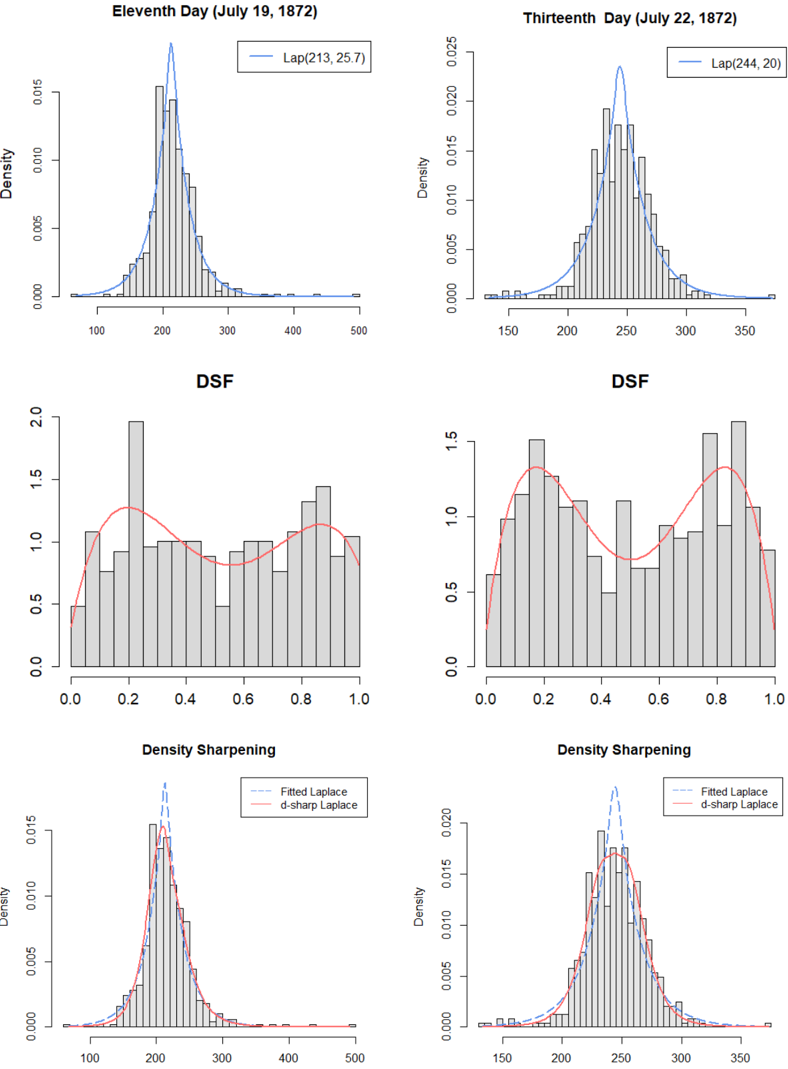
The image presents a 2x3 grid of plots, likely representing statistical analysis of data collected on the eleventh and thirteenth days of July 1872. Each pair of plots for a given day focuses on a different aspect of the data: a histogram with density curve, a Density Spectral Function (DSF) plot, and a Density Sharpening plot. The plots appear to be related to a distribution, potentially representing measurements or observations.
### Components/Axes
Each plot shares common elements:
* **X-axis:** Represents the data values. The scale varies between plots, ranging approximately from 0 to 500 in some and 150 to 350 in others.
* **Y-axis:** Labeled "Density" in the top row and unspecified in the middle and bottom rows, representing the probability density of the data. The scale ranges from 0 to approximately 0.025.
* **Titles:** Each plot has a title indicating the date and analysis type.
* **Histograms:** Represent the frequency distribution of the data, with bars indicating the count of observations within specific bins.
* **Density Curves:** Smooth curves overlaid on the histograms, representing the estimated probability density function.
* **DSF Plots:** Show a curve (red) and a histogram. The x-axis ranges from 0 to 1, and the y-axis ranges from 0 to 2.
* **Density Sharpening Plots:** Show two density curves (grey and light blue) overlaid on a histogram.
* **Laplace Parameters:** The top plots include "Lap(μ, σ)" notation, indicating a Laplace distribution fit to the data, with μ and σ representing the location and scale parameters, respectively.
### Detailed Analysis or Content Details
**Eleventh Day (July 19, 1872)**
* **Top-Left Plot:** Histogram and density curve. The distribution appears roughly unimodal, with a peak around 213. The Laplace parameters are Lap(213, 25.7). The density curve reaches a maximum density of approximately 0.014 at around 213.
* **Middle-Left Plot (DSF):** The red curve shows a peak around 0.2, with a value of approximately 1.6. The histogram is relatively flat, with values ranging from 0 to 1.5.
* **Bottom-Left Plot (Density Sharpening):** Two density curves are shown. The grey curve is smoother and has a peak around 213. The light blue curve is more jagged and has a similar peak.
**Thirteenth Day (July 22, 1872)**
* **Top-Right Plot:** Histogram and density curve. The distribution appears roughly unimodal, with a peak around 244. The Laplace parameters are Lap(244, 20). The density curve reaches a maximum density of approximately 0.022 at around 244.
* **Middle-Right Plot (DSF):** The red curve shows a peak around 0.4, with a value of approximately 1.5. The histogram is relatively flat, with values ranging from 0 to 1.5.
* **Bottom-Right Plot (Density Sharpening):** Two density curves are shown. The grey curve is smoother and has a peak around 244. The light blue curve is more jagged and has a similar peak.
### Key Observations
* The distributions on both days are unimodal and roughly symmetric.
* The peak of the distribution shifted from approximately 213 on July 19th to 244 on July 22nd.
* The scale parameter of the Laplace distribution decreased from 25.7 to 20, indicating a more concentrated distribution on July 22nd.
* The DSF plots show a similar pattern on both days, with a peak in the red curve.
* The Density Sharpening plots show two curves, one smoother and one more jagged, suggesting different methods of density estimation.
### Interpretation
The data suggests a change in the underlying distribution between July 19th and July 22nd. The shift in the peak and the decrease in the scale parameter indicate that the values are generally higher and more concentrated on July 22nd. The DSF plots may represent a spectral analysis of the data, highlighting specific frequencies or patterns. The Density Sharpening plots suggest that different methods of density estimation can produce slightly different results.
The Laplace distribution fitting suggests an attempt to model the data with a known distribution. The parameters (μ and σ) provide a concise summary of the distribution's location and spread. The DSF and Density Sharpening plots likely represent attempts to refine or analyze the density estimation further.
The consistent structure of the plots across both days suggests a systematic analysis of the data, potentially as part of a time series or longitudinal study. The specific meaning of the data would depend on the context in which it was collected.