TECHNICAL ASSET FINGERPRINT
5ebff235fd7e73253813b84e
Click to view fullscreen
Press ESC or click to close
FOUND IN PAPERS
EXPERT: healer-alpha-free VERSION 1
RUNTIME: free/openrouter/healer-alpha
INTEL_VERIFIED
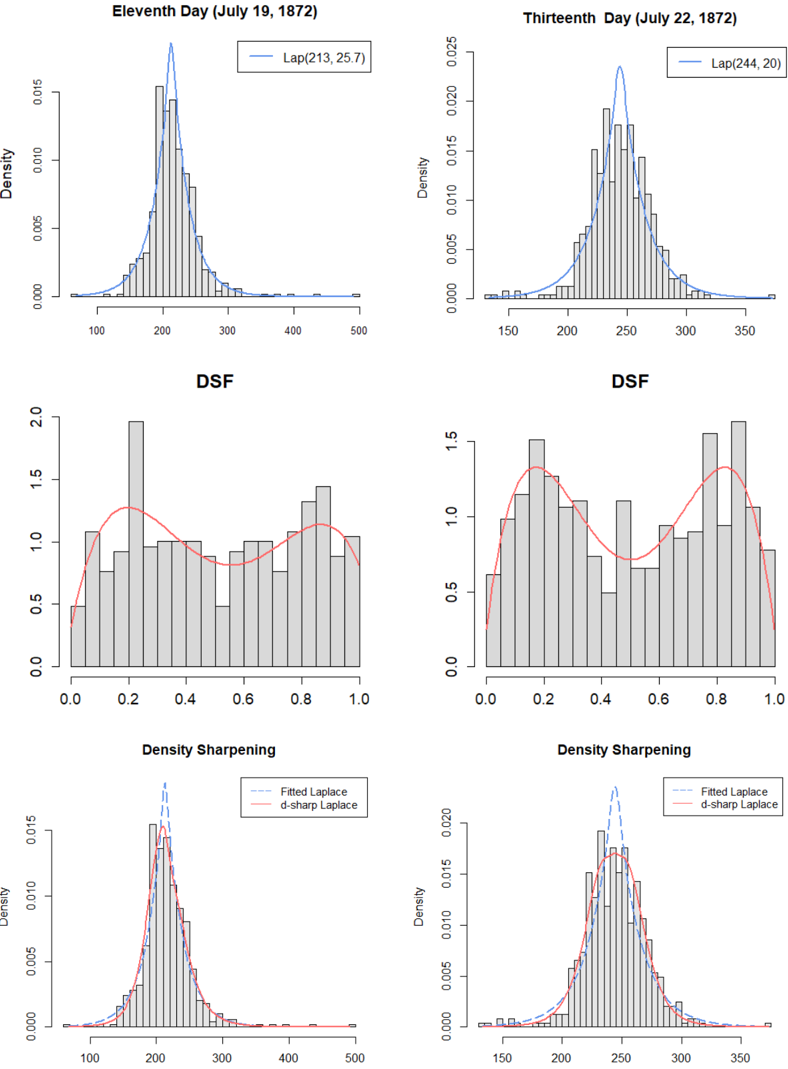
## Statistical Distribution Plots: Historical Data Analysis (July 1872)
### Overview
The image displays a 3x2 grid of statistical plots analyzing data from two specific days in July 1872. The top row shows histograms of raw data with fitted Laplace distributions. The middle row, labeled "DSF," presents histograms of a transformed or normalized dataset (likely "Density Sharpening Function" or similar) with overlaid red curves. The bottom row, titled "Density Sharpening," compares the original fitted Laplace distribution with a "d-sharp Laplace" distribution on the same data. The left column corresponds to "Eleventh Day (July 19, 1872)" and the right column to "Thirteenth Day (July 22, 1872)."
### Components/Axes
**General Structure:**
* **Layout:** Six individual plots arranged in three rows and two columns.
* **Titles:** Each plot has a title. The top row has date-specific titles. The middle row plots are both titled "DSF". The bottom row plots are both titled "Density Sharpening".
* **Axes:** All plots have numerical x-axes and y-axes labeled "Density".
* **Legends:** Present in the top and bottom row plots, located in the top-right corner of each plot area.
**Row 1: Raw Data with Laplace Fit**
* **Left Plot (July 19):**
* **Title:** "Eleventh Day (July 19, 1872)"
* **X-axis:** Range approximately 50 to 500. Major ticks at 100, 200, 300, 400, 500.
* **Y-axis:** "Density". Range 0.000 to 0.015. Major ticks at 0.000, 0.005, 0.010, 0.015.
* **Legend:** A blue line labeled "Lap(213,25.7)". This indicates a Laplace distribution with location parameter μ=213 and scale parameter b=25.7.
* **Right Plot (July 22):**
* **Title:** "Thirteenth Day (July 22, 1872)"
* **X-axis:** Range approximately 125 to 375. Major ticks at 150, 200, 250, 300, 350.
* **Y-axis:** "Density". Range 0.000 to 0.025. Major ticks at 0.000, 0.005, 0.010, 0.015, 0.020, 0.025.
* **Legend:** A blue line labeled "Lap(244, 20)". This indicates a Laplace distribution with μ=244 and b=20.
**Row 2: DSF Plots**
* **Left Plot (July 19):**
* **Title:** "DSF"
* **X-axis:** Range 0.0 to 1.0. Major ticks at 0.0, 0.2, 0.4, 0.6, 0.8, 1.0.
* **Y-axis:** Range 0.0 to 2.0. Major ticks at 0.0, 0.5, 1.0, 1.5, 2.0.
* **Data:** A histogram with a red, smooth, bimodal curve overlaid.
* **Right Plot (July 22):**
* **Title:** "DSF"
* **X-axis:** Range 0.0 to 1.0. Major ticks at 0.0, 0.2, 0.4, 0.6, 0.8, 1.0.
* **Y-axis:** Range 0.0 to 1.5. Major ticks at 0.0, 0.5, 1.0, 1.5.
* **Data:** A histogram with a red, smooth, bimodal curve overlaid.
**Row 3: Density Sharpening Comparison**
* **Left Plot (July 19):**
* **Title:** "Density Sharpening"
* **X-axis:** Range approximately 50 to 500. Major ticks at 100, 200, 300, 400, 500.
* **Y-axis:** "Density". Range 0.000 to 0.015. Major ticks at 0.000, 0.005, 0.010, 0.015.
* **Legend:** Two entries.
1. A dashed blue line labeled "Fitted Laplace".
2. A solid red line labeled "d-sharp Laplace".
* **Right Plot (July 22):**
* **Title:** "Density Sharpening"
* **X-axis:** Range approximately 125 to 375. Major ticks at 150, 200, 250, 300, 350.
* **Y-axis:** "Density". Range 0.000 to 0.020. Major ticks at 0.000, 0.005, 0.010, 0.015, 0.020.
* **Legend:** Two entries.
1. A dashed blue line labeled "Fitted Laplace".
2. A solid red line labeled "d-sharp Laplace".
### Detailed Analysis
**Row 1 (Raw Data):**
* **July 19:** The histogram shows a unimodal distribution centered near 210-220. The fitted Laplace curve (blue, `Lap(213,25.7)`) peaks sharply at the mode, aligning well with the highest histogram bar. The distribution has a long right tail extending past 400.
* **July 22:** The histogram is also unimodal, centered near 240-250. The fitted Laplace curve (blue, `Lap(244,20)`) peaks at the mode. The distribution appears slightly tighter (scale parameter b=20 vs. 25.7) and is shifted to the right compared to July 19.
**Row 2 (DSF):**
* **July 19:** The histogram of the transformed data (DSF) is clearly bimodal. One mode is near x=0.2, and a second, broader mode is between x=0.8 and x=0.9. The overlaid red curve smoothly traces this bimodal shape, with peaks near 0.2 and 0.85.
* **July 22:** This DSF histogram is also bimodal. One mode is near x=0.2, and a second, more pronounced mode is near x=0.8-0.9. The red curve shows peaks at approximately 0.2 and 0.85, with a deeper valley between them compared to the July 19 plot.
**Row 3 (Density Sharpening):**
* **July 19:** This plot overlays two distributions on the original data histogram. The "Fitted Laplace" (dashed blue) is the same as in the top-left plot. The "d-sharp Laplace" (solid red) is a modified distribution. Visually, the red curve is slightly narrower and taller at the peak than the blue curve, suggesting it is a "sharpened" or more concentrated estimate of the density.
* **July 22:** Similarly, the "Fitted Laplace" (dashed blue) matches the top-right plot. The "d-sharp Laplace" (solid red) is again slightly more peaked and less spread at the base than the blue Laplace fit.
### Key Observations
1. **Temporal Shift:** The central location of the raw data increased from ~213 on July 19 to ~244 on July 22.
2. **Distribution Shape:** The raw data on both days is reasonably modeled by a Laplace (double-exponential) distribution, characterized by a sharp peak and heavy tails.
3. **Bimodality in Transformation:** The "DSF" transformation reveals a strong bimodal structure in the data that is not apparent in the raw histograms. This suggests the underlying data may consist of two distinct subgroups or processes.
4. **Density Sharpening Effect:** The "d-sharp Laplace" method produces a density estimate that is consistently more concentrated (higher peak, slightly lower tails) than the standard Laplace fit for both datasets.
### Interpretation
This set of plots appears to be a technical analysis of historical measurement data, possibly from a scientific or astronomical observation log given the 1872 dates. The analysis pipeline demonstrates a method for exploring data structure:
1. **Initial Fit:** The raw data is first characterized by a simple parametric model (Laplace distribution). The change in parameters (μ, b) between the two dates indicates a shift in the measured quantity's central tendency and variability.
2. **Revealing Latent Structure:** The "DSF" step is crucial. By transforming the data (perhaps via a kernel density estimate or a derivative-based sharpening function), the analysis uncovers a hidden bimodal pattern. This implies the single peak in the raw data is actually an aggregate of two underlying populations or states. The x-axis from 0 to 1 suggests this might be a normalized derivative or probability scale.
3. **Refined Estimation:** The "Density Sharpening" step applies a technique to improve upon the initial parametric fit. The "d-sharp Laplace" likely uses information from the DSF step to create a more accurate, less smoothed density estimate that better captures the sharp peak of the true distribution.
**Overall Purpose:** The figure documents a statistical method that moves from a simple summary (Laplace fit) to a more nuanced understanding (bimodal structure via DSF) and finally to a refined model (d-sharp Laplace). It shows the method's consistent application and results across two related but distinct datasets from consecutive observations. The notable outlier is the consistent bimodality in the DSF plots, which is the key finding that the raw data histograms obscure.
DECODING INTELLIGENCE...