TECHNICAL ASSET FINGERPRINT
5ec57a968a69047f541d7ef7
Click to view fullscreen
Press ESC or click to close
FOUND IN PAPERS
EXPERT: healer-alpha-free VERSION 1
RUNTIME: free/openrouter/healer-alpha
INTEL_VERIFIED
\n
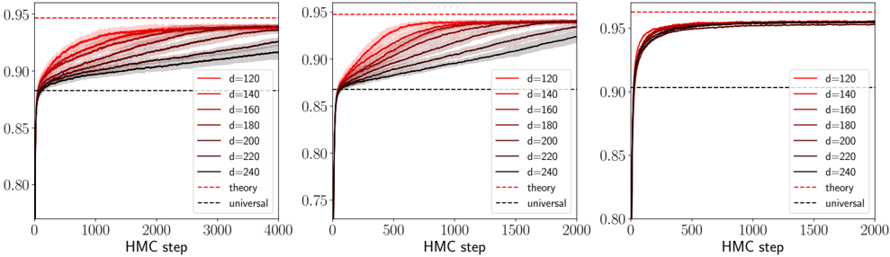
## Line Charts: Convergence of HMC Steps for Different Dimensions (d)
### Overview
The image displays three horizontally arranged line charts. Each chart plots the performance (y-axis, likely accuracy or a similar metric) against the number of Hybrid Monte Carlo (HMC) steps (x-axis) for a series of different dimension parameters (`d`). The charts appear to show the convergence behavior of a process, with higher dimensions (`d`) converging to higher performance values. The three charts likely represent different experimental conditions or model configurations, as the x-axis scale and convergence speed vary.
### Components/Axes
* **Chart Layout:** Three separate line charts arranged side-by-side.
* **X-Axis (All Charts):** Labeled "HMC step".
* **Left Chart:** Scale from 0 to 4000, with major ticks at 0, 1000, 2000, 3000, 4000.
* **Middle Chart:** Scale from 0 to 2000, with major ticks at 0, 500, 1000, 1500, 2000.
* **Right Chart:** Scale from 0 to 2000, with major ticks at 0, 500, 1000, 1500, 2000.
* **Y-Axis (All Charts):** Numerical scale representing a performance metric (e.g., accuracy). The visible range is approximately 0.75 to 0.95.
* **Left Chart:** Major ticks at 0.80, 0.85, 0.90, 0.95.
* **Middle Chart:** Major ticks at 0.75, 0.80, 0.85, 0.90, 0.95.
* **Right Chart:** Major ticks at 0.80, 0.85, 0.90, 0.95.
* **Legend (Present in all three charts, located in the bottom-right corner):**
* **Data Series (Colored Solid Lines):** Represent different values of a parameter `d`.
* `d=120` (Lightest red/pink)
* `d=140`
* `d=160`
* `d=180`
* `d=200`
* `d=220`
* `d=240` (Darkest red/brown)
* **Reference Lines (Dashed):**
* `theory` (Red dashed line)
* `universal` (Black dashed line)
### Detailed Analysis
**General Trend (All Charts):** For each value of `d`, the performance metric starts low (near 0.75-0.80) at HMC step 0 and increases rapidly initially, then gradually plateaus as the number of HMC steps increases. Higher values of `d` consistently converge to higher plateau values.
**Left Chart (x-axis: 0-4000 steps):**
* **Convergence Speed:** The slowest of the three. Lines are still visibly rising at 4000 steps, especially for lower `d` values.
* **Plateau Values (Approximate at step 4000):**
* `d=120`: ~0.915
* `d=140`: ~0.925
* `d=160`: ~0.930
* `d=180`: ~0.935
* `d=200`: ~0.940
* `d=220`: ~0.942
* `d=240`: ~0.944
* **Reference Lines:**
* `theory` (Red dashed): Horizontal line at y ≈ 0.95.
* `universal` (Black dashed): Horizontal line at y ≈ 0.88.
**Middle Chart (x-axis: 0-2000 steps):**
* **Convergence Speed:** Faster than the left chart. Most lines appear to plateau by step 1500-2000.
* **Plateau Values (Approximate at step 2000):**
* `d=120`: ~0.925
* `d=140`: ~0.935
* `d=160`: ~0.940
* `d=180`: ~0.943
* `d=200`: ~0.945
* `d=220`: ~0.947
* `d=240`: ~0.948
* **Reference Lines:**
* `theory` (Red dashed): Horizontal line at y ≈ 0.95.
* `universal` (Black dashed): Horizontal line at y ≈ 0.87.
**Right Chart (x-axis: 0-2000 steps):**
* **Convergence Speed:** The fastest. All lines reach a clear plateau by step 1000.
* **Plateau Values (Approximate at step 2000):**
* `d=120`: ~0.945
* `d=140`: ~0.948
* `d=160`: ~0.950
* `d=180`: ~0.951
* `d=200`: ~0.952
* `d=220`: ~0.953
* `d=240`: ~0.954
* **Reference Lines:**
* `theory` (Red dashed): Horizontal line at y ≈ 0.96.
* `universal` (Black dashed): Horizontal line at y ≈ 0.90.
### Key Observations
1. **Dimension (`d`) Effect:** There is a clear, monotonic relationship: increasing `d` leads to a higher final performance plateau across all three charts.
2. **Convergence Rate:** The three charts show different convergence rates. The right chart converges fastest (within ~1000 steps), the middle chart is intermediate (~1500-2000 steps), and the left chart is slowest (not fully converged by 4000 steps). This suggests the charts represent different experimental setups (e.g., different model architectures, learning rates, or datasets).
3. **Proximity to Theory:** In all cases, the performance for the highest `d` values approaches but does not exceed the `theory` line. The gap between the best performance (`d=240`) and the `theory` line is smallest in the right chart.
4. **Universal Baseline:** The `universal` line acts as a lower bound or baseline performance that all `d` values surpass relatively quickly.
5. **Line Ordering:** The colored lines maintain their order (`d=120` lowest, `d=240` highest) throughout the convergence process in all charts, with no crossovers.
### Interpretation
These charts demonstrate the convergence properties of an HMC-based sampling or optimization algorithm applied to a problem parameterized by dimension `d`. The key findings are:
* **Scalability with Dimension:** Contrary to many algorithms that degrade with higher dimensionality, this process shows *improved* asymptotic performance as `d` increases. This could indicate that the problem becomes "easier" or more constrained in higher dimensions, or that the algorithm is particularly well-suited for high-dimensional spaces.
* **Efficiency vs. Accuracy Trade-off:** The different charts likely represent a trade-off. The right chart achieves near-theoretical maximum performance very quickly but may correspond to a more computationally expensive setup per HMC step. The left chart is slower but might be using a cheaper approximation.
* **Theoretical Limit:** The `theory` line represents a proven or conjectured upper bound on performance. The data shows the algorithm can approach this bound, especially for high `d` and sufficient steps, validating the theoretical model.
* **Universal Baseline:** The `universal` line may represent the performance of a simpler, dimension-agnostic method. The charts show that the HMC method with any `d > ~120` quickly surpasses this baseline, justifying its use.
**In summary, the visualization provides strong evidence that the HMC process scales favorably with dimension `d`, converges to a theoretically predictable limit, and does so with efficiency that depends on the specific configuration (as shown by the three panels).**
DECODING INTELLIGENCE...