## Heatmap Visualization: EFE1, EFER, EFE2
### Overview
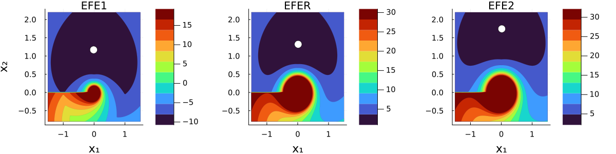
The image contains three side-by-side heatmaps labeled **EFE1**, **EFER**, and **EFE2**, each depicting a 2D spatial distribution of values across axes **X1** (horizontal, -1 to 1) and **X2** (vertical, -0.5 to 2.0). All heatmaps share a consistent coordinate system but differ in color intensity ranges and spatial patterns. A white dot is consistently positioned at **(X1=0, X2=1)** across all plots.
---
### Components/Axes
- **Axes**:
- **X1**: Horizontal axis, labeled with values **-1, 0, 1**.
- **X2**: Vertical axis, labeled with values **-0.5, 0, 0.5, 1, 1.5, 2.0**.
- **Color Scales**:
- **EFE1**: Ranges from **-10 (dark blue)** to **15 (dark red)**.
- **EFER**: Ranges from **-10 (dark blue)** to **30 (dark red)**.
- **EFE2**: Ranges from **5 (light blue)** to **30 (dark red)**.
- **Legend**: Positioned on the right of each heatmap, with a vertical gradient from dark blue (low values) to dark red (high values). No explicit legend labels beyond the colorbar.
- **White Dot**: Located at **(X1=0, X2=1)** in all heatmaps, likely a reference point.
---
### Detailed Analysis
#### EFE1
- **Color Distribution**:
- Dominant **dark purple/blue** in the upper-left quadrant (X1 < 0, X2 > 0.5), indicating values near **-10**.
- A **gradient from red to blue** in the lower-left quadrant (X1 < 0, X2 < 0.5), transitioning from **15 to -10**.
- A **small white dot** at **(0,1)** stands out against the dark background.
- **Key Features**:
- A **circular red region** centered at **(X1=0, X2=1)** with a radius of ~0.5 units.
- A **funnel-like gradient** in the lower-left corner, transitioning from red (high values) to blue (low values).
#### EFER
- **Color Distribution**:
- Similar **dark purple/blue** upper-left quadrant as EFE1.
- A **larger red region** in the lower-left quadrant (X1 < 0, X2 < 0.5), extending to **X1=-0.5**, with values up to **30**.
- The white dot at **(0,1)** is surrounded by a **darker red halo** compared to EFE1.
- **Key Features**:
- The red region in the lower-left is **more extensive** than in EFE1, suggesting higher values in this area.
- The gradient near **(X1=0, X2=0.5)** transitions sharply from red to blue.
#### EFE2
- **Color Distribution**:
- **Dark purple/blue** upper-left quadrant, but with a **smaller red region** near **(X1=0, X2=1)** compared to EFER.
- A **broad red-to-blue gradient** in the lower-left quadrant, with values peaking at **30** near **(X1=-0.5, X2=0)**.
- The white dot at **(0,1)** is surrounded by a **moderate red halo**.
- **Key Features**:
- The red region in the lower-left is **less concentrated** than in EFER but covers a wider area.
- A **distinct gradient** from red (high values) to blue (low values) along the X1=0 axis.
---
### Key Observations
1. **Consistent Reference Point**: The white dot at **(0,1)** is present in all heatmaps, possibly indicating a critical threshold or anomaly.
2. **Color Scale Variability**:
- EFE1 has the **narrowest range** (-10 to 15), while EFER and EFE2 extend to **30**.
- EFE2’s scale starts at **5**, excluding negative values.
3. **Spatial Patterns**:
- All heatmaps show a **concentration of high values (red)** near **(X1=0, X2=1)**.
- EFER exhibits the **strongest gradient** in the lower-left quadrant, while EFE2 has a **wider but less intense red region**.
4. **Anomalies**:
- The white dot’s position remains unexplained by the color gradients, suggesting it may represent an outlier or predefined value.
---
### Interpretation
- **EFE1** likely represents a baseline scenario with moderate value ranges, where the white dot’s significance is unclear.
- **EFER** shows amplified values in the lower-left quadrant, possibly indicating a localized phenomenon (e.g., a shockwave or energy concentration).
- **EFE2** suggests a broader distribution of high values, with the white dot acting as a focal point for moderate-intensity effects.
- The **white dot’s consistent placement** across all heatmaps implies it is a **fixed reference** (e.g., a sensor location or theoretical origin point). Its lack of alignment with the red regions in EFE2 may indicate a decoupling between the reference and high-value zones in this scenario.
The heatmaps collectively demonstrate how spatial distributions of values (possibly energy, pressure, or error metrics) evolve across different conditions or parameters, with the white dot serving as a critical anchor for analysis.