## Contour Plots: Comparative Analysis of EFE1, EFER, and EFE2
### Overview
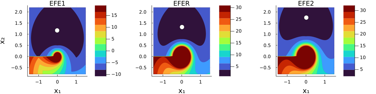
The image displays three side-by-side contour plots (heatmaps) labeled "EFE1", "EFER", and "EFE2". These plots visualize a scalar field over a two-dimensional domain defined by axes $X_1$ and $X_2$. Each plot features a distinct "swirl" or vortex-like pattern centered near the origin $(0,0)$ and a single white circular marker positioned at varying heights along the $X_2$ axis.
### Components/Axes
* **X-Axis ($X_1$):** Horizontal axis ranging from approximately -1.5 to 1.5, with major ticks at -1, 0, and 1.
* **Y-Axis ($X_2$):** Vertical axis ranging from -0.5 to 2.0, with major ticks at -0.5, 0.0, 0.5, 1.0, 1.5, and 2.0.
* **Legends:** Each plot includes a vertical color bar on the right side, mapping colors to numerical values.
* **EFE1:** Scale ranges from -10 (dark purple) to 15 (dark red).
* **EFER:** Scale ranges from 5 (dark purple) to 30 (dark red).
* **EFE2:** Scale ranges from 5 (dark purple) to 30 (dark red).
* **Markers:** A white dot is present in each plot, positioned at $X_1 = 0$.
* **EFE1:** $X_2 \approx 1.2$
* **EFER:** $X_2 \approx 1.3$
* **EFE2:** $X_2 \approx 1.7$
### Detailed Analysis
#### 1. EFE1
* **Trend:** The plot exhibits a large, low-value region (dark purple, $\approx -10$) occupying the upper portion of the domain. A high-value "swirl" (orange/red, $\approx 10-15$) originates from the left side ($X_1 < 0$) and spirals into a central point near $(0,0)$.
* **Marker:** The white dot is located at $(0, 1.2)$, situated within the low-value dark purple region.
#### 2. EFER
* **Trend:** The color distribution is similar to EFE1 but shifted to a positive scale (5 to 30). A large dark purple region (value $\approx 5$) dominates the top half. A high-intensity vortex (dark red, $\approx 30$) is concentrated at the origin $(0,0)$.
* **Marker:** The white dot is located at $(0, 1.3)$, slightly higher than in EFE1, still within the low-value region.
#### 3. EFE2
* **Trend:** This plot is visually nearly identical to EFER. It features the same large dark purple region at the top and the same high-intensity vortex at the origin.
* **Marker:** The white dot is located at $(0, 1.7)$, significantly higher than in the previous two plots, moving further away from the central vortex.
### Key Observations
* **Vortex Feature:** All three plots share a common topological feature: a high-value vortex centered at $(0,0)$. This suggests a non-convex landscape or a potential field with a singularity at the origin.
* **Marker Progression:** The white dot moves vertically upward across the three plots ($1.2 \rightarrow 1.3 \rightarrow 1.7$). This implies a sequential process, such as an optimization path, a parameter sweep, or a time-series evolution of a system state.
* **Scale Discrepancy:** EFE1 uses a different color scale (including negative values) compared to EFER and EFE2, which use identical positive scales. This suggests EFE1 may represent a different function, a different phase of the system, or a normalized version of the data.
### Interpretation
The data suggests these plots represent the evaluation of a cost function or a potential field in a 2D space. The "swirl" pattern is characteristic of optimization landscapes where a global or local optimum is surrounded by a "valley" or "ridge" that spirals toward the center.
The progression of the white dot indicates that the system is moving away from the central vortex (the high-value region) as the index progresses from EFE1 to EFE2. Given the visual similarity between EFER and EFE2, they likely represent the same underlying model or state, whereas EFE1 represents a distinct state or a different mathematical formulation. The white dot likely represents the current "position" or "state" of an agent or algorithm being tracked across these different configurations.