\n
## Line Chart: Pass@k Performance Comparison
### Overview
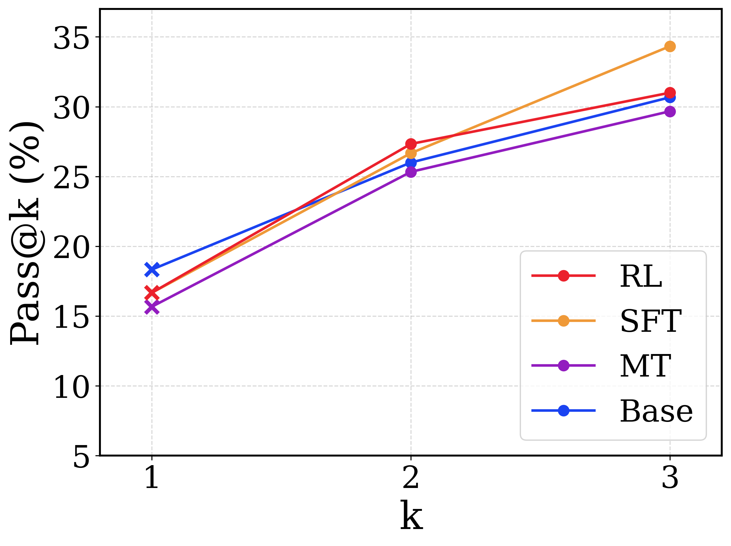
This image displays a line chart comparing the performance of four different models or methods (RL, SFT, MT, Base) on a metric called "Pass@k" across three discrete values of k (1, 2, and 3). The chart shows a clear upward trend for all methods as k increases.
### Components/Axes
* **Chart Type:** Line chart with markers.
* **X-Axis:**
* **Label:** `k`
* **Scale:** Discrete, linear scale with major ticks at `1`, `2`, and `3`.
* **Y-Axis:**
* **Label:** `Pass@k (%)`
* **Scale:** Linear scale ranging from 5 to 35, with major ticks every 5 units (5, 10, 15, 20, 25, 30, 35).
* **Legend:**
* **Position:** Bottom-right corner of the plot area.
* **Entries (from top to bottom):**
1. **RL:** Red line with circular markers.
2. **SFT:** Orange line with circular markers.
3. **MT:** Purple line with circular markers.
4. **Base:** Blue line with circular markers (note: at k=1, the marker is an 'x' instead of a circle).
* **Grid:** Light gray dashed grid lines are present for both axes.
### Detailed Analysis
**Trend Verification:** All four data series exhibit a positive, upward-sloping trend from k=1 to k=3. The slope appears steepest between k=1 and k=2 for all series.
**Data Points (Approximate Values):**
| Method (Color) | k=1 | k=2 | k=3 |
| :--- | :--- | :--- | :--- |
| **RL (Red)** | ~17% | ~27.5% | ~31% |
| **SFT (Orange)** | ~16.5% | ~26.5% | ~34.5% |
| **MT (Purple)** | ~15.5% | ~25.5% | ~29.5% |
| **Base (Blue)** | ~18.5% | ~26% | ~30.5% |
**Spatial Grounding & Component Isolation:**
* **Header/Title:** No chart title is present.
* **Main Chart Area:** Contains the four plotted lines and the grid.
* **Footer/Axes:** The x-axis label "k" is centered below the axis. The y-axis label "Pass@k (%)" is rotated 90 degrees and placed to the left of the axis.
* **Legend:** Located in the bottom-right quadrant, overlapping slightly with the grid lines but not obscuring data points.
### Key Observations
1. **Performance Hierarchy at k=1:** The `Base` model (blue) starts with the highest Pass@1 score (~18.5%), followed by `RL` (~17%), `SFT` (~16.5%), and `MT` (~15.5%).
2. **Performance Hierarchy at k=3:** The order changes significantly. `SFT` (orange) achieves the highest Pass@3 score (~34.5%), followed by `RL` (~31%), `Base` (~30.5%), and `MT` (~29.5%).
3. **Rate of Improvement:** The `SFT` method shows the most dramatic improvement, increasing by approximately 18 percentage points from k=1 to k=3. Its slope is the steepest, especially between k=2 and k=3.
4. **Crossover Point:** Between k=1 and k=2, the `RL` (red) line crosses above the `Base` (blue) line. The `SFT` (orange) line also crosses above the `Base` line in this interval.
5. **Marker Anomaly:** The `Base` series uses a distinct 'x' marker at k=1, while all other data points across all series use circular markers.
### Interpretation
This chart likely evaluates the effectiveness of different training or decoding strategies (Reinforcement Learning - RL, Supervised Fine-Tuning - SFT, perhaps Multi-Task - MT) against a baseline model (Base) on a code generation or problem-solving task, where "Pass@k" measures the probability that at least one of k generated samples is correct.
The data suggests that while the `Base` model is the strongest for single-attempt generation (k=1), the specialized training methods (`SFT` and `RL`) scale better with increased sampling (higher k). `SFT` demonstrates the most significant benefit from additional attempts, ultimately outperforming all other methods at k=3. This implies that the `SFT` method produces a more diverse set of high-quality candidate solutions, increasing the likelihood of finding a correct one when given multiple chances. The `MT` method, while improving, consistently underperforms the other approaches across all k values shown. The crossover between `RL`/`SFT` and `Base` highlights a key trade-off: the baseline may be better for efficiency (single try), but the fine-tuned methods are superior when computational resources allow for multiple sampling attempts.