## Pie Chart: Instance and Token Level Distributions at Varying Temperatures
### Overview
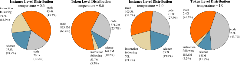
The image presents four pie charts, each depicting the distribution of data across four categories: "math," "code," "science," and "instruction following." The charts are organized into two pairs, with the left pair showing "Instance Level Distribution" and "Token Level Distribution" at a temperature of 0.6, and the right pair showing the same distributions at a temperature of 1.0. Each slice of the pie chart is labeled with the category name, the corresponding value (in 'k' or 'M' or 'G' units), and the percentage of the total.
### Components/Axes
* **Titles:**
* Top-left: "Instance Level Distribution temperature = 0.6"
* Top-middle-left: "Token Level Distribution temperature = 0.6"
* Top-middle-right: "Instance Level Distribution temperature = 1.0"
* Top-right: "Token Level Distribution temperature = 1.0"
* **Categories:**
* math (orange)
* code (light gray)
* science (blue-gray)
* instruction following (beige)
* **Units:** Values are given in thousands (k), millions (M), or billions (G).
* **Percentages:** Each slice is labeled with its percentage of the total.
### Detailed Analysis
**Chart 1: Instance Level Distribution, temperature = 0.6**
* math: 45.4k (43.3%) - Orange
* code: 20.1k (19.2%) - Light Gray
* science: 19.8k (18.9%) - Blue-Gray
* instruction following: 19.6k (18.7%) - Beige
**Chart 2: Token Level Distribution, temperature = 0.6**
* math: 873.5M (60.4%) - Orange
* code: 371.2M (25.7%) - Light Gray
* science: 147.2M (10.2%) - Blue-Gray
* instruction following: 53.7M (3.7%) - Beige
**Chart 3: Instance Level Distribution, temperature = 1.0**
* math: 103.3k (31.3%) - Orange
* code: 91.3k (27.7%) - Light Gray
* science: 65.2k (19.8%) - Blue-Gray
* instruction following: 70k (21.2%) - Beige
**Chart 4: Token Level Distribution, temperature = 1.0**
* math: 2.4G (41.2%) - Orange
* code: 2.5G (43.7%) - Light Gray
* science: 681M (11.8%) - Blue-Gray
* instruction following: 186.6M (3.2%) - Beige
### Key Observations
* **Temperature Impact:** Increasing the temperature from 0.6 to 1.0 significantly alters the distributions.
* **Instance vs. Token Level:** The distribution patterns differ substantially between instance and token levels.
* **Math Dominance:** At a temperature of 0.6, "math" dominates both instance and token level distributions.
* **Code Increase:** At a temperature of 1.0, "code" increases significantly in both instance and token level distributions, surpassing "math" at the token level.
* **Instruction Following Decline:** "Instruction following" consistently has the lowest percentage in all charts.
### Interpretation
The pie charts illustrate how the distribution of different categories (math, code, science, instruction following) varies based on temperature and the level of analysis (instance vs. token). The data suggests that increasing the temperature shifts the emphasis from "math" to "code," particularly at the token level. This could indicate that higher temperatures lead to more diverse and code-heavy outputs. The consistently low representation of "instruction following" might suggest that this category is less prevalent in the dataset or that the model generates fewer tokens related to instruction following. The difference between instance and token level distributions highlights the varying frequencies of these categories at different granularities.