\n
## Scatter Plot: Association Hallucinations
### Overview
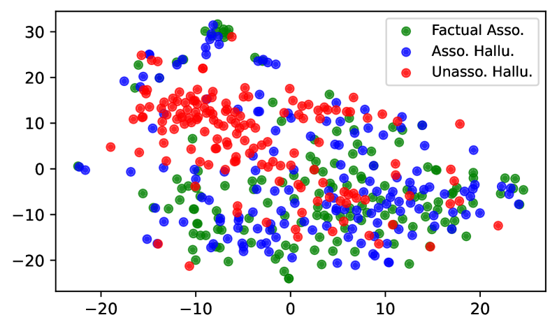
This image presents a scatter plot visualizing the relationship between three categories: "Factual Asso.", "Asso. Hallu.", and "Unasso. Hallu." The plot displays data points distributed across a two-dimensional space, likely representing some form of association strength or measurement.
### Components/Axes
* **X-axis:** Ranges approximately from -25 to 25, with no explicit label.
* **Y-axis:** Ranges approximately from -25 to 30, with no explicit label.
* **Legend:** Located in the top-right corner.
* **Factual Asso.** (Green circles)
* **Asso. Hallu.** (Blue circles)
* **Unasso. Hallu.** (Red circles)
### Detailed Analysis
The plot contains a large number of data points for each category.
* **Factual Asso. (Green):** The points are scattered broadly across the plot, with a concentration in the lower-left quadrant (approximately x=-15 to 5, y=-20 to 10). There's a noticeable cluster around x=-5, y=-5. The points generally range from y=-20 to y=15, and x=-20 to x=10.
* **Asso. Hallu. (Blue):** These points are concentrated in the upper-left quadrant (approximately x=-15 to 5, y=5 to 30). There's a distinct cluster around x=-10, y=25. The points generally range from y=0 to y=30, and x=-20 to x=20.
* **Unasso. Hallu. (Red):** These points are widely distributed, with a significant concentration in the upper-right quadrant (approximately x=5 to 20, y=5 to 20). There's a cluster around x=10, y=10. The points generally range from y=-5 to y=20, and x=-20 to x=25.
Trend Verification:
* Factual Asso. shows no clear trend, appearing randomly distributed.
* Asso. Hallu. shows a tendency to cluster in the upper-left quadrant.
* Unasso. Hallu. shows a tendency to cluster in the upper-right quadrant.
### Key Observations
* The "Asso. Hallu." and "Unasso. Hallu." categories exhibit a higher concentration of points in the positive Y-axis region compared to "Factual Asso.".
* There is significant overlap between all three categories, indicating that the underlying variables are not perfectly separable.
* The distribution of "Factual Asso." is more spread out and less clustered than the other two categories.
* The "Asso. Hallu." points are generally located at higher Y values than the "Factual Asso." points.
### Interpretation
The scatter plot likely represents a comparison of associations derived from factual data versus those generated through some form of hallucination or non-associated process. The x and y axes likely represent dimensions of some underlying feature space.
The clustering of "Asso. Hallu." in the upper-left quadrant suggests that these associations tend to have a positive value on the Y-axis, while being relatively negative or near zero on the X-axis. Conversely, "Unasso. Hallu." points in the upper-right quadrant suggest a positive value on both axes. "Factual Asso." points are more dispersed, indicating a wider range of values on both axes.
The overlap between the categories suggests that there is some ambiguity in distinguishing between factual associations and hallucinated associations. The plot could be used to evaluate the performance of a model or system in identifying true associations versus spurious ones. The lack of axis labels makes it difficult to provide a more specific interpretation. The data suggests that hallucinated associations are different from factual associations, and that there are two distinct types of hallucinated associations ("Asso. Hallu." and "Unasso. Hallu.").