## Scatter Plot: Association and Hallucination Categories
### Overview
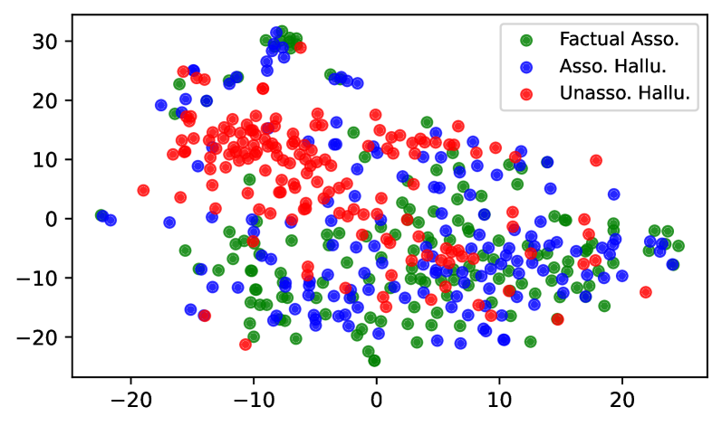
The image is a scatter plot displaying data points categorized into three groups, differentiated by color. The plot visualizes the distribution and clustering of these categories across a two-dimensional space defined by numerical x and y axes. No explicit axis titles are provided, suggesting the axes represent abstract or derived dimensions (e.g., principal components, latent space coordinates).
### Components/Axes
* **Legend:** Located in the top-right corner. It defines three categories:
* **Green Circle:** "Factual Asso." (Factual Association)
* **Blue Circle:** "Asso. Hallu." (Associated Hallucination)
* **Red Circle:** "Unasso. Hallu." (Unassociated Hallucination)
* **X-Axis:** A horizontal numerical axis with major tick marks labeled at -20, -10, 0, 10, and 20. The visible range extends slightly beyond these marks, approximately from -25 to +25.
* **Y-Axis:** A vertical numerical axis with major tick marks labeled at -20, -10, 0, 10, 20, and 30. The visible range extends from approximately -25 to +35.
* **Data Points:** Hundreds of colored circles (green, blue, red) are scattered across the plot area. The points are semi-transparent, allowing some visibility of overlap.
### Detailed Analysis
**Spatial Distribution and Trends:**
1. **Factual Asso. (Green):**
* **Trend:** These points are widely dispersed but show a concentration in the lower half of the plot (negative y-values). They are spread across the entire x-axis range.
* **Key Regions:** A dense cluster exists in the bottom-center and bottom-right quadrants (x: 0 to 20, y: -20 to 0). Another notable grouping is in the bottom-left (x: -15 to -5, y: -20 to -10). Some green points are interspersed within the blue and red clusters.
2. **Asso. Hallu. (Blue):**
* **Trend:** These points form the most widespread and centrally located group. They appear as a broad, diffuse cloud covering much of the central and right portions of the plot.
* **Key Regions:** The highest density is in the central region (x: -5 to 15, y: -10 to 15). There is a significant spread towards the right side (positive x). Blue points are heavily intermingled with green points in the lower half and with red points in the upper-left.
3. **Unasso. Hallu. (Red):**
* **Trend:** This group shows the most distinct clustering. The points are predominantly concentrated in the upper-left quadrant.
* **Key Regions:** A very dense, tight cluster is located approximately between x: -15 to 0 and y: 5 to 20. This cluster has the highest y-values on average. A secondary, less dense scattering of red points extends towards the center and right, often overlapping with blue points.
**Data Point Approximation (Representative Examples):**
* **Extreme High Y (Red):** A red point is near (x ≈ -8, y ≈ 32).
* **Extreme Low Y (Green):** A green point is near (x ≈ -2, y ≈ -24).
* **Extreme Left (Blue):** A blue point is near (x ≈ -23, y ≈ 0).
* **Extreme Right (Green/Blue):** Points from both categories are near (x ≈ 24, y ≈ -5).
### Key Observations
1. **Clear Separation of "Unasso. Hallu.":** The red points form a distinct, dense cluster in the upper-left, suggesting this category occupies a specific region of this feature space.
2. **Overlap Between "Factual Asso." and "Asso. Hallu.":** Green and blue points are heavily intermixed, particularly in the lower half of the plot (y < 0). This indicates these categories are not well-separated by these two dimensions.
3. **Gradient in Y-Value:** There is a rough vertical stratification: red points dominate the top (high y), blue points the middle, and green points the bottom (low y), though with significant overlap.
4. **X-Axis Spread:** All categories span the full x-axis range, but the red cluster is skewed towards negative x-values.
### Interpretation
This scatter plot likely visualizes the output of a dimensionality reduction technique (like t-SNE or PCA) applied to data related to language model outputs or knowledge associations. The axes represent latent dimensions that capture variance in the data.
The spatial arrangement suggests:
* **"Unassociated Hallucinations" (Red)** are a distinct phenomenon, characterized by high values in the latent dimension represented by the y-axis. Their clustering implies consistency in whatever underlying feature causes this separation.
* **"Factual Associations" (Green) and "Associated Hallucinations" (Blue)** are more similar to each other in this latent space, as evidenced by their significant overlap. This could mean that, based on the analyzed features, it is difficult to distinguish between a correct association and a hallucinated one that is still contextually associated.
* The overall distribution implies that the model's "factual" and "associated hallucination" states are part of a continuum, while "unassociated hallucinations" represent a more extreme or outlier state. The plot serves as a diagnostic tool to understand the separability and characteristics of different model error types.