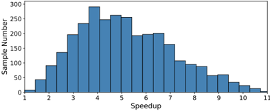
## Histogram: Speedup Distribution
### Overview
The image displays a histogram chart illustrating the frequency distribution of "Speedup" values across a sample set. The chart uses vertical blue bars to represent the number of samples falling within specific speedup intervals. The overall shape indicates a unimodal distribution that is positively skewed (right-skewed).
### Components/Axes
* **Chart Type:** Histogram
* **X-Axis (Horizontal):**
* **Label:** "Speedup"
* **Scale:** Linear scale ranging from 1 to 11.
* **Tick Marks:** Major ticks are present at every integer value from 1 to 11.
* **Y-Axis (Vertical):**
* **Label:** "Sample Number"
* **Scale:** Linear scale ranging from 0 to 300.
* **Tick Marks:** Major ticks are present at intervals of 50 (0, 50, 100, 150, 200, 250, 300).
* **Legend:** No legend is present in the image.
* **Data Series:** A single data series represented by blue bars. Each bar's width appears to represent a bin of width 1 (e.g., 1-2, 2-3, etc.).
### Detailed Analysis
The histogram consists of 10 bars, each representing a speedup bin. The approximate sample count (height) for each bin is estimated as follows:
* **Bin 1-2:** ~10 samples
* **Bin 2-3:** ~90 samples
* **Bin 3-4:** ~200 samples
* **Bin 4-5:** ~290 samples **(Mode - Highest Frequency)**
* **Bin 5-6:** ~250 samples
* **Bin 6-7:** ~200 samples
* **Bin 7-8:** ~160 samples
* **Bin 8-9:** ~100 samples
* **Bin 9-10:** ~60 samples
* **Bin 10-11:** ~20 samples
**Trend Verification:** The visual trend shows a rapid increase in sample count from the lowest speedup bin, peaking at the 4-5 bin. Following the peak, there is a steady, gradual decline in sample count as the speedup value increases, forming a long tail to the right.
### Key Observations
1. **Modal Peak:** The most frequent speedup value occurs in the interval between 4 and 5.
2. **Positive Skew:** The distribution is not symmetric. The tail on the right side (higher speedup values) is longer and more gradual than the steep rise on the left side.
3. **Range:** The observed speedup values span from approximately 1 to 11.
4. **Concentration:** The vast majority of samples (roughly 800 out of an estimated total ~1400) have a speedup between 3 and 7.
5. **Outliers:** Very few samples achieve a speedup greater than 9.
### Interpretation
This histogram likely represents the performance improvement ("speedup") achieved by a system, algorithm, or process across many trials or configurations.
* **Central Tendency:** The typical or most common outcome is a speedup factor of around 4-5x.
* **Performance Profile:** The system demonstrates reliable performance gains, with nearly all trials showing a speedup greater than 1x. The steep left side suggests a lower bound on effectiveness.
* **Diminishing Returns:** The long right tail indicates that while higher speedups (e.g., 8x, 10x) are possible, they become increasingly rare. This pattern is common in optimization scenarios where initial improvements are easier to achieve, but pushing to extreme performance yields smaller marginal gains.
* **Data Quality:** The smooth, unimodal shape suggests a well-behaved dataset without significant measurement errors or multiple underlying populations. The clear binning implies the data was collected or processed in discrete intervals.