## Histogram: Speedup Distribution
### Overview
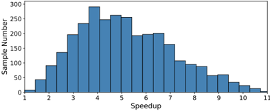
The image is a histogram displaying the distribution of "Speedup" values across a number of samples. The x-axis represents the speedup, ranging from approximately 1 to 11. The y-axis represents the sample number, ranging from 0 to 300. The histogram shows the frequency of each speedup value within the dataset.
### Components/Axes
* **X-axis:** Speedup, ranging from 1 to 11 in increments of 1.
* **Y-axis:** Sample Number, ranging from 0 to 300 in increments of 50.
### Detailed Analysis
The histogram bars represent the number of samples for each speedup value. The bars are blue with black outlines.
* **Speedup 1:** Approximately 40 samples.
* **Speedup 2:** Approximately 90 samples.
* **Speedup 3:** Approximately 140 samples.
* **Speedup 4:** Approximately 290 samples.
* **Speedup 5:** Approximately 260 samples.
* **Speedup 6:** Approximately 190 samples.
* **Speedup 7:** Approximately 180 samples.
* **Speedup 8:** Approximately 140 samples.
* **Speedup 9:** Approximately 60 samples.
* **Speedup 10:** Approximately 30 samples.
* **Speedup 11:** Approximately 10 samples.
### Key Observations
The distribution is unimodal and skewed to the right. The peak of the distribution (mode) is around a speedup of 4. The number of samples decreases as the speedup increases beyond 4.
### Interpretation
The histogram suggests that the most common speedup achieved is around 4. Higher speedups are less frequent. This could indicate that the system or process being measured has a typical performance improvement factor of around 4, with diminishing returns as speedup increases further. The right skew suggests that while high speedups are possible, they are relatively rare compared to the more typical speedup values.