## Scatter Plot with Trend Line and Inset: Coherence Fraction vs. Control Parameter
### Overview
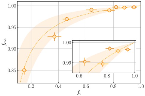
The image is a scientific scatter plot illustrating the relationship between a control parameter, denoted as \( f_c \), and a coherence fraction, denoted as \( f_{coh} \). The plot features a main chart and a smaller inset chart that provides a zoomed-in view of the upper-right region of the main plot. The data is presented with orange markers, a dashed trend line, and a shaded uncertainty band.
### Components/Axes
* **Main Chart Axes:**
* **X-axis (Horizontal):** Labeled **\( f_c \)**. The scale ranges from approximately 0.1 to 1.0, with major tick marks at 0.2, 0.4, 0.6, 0.8, and 1.0.
* **Y-axis (Vertical):** Labeled **\( f_{coh} \)**. The scale ranges from 0.85 to 1.00, with major tick marks at 0.85, 0.90, 0.95, and 1.00.
* **Inset Chart Axes:**
* **X-axis (Horizontal):** Labeled **\( f_c \)**. The scale is a zoomed-in segment from approximately 0.6 to 1.0, with major tick marks at 0.6, 0.8, and 1.0.
* **Y-axis (Vertical):** Labeled **\( f_{coh} \)**. The scale is a zoomed-in segment from approximately 0.99 to 1.00, with major tick marks at 0.99 and 1.00.
* **Data Series & Legend:**
* There is no explicit legend box. The data is represented by a single series: **orange circles with cross-shaped error bars**.
* A **dashed orange line** represents a fitted trend or theoretical curve.
* A **light orange shaded region** surrounds the dashed line, indicating a confidence interval or uncertainty band.
* **Spatial Grounding:**
* The main chart occupies the majority of the image.
* The inset chart is positioned in the **bottom-right quadrant** of the main chart area, overlapping the main plot's data region.
* The shaded uncertainty band is widest at low \( f_c \) values (left side) and narrows significantly as \( f_c \) increases.
### Detailed Analysis
* **Data Points (Approximate Values from Main Chart):**
* Point 1: \( f_c \approx 0.15 \), \( f_{coh} \approx 0.85 \)
* Point 2: \( f_c \approx 0.35 \), \( f_{coh} \approx 0.93 \)
* Point 3: \( f_c \approx 0.50 \), \( f_{coh} \approx 0.97 \)
* Points 4-8: Clustered between \( f_c \approx 0.60 \) and \( f_c \approx 1.00 \), with \( f_{coh} \) values rising from ~0.99 to nearly 1.00.
* **Data Points (Refined from Inset Chart):**
* The inset clarifies the high-\( f_c \) region:
* At \( f_c \approx 0.65 \), \( f_{coh} \approx 0.990 \)
* At \( f_c \approx 0.75 \), \( f_{coh} \approx 0.992 \)
* At \( f_c \approx 0.80 \), \( f_{coh} \approx 0.995 \)
* At \( f_c \approx 0.85 \), \( f_{coh} \approx 0.996 \)
* At \( f_c \approx 0.90 \), \( f_{coh} \approx 0.998 \)
* At \( f_c \approx 0.95 \), \( f_{coh} \approx 0.999 \)
* At \( f_c \approx 1.00 \), \( f_{coh} \approx 1.000 \)
* **Trend Verification:**
* The visual trend is a **monotonically increasing, concave-down curve**. The slope is steep at low \( f_c \) and gradually flattens, approaching a horizontal asymptote near \( f_{coh} = 1.00 \).
* The dashed trend line follows this exact curvature.
* The data points (orange circles) closely follow the dashed line, with their error bars generally overlapping it.
* **Uncertainty:**
* The light orange shaded band represents the uncertainty of the trend. It is very broad at \( f_c < 0.3 \) and becomes very narrow for \( f_c > 0.6 \).
* Each data point has horizontal and vertical error bars, indicating measurement uncertainty in both \( f_c \) and \( f_{coh} \).
### Key Observations
1. **Strong Positive Correlation:** There is a clear, strong positive correlation between \( f_c \) and \( f_{coh} \).
2. **Saturation Behavior:** The relationship is non-linear. \( f_{coh} \) increases rapidly with initial increases in \( f_c \) but exhibits saturation, asymptotically approaching a maximum value of 1.00 as \( f_c \) approaches 1.0.
3. **Decreasing Uncertainty:** Both the model uncertainty (shaded band) and the scatter of data points relative to the trend decrease significantly as \( f_c \) increases.
4. **Inset Purpose:** The inset is crucial for resolving the data in the saturation region, where changes in \( f_{coh} \) are very small (on the order of 0.001).
### Interpretation
This plot demonstrates a classic saturation or efficiency curve. The parameter \( f_c \) (which could represent a control variable like fidelity, coupling strength, or resource fraction) directly influences the coherence fraction \( f_{coh} \). The data suggests that achieving near-perfect coherence (\( f_{coh} \approx 1 \)) requires the control parameter \( f_c \) to be pushed to its maximum value (1.0). The diminishing returns at high \( f_c \) imply that the final increments of coherence are the most difficult or resource-intensive to obtain. The narrowing uncertainty band indicates that the system's behavior becomes more predictable and deterministic at higher operating points (\( f_c \)). This type of relationship is fundamental in fields like quantum information science, where \( f_{coh} \) might represent the fraction of a quantum state that remains coherent, and \( f_c \) could be the gate fidelity or the quality of a control pulse. The plot effectively communicates both the achievable performance and the associated experimental or theoretical uncertainties.