\n
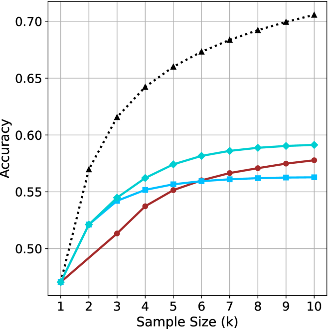
## Line Chart: Accuracy vs. Sample Size for Different Classification Methods
### Overview
The image is a line chart comparing the classification accuracy of four different methods as a function of increasing sample size (k). The chart demonstrates how the performance of two baseline methods and two proposed methods (each using either k-Nearest Neighbors (kNN) or Support Vector Machine (SVM) classifiers) scales with more training data.
### Components/Axes
* **Chart Type:** Multi-series line chart with markers.
* **X-Axis:** Labeled **"Sample Size (k)"**. It has a linear scale with major tick marks at integer values from 1 to 10.
* **Y-Axis:** Labeled **"Accuracy"**. It has a linear scale ranging from approximately 0.47 to 0.70, with major grid lines at intervals of 0.05 (0.50, 0.55, 0.60, 0.65, 0.70).
* **Legend:** Positioned in the **top-left corner** of the chart area. It contains four entries, each with a unique line style, color, and marker:
1. **Baseline (kNN):** Solid blue line with square markers (■).
2. **Baseline (SVM):** Solid red line with circle markers (●).
3. **Proposed Method (kNN):** Solid cyan line with diamond markers (◆).
4. **Proposed Method (SVM):** Dotted black line with upward-pointing triangle markers (▲).
* **Grid:** A light gray grid is present for both major x and y ticks, aiding in value estimation.
### Detailed Analysis
**Data Series and Approximate Values:**
All series start at the same point for k=1 (Accuracy ≈ 0.47). The following table lists the approximate accuracy values for each method at each sample size (k). Values are estimated from the chart's grid.
| k | Baseline (kNN) [Blue, ■] | Baseline (SVM) [Red, ●] | Proposed Method (kNN) [Cyan, ◆] | Proposed Method (SVM) [Black, ▲] |
| :--- | :--- | :--- | :--- | :--- |
| **1** | 0.47 | 0.47 | 0.47 | 0.47 |
| **2** | 0.52 | 0.49 | 0.52 | 0.57 |
| **3** | 0.545 | 0.51 | 0.545 | 0.615 |
| **4** | 0.55 | 0.535 | 0.56 | 0.64 |
| **5** | 0.555 | 0.55 | 0.575 | 0.66 |
| **6** | 0.56 | 0.56 | 0.58 | 0.67 |
| **7** | 0.56 | 0.565 | 0.585 | 0.68 |
| **8** | 0.56 | 0.57 | 0.59 | 0.69 |
| **9** | 0.56 | 0.575 | 0.59 | 0.70 |
| **10** | 0.56 | 0.58 | 0.59 | 0.70 |
**Trend Verification:**
* **Baseline (kNN) [Blue, ■]:** Shows a moderate initial increase from k=1 to k=3, then **plateaus sharply** from k=6 onward, showing no further improvement.
* **Baseline (SVM) [Red, ●]:** Exhibits a **steady, near-linear increase** in accuracy across the entire range of k. It starts as the lowest-performing method after k=1 but surpasses the Baseline (kNN) method around k=6.
* **Proposed Method (kNN) [Cyan, ◆]:** Shows a **strong, consistent upward trend** that begins to **saturate** (the rate of increase slows) after k=6. It consistently outperforms both baseline methods.
* **Proposed Method (SVM) [Black, ▲]:** Displays the **steepest and most significant upward trend**. It diverges sharply from the other methods starting at k=2 and maintains a high rate of improvement, showing only slight saturation towards k=9 and k=10. It is the top-performing method by a large margin.
### Key Observations
1. **Performance Hierarchy:** There is a clear and consistent performance hierarchy for all k > 1: Proposed Method (SVM) > Proposed Method (kNN) > Baseline (SVM) ≈ Baseline (kNN). The gap between the best and worst methods widens significantly as k increases.
2. **Impact of the Proposed Method:** The proposed method provides a substantial accuracy boost for both underlying classifiers (kNN and SVM). The improvement is most dramatic for the SVM classifier.
3. **Classifier Behavior:** The SVM-based methods (both baseline and proposed) show more sustained improvement with larger sample sizes compared to their kNN counterparts, which tend to plateau earlier.
4. **Convergence Point:** All methods have identical performance at the smallest sample size (k=1), suggesting the advantage of the proposed method and the benefit of larger datasets only become apparent with more data.
### Interpretation
This chart provides strong evidence for the efficacy of the "Proposed Method." The data suggests that the proposed technique is not merely a minor improvement but a fundamental enhancement that significantly boosts the learning capacity of standard classifiers, especially SVM.
The **Peircean insight** here is that the relationship is not just about "more data is better." The chart reveals an **interaction effect**: the *type of method* determines *how effectively* additional data is utilized. The Proposed Method (SVM) demonstrates a superior "data efficiency" – it translates each incremental increase in sample size into a larger gain in accuracy compared to all other methods.
The plateauing of the kNN-based methods (both baseline and proposed) might indicate an inherent limitation of the kNN algorithm or the feature space for this specific task, where beyond a certain point (k≈6), additional samples provide diminishing returns. In contrast, the continued rise of the SVM-based methods, particularly the proposed one, suggests they are better at leveraging complex patterns in larger datasets.
**Notable Anomaly:** The crossing of the two baseline lines (Red and Blue) around k=6 is interesting. It indicates that while kNN may be more data-efficient for very small samples, SVM's capacity to model complex boundaries allows it to eventually surpass kNN as the dataset grows, even without the proposed enhancement. The proposed method amplifies this inherent advantage of SVM.