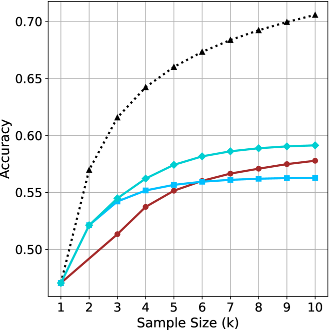
## Line Chart: Model Accuracy vs. Sample Size
### Overview
The chart compares the accuracy of three models (A, B, C) across increasing sample sizes (k=1 to k=10). Accuracy is measured on a y-axis from 0.50 to 0.70, with three distinct data series represented by color-coded lines.
### Components/Axes
- **X-axis**: "Sample Size (k)" with integer ticks (1–10)
- **Y-axis**: "Accuracy" with increments of 0.05 (0.50–0.70)
- **Legend**: Top-right corner, associating:
- Dotted black line → Model A
- Solid teal line → Model B
- Solid blue line → Model C
### Detailed Analysis
1. **Model A (Dotted Black Line)**:
- Starts at 0.50 (k=1)
- Sharp upward trend: 0.55 (k=2), 0.60 (k=3), 0.63 (k=4), 0.65 (k=5)
- Plateaus near 0.70 from k=6 onward (0.67–0.70)
- Final value: ~0.70 (k=10)
2. **Model B (Solid Teal Line)**:
- Starts at 0.50 (k=1)
- Gradual increase: 0.53 (k=2), 0.55 (k=3), 0.56 (k=4), 0.57 (k=5)
- Slows growth: 0.58 (k=6–10)
- Final value: ~0.58 (k=10)
3. **Model C (Solid Blue Line)**:
- Starts at 0.50 (k=1)
- Steady rise: 0.52 (k=2), 0.54 (k=3), 0.55 (k=4), 0.56 (k=5)
- Minimal improvement: 0.56–0.57 (k=6–10)
- Final value: ~0.57 (k=10)
### Key Observations
- Model A demonstrates the highest accuracy, particularly at larger sample sizes (k≥6).
- Model B and C show similar performance trajectories, with B slightly outperforming C across all k.
- All models begin at identical accuracy (0.50) when k=1, suggesting baseline performance parity at minimal data.
### Interpretation
The data suggests Model A scales more effectively with increased sample size, achieving near-optimal performance (0.70) by k=10. Models B and C exhibit diminishing returns, with accuracy gains plateauing below 0.60. This implies Model A may be preferable for applications requiring high accuracy with sufficient data, while B/C could be viable for smaller datasets or resource-constrained scenarios. The uniform starting point (k=1) indicates all models share a common baseline, but diverge significantly as data availability grows.