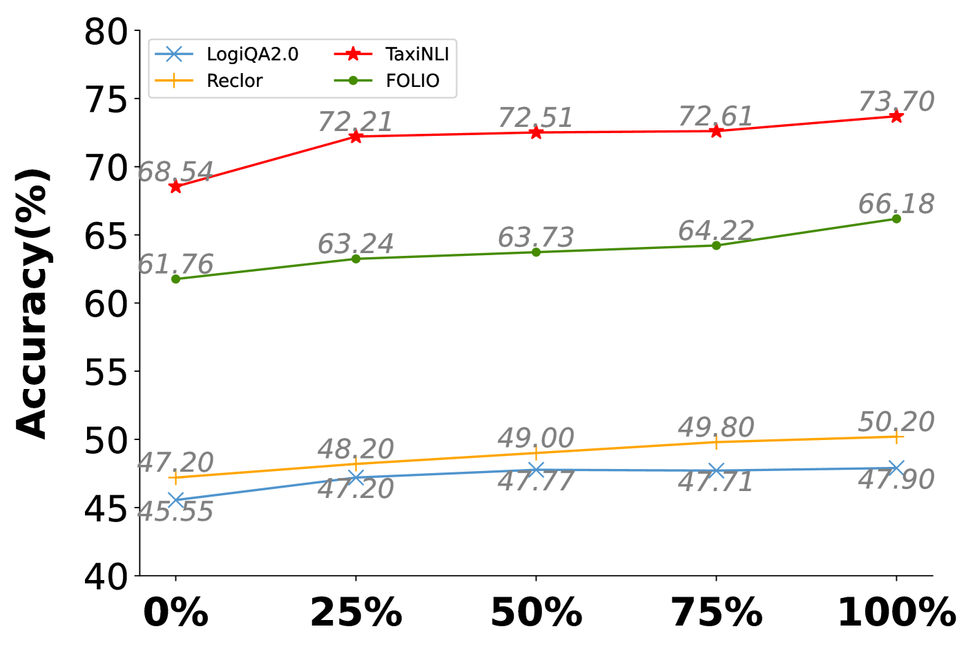
## Line Chart: Accuracy Comparison Across Four Datasets
### Overview
The image is a line chart comparing the accuracy percentages of four different datasets or models (LogiQA2.0, Reclor, TaxiNLI, FOLIO) across five distinct points on the x-axis, labeled from 0% to 100%. The chart visualizes performance trends, with each dataset represented by a uniquely colored line and marker.
### Components/Axes
* **Y-Axis:** Labeled "Accuracy(%)". The scale runs from 40 to 80, with major tick marks at intervals of 5 (40, 45, 50, 55, 60, 65, 70, 75, 80).
* **X-Axis:** Contains five categorical labels: "0%", "25%", "50%", "75%", "100%". The axis title is not explicitly shown.
* **Legend:** Positioned in the top-left corner of the chart area. It defines four data series:
* **LogiQA2.0:** Blue line with 'x' markers.
* **Reclor:** Orange line with '+' markers.
* **TaxiNLI:** Red line with star markers.
* **FOLIO:** Green line with circle markers.
### Detailed Analysis
**Data Series and Trends:**
1. **TaxiNLI (Red line with stars):**
* **Trend:** Shows a steady, slight upward slope from left to right.
* **Data Points:**
* At 0%: 68.54%
* At 25%: 72.21%
* At 50%: 72.51%
* At 75%: 72.61%
* At 100%: 73.70%
* **Observation:** This is the highest-performing series across all points. It experiences its largest gain between 0% and 25%, then plateaus with minimal increases before a final small rise to 100%.
2. **FOLIO (Green line with circles):**
* **Trend:** Shows a consistent, gentle upward slope.
* **Data Points:**
* At 0%: 61.76%
* At 25%: 63.24%
* At 50%: 63.73%
* At 75%: 64.22%
* At 100%: 66.18%
* **Observation:** This is the second-highest performing series. It maintains a steady, linear increase, with the most significant jump occurring between 75% and 100%.
3. **Reclor (Orange line with '+'):**
* **Trend:** Shows a very gradual, almost linear upward slope.
* **Data Points:**
* At 0%: 47.20%
* At 25%: 48.20%
* At 50%: 49.00%
* At 75%: 49.80%
* At 100%: 50.20%
* **Observation:** This series is in the lower performance tier. Its growth is slow and consistent, gaining exactly 1.00% between each labeled point from 0% to 75%, with a smaller 0.40% gain to 100%.
4. **LogiQA2.0 (Blue line with 'x'):**
* **Trend:** Shows an initial increase, followed by a plateau.
* **Data Points:**
* At 0%: 45.55%
* At 25%: 47.20%
* At 50%: 47.77%
* At 75%: 47.71%
* At 100%: 47.90%
* **Observation:** This is the lowest-performing series initially. It sees a notable increase from 0% to 25%, then essentially flatlines, with values hovering around 47.7-47.9% for the remainder of the chart. There is a negligible dip between 50% and 75%.
### Key Observations
* **Performance Tiers:** The chart clearly separates the datasets into two distinct performance groups. TaxiNLI and FOLIO operate in the 60-75% accuracy range, while Reclor and LogiQA2.0 operate in the 45-50% range.
* **Growth Patterns:** All series show non-decreasing accuracy from 0% to 100%. The highest-performing series (TaxiNLI) shows the most pronounced early gain, while the lowest (LogiQA2.0) shows the most pronounced plateau.
* **Convergence/Divergence:** The gap between the top series (TaxiNLI) and the bottom series (LogiQA2.0) widens from approximately 23 percentage points at 0% to nearly 26 percentage points at 100%. The gap between the two middle series (FOLIO and Reclor) remains relatively constant at around 14-16 percentage points.
### Interpretation
The data suggests that the variable represented on the x-axis (e.g., training data percentage, model size, or some other resource) has a positive but diminishing return on accuracy for these tasks. The most significant gains for the top models occur early (0-25%), after which improvements become marginal. This indicates a potential saturation point.
The clear stratification implies that the underlying difficulty or nature of the tasks measured by these datasets is fundamentally different. TaxiNLI and FOLIO appear to be "easier" tasks for the evaluated system, achieving high accuracy, while LogiQA2.0 and Reclor represent more challenging problems where accuracy is harder to improve. The plateau in LogiQA2.0 after 25% is particularly notable, suggesting that beyond a certain point, adding more of the x-axis resource does not help solve this specific type of problem. This chart would be crucial for understanding resource allocation—showing where input yields the best returns for different task types.