## Diagram: Transformation of Probability Distributions
### Overview
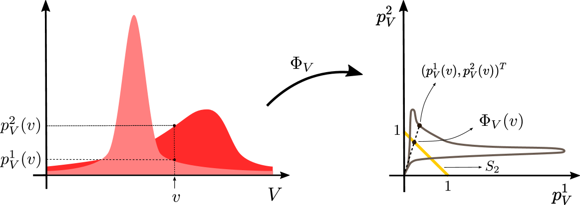
The image shows a transformation of probability distributions. The left side displays two probability distributions as functions of variable V, while the right side shows the transformed distribution in a different coordinate system. The transformation is denoted by ΦV.
### Components/Axes
**Left Chart:**
* **X-axis:** Labeled "V". Represents the variable for the original probability distributions.
* **Y-axis:** Labeled "p²V(v)". Represents the probability density.
* **Curves:** Two curves are shown. One is a lighter red, and the other is a darker red.
* **Labels:**
* "p¹V(v)" indicates the y-value of the lower curve at a specific point v.
* "p²V(v)" indicates the y-value of the upper curve at a specific point v.
* "v" indicates a specific point on the x-axis.
* **Transformation:** An arrow labeled "ΦV" indicates the transformation from the left chart to the right chart.
**Right Chart:**
* **X-axis:** Labeled "p¹V". Represents the first component of the transformed variable.
* **Y-axis:** Labeled "p²V". Represents the second component of the transformed variable.
* **Curve:** A gray curve represents the transformed probability distribution, labeled "ΦV(v)".
* **Line:** A yellow line segment is labeled "S₂".
* **Point:** A point on the gray curve is labeled "(p¹V(v), p²V(v))ᵀ".
* **Axis Markers:** Both axes have a marker at "1".
### Detailed Analysis
**Left Chart:**
* The lighter red curve has a peak around V = 0.25 (estimated).
* The darker red curve has a peak around V = 0.75 (estimated).
* At a specific value "v" on the x-axis, the corresponding y-values on the two curves are labeled "p¹V(v)" and "p²V(v)".
**Right Chart:**
* The gray curve starts near the origin, rises to a peak, and then decays.
* The yellow line segment "S₂" connects the origin to a point near (1,1).
* The point "(p¹V(v), p²V(v))ᵀ" on the gray curve corresponds to the transformation of the point "v" from the left chart.
### Key Observations
* The transformation ΦV maps the two probability distributions on the left to a single curve on the right.
* The yellow line segment S₂ seems to represent a constraint or a specific region in the transformed space.
* The point (p¹V(v), p²V(v))ᵀ highlights the mapping of a specific value "v" from the original space to the transformed space.
### Interpretation
The diagram illustrates a transformation of probability distributions, likely in the context of statistical modeling or machine learning. The transformation ΦV maps the original distributions (represented by the red curves) into a new space defined by p¹V and p²V. The resulting gray curve represents the transformed distribution. The yellow line segment S₂ might represent a decision boundary or a constraint imposed on the transformed variable. The diagram provides a visual representation of how the original probability distributions are mapped and reshaped by the transformation ΦV. The transformation could be used for dimensionality reduction, feature extraction, or other purposes.