## Diagram: Transformation of Probability Distributions
### Overview
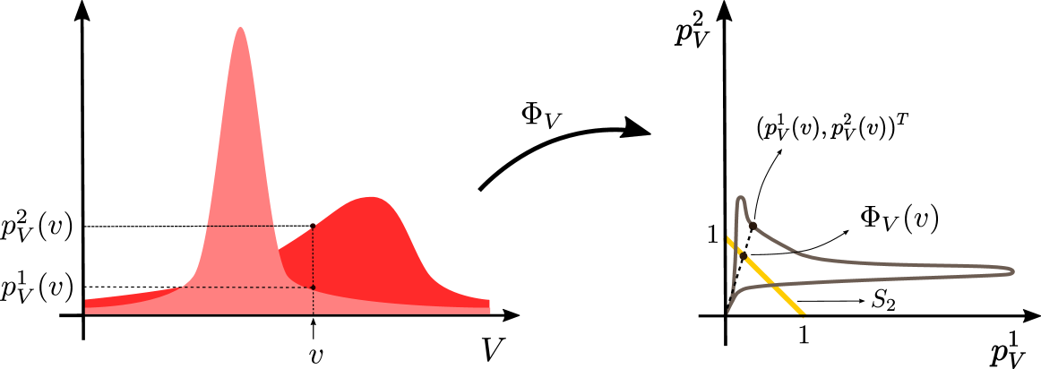
This image illustrates a mathematical transformation, denoted as $\Phi_V$, which maps a variable $v$ from a one-dimensional domain into a two-dimensional space defined by the values of two probability density functions. The left side displays the source distributions, while the right side displays the resulting parametric curve in the space of the two probability values.
### Components/Axes
**Left Plot (Source Domain):**
* **X-axis:** Labeled $V$. Represents the domain of the variable $v$.
* **Y-axis:** Unlabeled (implied probability density).
* **Data Series:**
* **Light Red Distribution:** A tall, narrow, unimodal peak.
* **Dark Red Distribution:** A shorter, wider, unimodal peak, partially overlapping with the light red distribution.
* **Markers:** A vertical dashed line is drawn at a specific value $v$ on the X-axis. This line intersects the dark red distribution at $p_V^1(v)$ and the light red distribution at $p_V^2(v)$.
**Transformation:**
* **Arrow:** A curved arrow labeled $\Phi_V$ connects the left plot to the right plot, indicating the mapping function.
**Right Plot (Target Space):**
* **X-axis:** Labeled $p_V^1$.
* **Y-axis:** Labeled $p_V^2$.
* **Data Series:**
* **Curve:** A closed, loop-like trajectory plotted in the first quadrant.
* **Yellow Line:** A straight line segment labeled $S_2$ that intersects both axes at the value $1$.
* **Markers:**
* A specific point on the curve is marked with a dot, labeled $(p_V^1(v), p_V^2(v))^T$.
* A dashed line connects the origin $(0,0)$ to this point.
* An arrow points from the curve to the label $\Phi_V(v)$.
### Detailed Analysis
**Left Plot Analysis:**
* The vertical dashed line at $v$ acts as a cross-section.
* The intersection points are clearly marked:
* The lower intersection point on the dark red curve is labeled $p_V^1(v)$.
* The higher intersection point on the light red curve is labeled $p_V^2(v)$.
* This demonstrates that for a single input $v$, we obtain a coordinate pair $(p_V^1(v), p_V^2(v))$.
**Right Plot Analysis:**
* The axes represent the values of the two distributions from the left plot.
* The curve represents the set of all points $(p_V^1(v), p_V^2(v))$ as $v$ varies across its domain.
* The point $(p_V^1(v), p_V^2(v))^T$ is the image of the point $v$ under the transformation $\Phi_V$.
* The yellow line $S_2$ appears to represent a linear constraint or boundary condition (likely $p_V^1 + p_V^2 = 1$ or similar) within the probability space.
### Key Observations
* **Mapping Logic:** The diagram visually demonstrates the construction of a parametric curve in a 2D probability space. The coordinates of the curve are defined by the values of two distinct probability density functions evaluated at the same point $v$.
* **Spatial Relationship:** The point $(p_V^1(v), p_V^2(v))^T$ on the right plot corresponds exactly to the intersection heights of the vertical line at $v$ on the left plot.
* **Constraint:** The presence of the yellow line $S_2$ suggests that the transformation $\Phi_V$ is constrained, or that the system operates within a specific simplex or boundary defined by the sum of the probabilities.
### Interpretation
This diagram is a representation of a **parametric mapping** often found in information geometry or statistical manifold theory. It visualizes how a single parameter $v$ generates a trajectory in the space of probability distributions.
The transformation $\Phi_V$ essentially "flattens" the relationship between two distributions into a single curve in a 2D plane. By plotting $p_V^1$ against $p_V^2$, the diagram allows for the analysis of the relationship between the two distributions (e.g., correlation, divergence, or dependency) as the parameter $v$ changes. The yellow line $S_2$ likely represents a normalization constraint, indicating that the system is restricted to a specific region of the probability space where the sum of the densities (or a related metric) is constant.