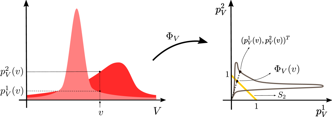
## Diagram: Probability Density Function Transformation
### Overview
The image is a technical diagram illustrating a mathematical transformation, denoted as Φ_V, that maps two probability density functions (PDFs) of a variable V into a parametric curve in a two-dimensional probability space. The diagram is split into two main panels: a left panel showing the original PDFs and a right panel showing the transformed representation.
### Components/Axes
**Left Panel (Original Space):**
* **Horizontal Axis:** Labeled `V`. Represents the domain of the random variable.
* **Vertical Axis:** Represents probability density. Two specific density values are marked with dashed horizontal lines:
* `p_V^1(v)`: The lower density value.
* `p_V^2(v)`: The higher density value.
* **Data Series:** Two overlapping, filled-area curves in shades of red.
* A taller, narrower distribution (lighter red).
* A shorter, wider distribution (darker red).
* **Key Point:** A specific value `v` is marked on the V-axis. Vertical dashed lines connect this `v` to the corresponding points on both density curves, defining the pair `(p_V^1(v), p_V^2(v))`.
**Transformation Arrow:**
* A thick, curved black arrow labeled `Φ_V` points from the left panel to the right panel, indicating the mapping function.
**Right Panel (Transformed Space):**
* **Horizontal Axis:** Labeled `p_V^1`. Represents the density from the first distribution.
* **Vertical Axis:** Labeled `p_V^2`. Represents the density from the second distribution.
* **Data Series:** A single, continuous, brownish-gray parametric curve labeled `Φ_V(v)`. This curve is the locus of points `(p_V^1(v), p_V^2(v))` as `v` varies over its domain.
* **Key Point:** A specific point on the curve is marked with a black dot and labeled `(p_V^1(v), p_V^2(v))^T`. This corresponds directly to the value `v` highlighted in the left panel.
* **Geometric Element:** A straight, yellow line segment labeled `S_2`. It connects the point `(0, 1)` on the vertical axis to the point `(1, 0)` on the horizontal axis. This line represents the set where `p_V^1 + p_V^2 = 1`.
### Detailed Analysis
1. **Left Panel Analysis:** The diagram shows two distinct probability distributions for the same variable `V`. At the chosen value `v`, the second distribution (`p_V^2`) has a significantly higher density than the first (`p_V^1`). The visual trend is that the taller distribution is more peaked (lower variance), while the shorter one is more spread out (higher variance).
2. **Transformation (Φ_V):** The function Φ_V takes a scalar input `v` and outputs a 2D vector `(p_V^1(v), p_V^2(v))`. Plotting this vector for all `v` generates the curve in the right panel.
3. **Right Panel Analysis:** The curve `Φ_V(v)` starts near the origin `(0,0)`, rises sharply to a peak where `p_V^2` is high and `p_V^1` is low, then loops back as `p_V^1` increases and `p_V^2` decreases. The marked point `(p_V^1(v), p_V^2(v))^T` lies on the descending portion of this loop. The yellow line `S_2` acts as a reference; points on this line satisfy `p_V^1 + p_V^2 = 1`. The curve `Φ_V(v)` lies entirely below this line, indicating that for any `v`, `p_V^1(v) + p_V^2(v) < 1`.
### Key Observations
* The transformation converts information about a single variable's distribution under two different models (or from two different sources) into a geometric relationship in a joint density space.
* The curve `Φ_V(v)` does not intersect the line `S_2`, meaning the sum of the two densities is always less than 1 for all `v`.
* The shape of the curve in the right panel is determined by the relative shapes and overlap of the two PDFs in the left panel. A high peak in the curve corresponds to a value of `v` where one density is high and the other is low.
### Interpretation
This diagram is a conceptual tool likely used in fields like information theory, statistics, or machine learning (e.g., in the study of f-divergences, density ratio estimation, or probabilistic classification).
* **What it demonstrates:** It visualizes how the relationship between two probability distributions (`p_V^1` and `p_V^2`) can be analyzed by treating their density values at each point `v` as coordinates. The resulting curve `Φ_V` provides a "fingerprint" of the relationship between the two distributions.
* **Relationship between elements:** The left panel provides the foundational data (the two PDFs). The transformation Φ_V is the analytical operation. The right panel is the diagnostic output, where geometric properties of the curve (its distance from the origin, its shape, its position relative to `S_2`) encode statistical properties like the divergence or similarity between the two distributions.
* **Notable implication:** The fact that the entire curve lies below the line `S_2` (`p_V^1 + p_V^2 < 1`) is a direct consequence of both `p_V^1` and `p_V^2` being valid probability density functions (their integrals over V are 1, but their pointwise sums are not constrained to be 1). The specific shape and location of the curve would allow an expert to infer which distribution is more "peaked" or where they differ the most.