## Heatmap: Duo Attention
### Overview
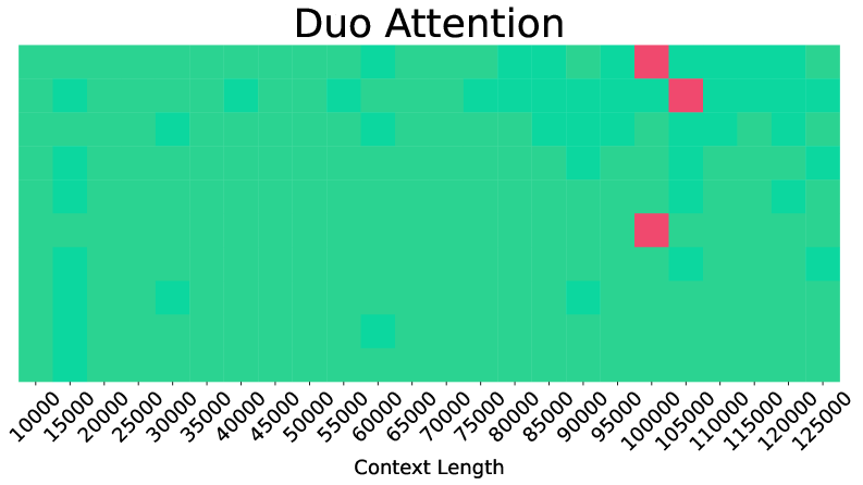
The image is a heatmap titled "Duo Attention," visualizing data points across two dimensions: **Context Length** (x-axis) and an unlabeled y-axis. The heatmap uses a color gradient (green to red) to represent values, with red squares indicating higher intensity and green squares representing lower intensity. The x-axis ranges from 10,000 to 125,000 in increments of 15,000, while the y-axis spans approximately 5,000 to 15,000, though no explicit label is provided.
---
### Components/Axes
- **Title**: "Duo Attention" (top-center).
- **X-Axis**: Labeled "Context Length," with values from 10,000 to 125,000 in 15,000 increments.
- **Y-Axis**: Unlabeled, but values range from ~5,000 to ~15,000 based on grid alignment.
- **Legend**: No explicit legend is present, but the color gradient (green to red) implies a value scale, with red denoting higher values and green lower values.
- **Grid**: Light gray grid lines divide the plot into cells, with red squares concentrated in specific regions.
---
### Detailed Analysis
- **Red Squares**:
- Located in the upper-right quadrant (x: 95,000–115,000; y: 5,000–15,000).
- Three prominent red squares are clustered near (x: 100,000, y: 10,000), (x: 105,000, y: 10,000), and (x: 110,000, y: 10,000).
- Additional red squares appear sporadically in the upper-right region (e.g., x: 95,000, y: 5,000; x: 115,000, y: 15,000).
- **Green Squares**:
- Dominant across most of the plot, especially in the lower-left quadrant (x: 10,000–85,000; y: 5,000–15,000).
- Scattered in the lower-right quadrant (x: 85,000–125,000; y: 5,000–15,000).
---
### Key Observations
1. **High-Intensity Clusters**: Red squares are concentrated in the upper-right quadrant, suggesting a correlation between higher context lengths (x-axis) and higher y-axis values (unlabeled).
2. **Sparse Distribution**: Green squares are more evenly distributed, with fewer high-intensity regions.
3. **Y-Axis Ambiguity**: The unlabeled y-axis limits interpretation of the vertical dimension’s significance.
---
### Interpretation
The heatmap suggests that **higher context lengths** (x-axis) are associated with increased "attention" (implied by red squares) in specific y-axis ranges. However, the absence of a y-axis label prevents definitive conclusions about the relationship between the two variables. The clustering of red squares in the upper-right quadrant may indicate a threshold or critical region where context length and an unspecified metric interact to produce higher attention values. Further clarification of the y-axis label and the metric being measured is required to validate these observations.