\n
## Diagram: Causal Relationship Models
### Overview
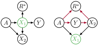
The image presents two directed acyclic graphs (DAGs) illustrating potential causal relationships between variables. Each graph depicts a different hypothesized structure for how variables A, X1, X2, Y, and R* might influence each other. The diagrams use nodes to represent variables and arrows to represent causal links. The color of the nodes appears to indicate a specific status or type of variable.
### Components/Axes
The diagrams consist of the following variables:
* **A**: A starting variable.
* **X1**: An intermediate variable, highlighted in green.
* **X2**: An intermediate variable.
* **Y**: An intermediate variable.
* **R*:** A final variable.
The arrows represent directed causal relationships. The left diagram uses gray arrows, while the right diagram uses red arrows.
### Detailed Analysis or Content Details
**Left Diagram:**
* A causes X1.
* X1 causes Y.
* A causes X2.
* X1 causes X2.
* X2 causes R*.
* R* causes X1.
**Right Diagram:**
* A causes Y.
* Y causes X1.
* Y causes X2.
* X1 causes R*.
* X2 causes R*.
* R* causes A.
The nodes X1 in both diagrams are highlighted in green.
### Key Observations
The two diagrams represent different causal structures. The left diagram shows a more complex interplay between X1 and X2, with feedback loops involving R*. The right diagram presents a simpler structure where Y is the central variable influencing X1 and X2, which then influence R*. The feedback loop in the right diagram involves R* influencing A.
### Interpretation
These diagrams likely represent competing hypotheses about the causal mechanisms underlying a phenomenon. The choice between these models would depend on empirical evidence and theoretical considerations. The green highlighting of X1 in both diagrams might indicate that this variable is of particular interest or is believed to play a crucial role in the system. The diagrams are abstract representations and do not provide specific numerical data or values. They are conceptual tools for reasoning about causal relationships. The use of different arrow colors (gray vs. red) could signify different strengths of causal effects or different types of relationships. Without further context, it is difficult to determine the precise meaning of these differences. The diagrams suggest a system with potential feedback loops, where effects can propagate back to influence causes. This is a common feature of complex systems.