## Directed Acyclic Graphs (DAGs): Causal Model Diagrams
### Overview
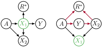
The image displays two side-by-side directed acyclic graphs (DAGs), which are diagrams used to represent causal relationships between variables. Each graph consists of five nodes labeled with letters and arrows indicating the direction of hypothesized causal influence. The node `X₁` is highlighted in green in both diagrams, suggesting it is a focal variable. The right diagram features red arrows, distinguishing a specific set of relationships.
### Components/Axes
**Nodes (Variables):**
- `A`: Appears as a root cause or exogenous variable in both diagrams.
- `X₁`: Highlighted with a green fill in both diagrams. Positioned centrally in the left diagram and at the bottom in the right diagram.
- `X₂`: Positioned below `X₁` in the left diagram and to the right of `Y` in the right diagram.
- `Y`: Positioned to the right of `X₁` in the left diagram and centrally in the right diagram.
- `R*`: Positioned at the top of both diagrams.
**Edges (Causal Paths):**
- **Left Diagram (Black Arrows):**
- `A` → `X₁`
- `A` → `X₂`
- `X₁` → `R*`
- `X₁` → `Y`
- `X₁` → `X₂`
- `X₂` → `Y`
- **Right Diagram (Mixed Black and Red Arrows):**
- `A` → `Y` (Black)
- `A` → `X₁` (Black)
- `Y` → `R*` (Red)
- `Y` → `X₂` (Red)
- `X₂` → `R*` (Black)
- `X₂` → `X₁` (Black)
**Color Coding:**
- **Green Fill:** Applied exclusively to the `X₁` node in both diagrams.
- **Red Arrows:** Used in the right diagram for the paths `Y` → `R*` and `Y` → `X₂`.
### Detailed Analysis
**Left Diagram Structure:**
- `A` is a common cause of both `X₁` and `X₂`.
- `X₁` is a central node, influencing `R*`, `Y`, and `X₂`.
- `X₂` is influenced by both `A` and `X₁`, and in turn influences `Y`.
- This structure suggests `X₁` may be a mediator between `A` and `Y`, and `X₂` could be a collider (influenced by `A` and `X₁`) or a mediator itself.
**Right Diagram Structure:**
- `A` influences `Y` and `X₁` directly.
- `Y` becomes a central node, influencing `R*` and `X₂` (marked with red arrows).
- `X₂` influences both `R*` and `X₁`.
- The red arrows highlight a specific pathway from `Y` to `R*` and `Y` to `X₂`, which may indicate a focus on the effects of `Y` or a potential biasing path.
### Key Observations
1. **Variable Repositioning:** The spatial arrangement of nodes changes significantly between the two diagrams, altering the perceived flow of causality. `X₁` moves from a central mediator position (left) to a downstream outcome position (right).
2. **Highlighted Pathways:** The use of red arrows in the right diagram draws attention to the paths originating from `Y`. This could signify these paths are of particular interest, are being conditioned on, or represent a source of bias (e.g., collider bias).
3. **Common Elements:** Both diagrams include the same set of variables (`A`, `X₁`, `X₂`, `Y`, `R*`) and the green highlighting of `X₁`, indicating a comparative analysis of `X₁`'s role under different structural assumptions.
### Interpretation
These diagrams are tools for causal inference, likely from fields like epidemiology, economics, or social sciences. They illustrate how the same set of variables can be connected in fundamentally different causal structures.
- **Left Diagram:** Suggests a model where `X₁` is a key mediator transmitting the effect of `A` to `Y` and `X₂`. `R*` is an outcome of `X₁`. This could represent a scenario where `X₁` is a treatment or exposure of interest.
- **Right Diagram:** Presents an alternative model where `Y` is a central cause, influencing `X₂` and `R*`. The red arrows may indicate that `Y` is being adjusted for (e.g., controlled in a study), which could open a non-causal association between `X₂` and `R*` (collider bias) or block a legitimate causal path.
- **Comparative Purpose:** The side-by-side presentation is likely used to teach or analyze how causal conclusions depend on the assumed structure. It warns against misinterpreting associations without a causal framework. The green highlight on `X₁` forces the viewer to consider its role—mediator vs. outcome—across different models. The core message is that statistical associations alone are insufficient; one must specify a causal graph to interpret data correctly.