## Line Chart: RMSE vs. Sample Size (n) for Four Statistical Methods
### Overview
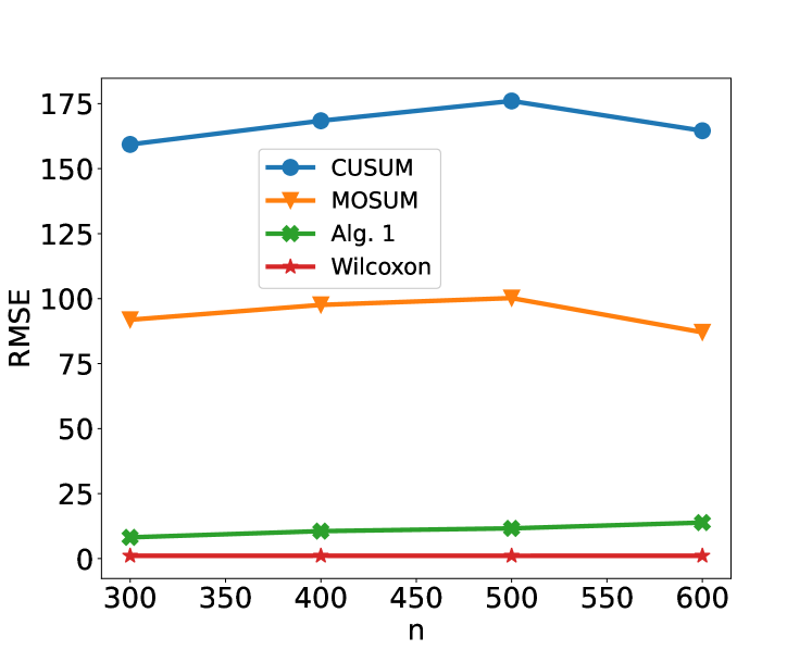
The image displays a line chart comparing the Root Mean Square Error (RMSE) of four different statistical methods—CUSUM, MOSUM, Alg. 1, and Wilcoxon—across varying sample sizes (n). The chart illustrates how the estimation error of each method changes as the sample size increases from 300 to 600.
### Components/Axes
* **Chart Type:** Multi-line chart with markers.
* **X-Axis:**
* **Label:** `n` (representing sample size).
* **Scale:** Linear, ranging from 300 to 600.
* **Tick Marks:** 300, 350, 400, 450, 500, 550, 600.
* **Y-Axis:**
* **Label:** `RMSE` (Root Mean Square Error).
* **Scale:** Linear, ranging from 0 to 175.
* **Tick Marks:** 0, 25, 50, 75, 100, 125, 150, 175.
* **Legend:**
* **Position:** Top-left quadrant of the plot area.
* **Entries (with corresponding visual markers):**
1. `CUSUM` - Blue line with circle markers.
2. `MOSUM` - Orange line with downward-pointing triangle markers.
3. `Alg. 1` - Green line with 'X' (cross) markers.
4. `Wilcoxon` - Red line with star markers.
### Detailed Analysis
The chart plots four distinct data series. Below is an analysis of each, including approximate data points extracted from the visual positions of the markers.
**1. CUSUM (Blue Line, Circle Markers)**
* **Trend:** The line shows an initial increase, peaks at n=500, and then decreases. It consistently has the highest RMSE values.
* **Approximate Data Points:**
* n=300: RMSE ≈ 160
* n=400: RMSE ≈ 170
* n=500: RMSE ≈ 175 (peak)
* n=600: RMSE ≈ 165
**2. MOSUM (Orange Line, Triangle Markers)**
* **Trend:** Similar to CUSUM, it increases to a peak at n=500 before declining. Its RMSE values are significantly lower than CUSUM but higher than the other two methods.
* **Approximate Data Points:**
* n=300: RMSE ≈ 92
* n=400: RMSE ≈ 98
* n=500: RMSE ≈ 100 (peak)
* n=600: RMSE ≈ 88
**3. Alg. 1 (Green Line, 'X' Markers)**
* **Trend:** Shows a very slight, steady upward trend across the sample sizes. Its RMSE is an order of magnitude lower than CUSUM and MOSUM.
* **Approximate Data Points:**
* n=300: RMSE ≈ 8
* n=400: RMSE ≈ 10
* n=500: RMSE ≈ 12
* n=600: RMSE ≈ 15
**4. Wilcoxon (Red Line, Star Markers)**
* **Trend:** The line is nearly flat, hovering just above zero. It demonstrates the lowest and most stable RMSE across all tested sample sizes.
* **Approximate Data Points:**
* n=300: RMSE ≈ 1
* n=400: RMSE ≈ 1
* n=500: RMSE ≈ 1
* n=600: RMSE ≈ 1
### Key Observations
1. **Performance Hierarchy:** There is a clear and consistent hierarchy in performance (lower RMSE is better): Wilcoxon >> Alg. 1 >> MOSUM >> CUSUM.
2. **Scale of Difference:** The difference in RMSE between the top-performing method (Wilcoxon) and the worst (CUSUM) is vast, spanning over two orders of magnitude.
3. **Trend Divergence:** While CUSUM and MOSUM show a non-monotonic trend (increasing then decreasing error with sample size), Alg. 1 shows a slight monotonic increase, and Wilcoxon shows no discernible trend (constant low error).
4. **Peak Error:** Both CUSUM and MOSUM exhibit their highest error at the intermediate sample size of n=500, not at the smallest (n=300) or largest (n=600) tested.
### Interpretation
This chart likely compares the accuracy of different change-point detection or statistical testing algorithms. The RMSE probably measures the error in estimating a parameter or the location of a change point.
* **Wilcoxon's Superiority:** The Wilcoxon method's consistently near-zero RMSE suggests it is highly accurate and robust to changes in sample size within this range. This could indicate it is a non-parametric method well-suited to the underlying data distribution of the test.
* **CUSUM and MOSUM Behavior:** The hump-shaped error curve for CUSUM and MOSUM is intriguing. It suggests these methods may have an optimal operational range around n=500 for this specific scenario, with performance degrading for both smaller and larger samples. This could be due to sensitivity to tuning parameters or assumptions about the signal-to-noise ratio that are best met at n=500.
* **Alg. 1's Gradual Increase:** The slight upward trend for Alg. 1 might indicate that its error accumulates or its assumptions become slightly less valid as the sample size grows, though the absolute error remains low.
* **Practical Implication:** For the task represented by this chart, the Wilcoxon method is the clear choice for minimizing error. The significant performance gap suggests that the choice of algorithm is far more critical than simply increasing the sample size from 300 to 600, especially when using CUSUM or MOSUM.