# Technical Document Extraction: Line Graph Analysis
## Axis Labels and Titles
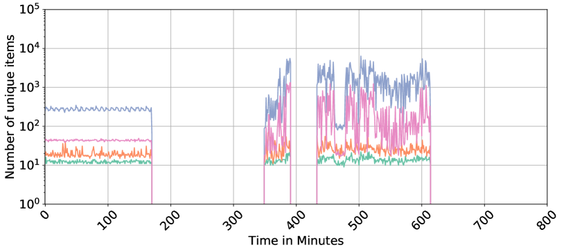
- **Y-Axis**: "Number of unique items" (logarithmic scale, ranging from 10⁰ to 10⁵)
- **X-Axis**: "Time in Minutes" (linear scale, ranging from 0 to 800 minutes)
## Legend
- **Placement**: Right side of the graph
- **Color-Coded Labels**:
- **Blue**: Line A (highest data series)
- **Pink**: Line B (second-highest)
- **Orange**: Line C (third-highest)
- **Green**: Line D (lowest data series)
## Data Series Trends
### Line A (Blue)
- **Initial Trend**: Stable at ~1000 units (10²) from 0–150 minutes.
- **Key Drop**: Sharp decline to ~100 units (10¹) at ~150 minutes.
- **Post-Drop Behavior**: Fluctuates between ~100 and ~1000 units (10¹–10³) with irregular spikes.
- **Final Trend**: Stabilizes near ~1000 units (10³) after ~600 minutes.
### Line B (Pink)
- **Initial Trend**: Stable at ~100 units (10²) from 0–150 minutes.
- **Key Drop**: Sharp decline to ~10 units (10¹) at ~150 minutes.
- **Post-Drop Behavior**: Fluctuates between ~10 and ~100 units (10¹–10²) with moderate variability.
- **Final Trend**: Stabilizes near ~100 units (10²) after ~600 minutes.
### Line C (Orange)
- **Initial Trend**: Stable at ~10 units (10¹) from 0–150 minutes.
- **Key Rise**: Sharp increase to ~100 units (10²) at ~150 minutes.
- **Post-Rise Behavior**: Fluctuates between ~10 and ~100 units (10¹–10²) with moderate variability.
- **Final Trend**: Stabilizes near ~100 units (10²) after ~600 minutes.
### Line D (Green)
- **Initial Trend**: Stable at ~10 units (10¹) from 0–150 minutes.
- **Key Drop**: Sharp decline to ~1 unit (10⁰) at ~150 minutes.
- **Post-Drop Behavior**: Fluctuates between ~1 and ~10 units (10⁰–10¹) with minor variability.
- **Final Trend**: Stabilizes near ~10 units (10¹) after ~600 minutes.
## Key Observations
1. **Synchronized Event at ~150 Minutes**: All lines exhibit a sharp change (drop or rise) at ~150 minutes, suggesting a systemic event or intervention.
2. **Hierarchical Behavior**:
- Line A (blue) consistently maintains the highest values.
- Line B (pink) and Line C (orange) show inverse responses to the ~150-minute event (B drops, C rises).
- Line D (green) exhibits the most extreme drop, suggesting a critical threshold or failure.
3. **Logarithmic Scale Implications**: The y-axis's logarithmic nature emphasizes relative changes (e.g., a 10x increase from 10 to 100 units is visually equivalent to a 10x increase from 100 to 1000 units).
## Spatial Grounding
- **Legend Position**: Right-aligned, adjacent to the graph.
- **Color Consistency**:
- Blue (Line A) matches the highest data series.
- Pink (Line B) aligns with the second-highest.
- Orange (Line C) corresponds to the third-highest.
- Green (Line D) matches the lowest data series.
## Trend Verification
- **Line A**: Slopes downward sharply at ~150 minutes, then oscillates with decreasing amplitude.
- **Line B**: Slopes downward sharply at ~150 minutes, then oscillates with moderate amplitude.
- **Line C**: Slopes upward sharply at ~150 minutes, then oscillates with moderate amplitude.
- **Line D**: Slopes downward sharply at ~150 minutes, then oscillates with minimal amplitude.
## Conclusion
The graph depicts four distinct data series with synchronized behavioral shifts at ~150 minutes. The logarithmic y-axis highlights proportional changes, while the linear x-axis provides temporal context. The legend confirms color-to-series mapping, and spatial grounding ensures clarity in data interpretation.