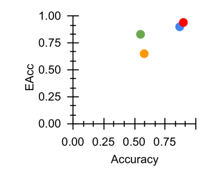
## Scatter Plot: Accuracy vs. EAcc
### Overview
The image is a scatter plot comparing two performance metrics: "Accuracy" on the horizontal axis and "EAcc" on the vertical axis. It displays four distinct data points, each represented by a colored circle (red, blue, green, orange). The plot suggests a positive correlation between the two metrics, with all points located in the upper-right quadrant, indicating generally high values for both measures.
### Components/Axes
* **X-Axis (Horizontal):**
* **Label:** "Accuracy"
* **Scale:** Linear, ranging from 0.00 to 1.00.
* **Major Tick Marks:** 0.00, 0.25, 0.50, 0.75, 1.00.
* **Minor Tick Marks:** Present between each major tick, dividing each 0.25 interval into five sub-intervals of 0.05 each.
* **Y-Axis (Vertical):**
* **Label:** "EAcc"
* **Scale:** Linear, ranging from 0.00 to 1.00.
* **Major Tick Marks:** 0.00, 0.25, 0.50, 0.75, 1.00.
* **Minor Tick Marks:** Present between each major tick, dividing each 0.25 interval into five sub-intervals of 0.05 each.
* **Data Series (Legend):** **No explicit legend is present in the image.** The four data points are distinguished only by color (red, blue, green, orange). Their specific categorical identities (e.g., model names, experimental conditions) are not provided.
### Detailed Analysis
The plot contains four data points. Their approximate coordinates, determined by visual alignment with the axis ticks, are as follows:
1. **Red Point:**
* **Position:** Top-right corner of the data cluster.
* **Approximate Coordinates:** Accuracy ≈ 0.95, EAcc ≈ 0.95.
* **Visual Trend:** This point represents the highest combined performance on both metrics.
2. **Blue Point:**
* **Position:** Slightly to the left and below the red point.
* **Approximate Coordinates:** Accuracy ≈ 0.90, EAcc ≈ 0.90.
* **Visual Trend:** Very high performance, nearly matching the red point but marginally lower on both axes.
3. **Green Point:**
* **Position:** To the left of the blue point and noticeably lower on the EAcc axis.
* **Approximate Coordinates:** Accuracy ≈ 0.60, EAcc ≈ 0.80.
* **Visual Trend:** Shows a significant drop in Accuracy compared to the red and blue points, while maintaining a relatively high EAcc.
4. **Orange Point:**
* **Position:** The leftmost and lowest point in the cluster.
* **Approximate Coordinates:** Accuracy ≈ 0.55, EAcc ≈ 0.65.
* **Visual Trend:** Represents the lowest performance on both metrics among the four points shown.
**Overall Trend:** The data points form a rough, positive-sloping trend from the lower-left (orange) to the upper-right (red). This indicates that, for these four samples, higher Accuracy is generally associated with higher EAcc. However, the relationship is not perfectly linear, as seen by the green point which has a moderate Accuracy but a disproportionately high EAcc.
### Key Observations
1. **Positive Correlation:** There is a clear visual trend where increases in Accuracy correspond to increases in EAcc.
2. **Performance Clustering:** Three of the four points (red, blue, green) have an EAcc value of 0.80 or higher, suggesting that the "EAcc" metric tends to be high for these samples.
3. **Outlier in Trend:** The green point deviates from a strict linear relationship. It has an Accuracy similar to the orange point (~0.55-0.60) but an EAcc (~0.80) much closer to the high-performing blue point.
4. **Missing Context:** The most significant limitation is the absence of a legend. Without labels for the colored points, it is impossible to determine what specific entities (e.g., algorithms, datasets, model versions) are being compared.
### Interpretation
This scatter plot is likely used to compare the performance of different models, methods, or experimental runs on two related but distinct metrics: "Accuracy" (a standard performance measure) and "EAcc" (which could stand for "Expected Accuracy," "Ensemble Accuracy," or another domain-specific variant).
The data suggests that the methods represented by the red and blue points are superior, achieving near-perfect scores on both metrics. The green point is particularly interesting; it indicates a scenario where a method achieves a high "EAcc" despite only moderate standard "Accuracy." This could imply robustness, better calibration, or performance on a specific subset of data that the EAcc metric captures more effectively. The orange point represents the baseline or lowest-performing method in this comparison.
The primary takeaway is the strong positive relationship between the two metrics, with one notable exception (green point) that warrants further investigation to understand why its EAcc is high relative to its Accuracy. To make this chart fully informative, a legend mapping each color to a specific identifier is essential.