\n
## Scatter Plot: EAcc vs. Accuracy
### Overview
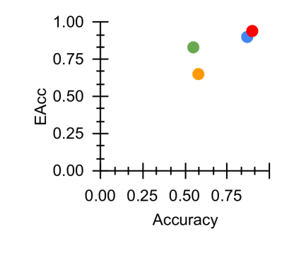
The image presents a scatter plot visualizing the relationship between "Accuracy" and "EAcc". There are five data points plotted, each represented by a different colored circle. The axes range from 0.00 to 1.00 for both Accuracy and EAcc. There is no explicit legend, so the meaning of each color is inferred from the data point's position.
### Components/Axes
* **X-axis:** Labeled "Accuracy", ranging from 0.00 to 0.75, with tick marks at 0.00, 0.25, 0.50, and 0.75.
* **Y-axis:** Labeled "EAcc", ranging from 0.00 to 1.00, with tick marks at 0.00, 0.25, 0.50, 0.75, and 1.00.
* **Data Points:** Five colored circles representing individual data observations.
### Detailed Analysis
Let's analyze each data point based on its approximate coordinates and color:
1. **Orange:** Located at approximately (0.50, 0.65).
2. **Green:** Located at approximately (0.50, 0.75).
3. **Blue:** Located at approximately (0.75, 0.95).
4. **Red:** Located at approximately (0.75, 0.80).
5. **Yellow:** Located at approximately (0.50, 0.50).
### Key Observations
* There appears to be a positive correlation between Accuracy and EAcc, as higher Accuracy values generally correspond to higher EAcc values.
* The data points are not densely clustered, suggesting a relatively sparse dataset.
* The blue data point has the highest values for both Accuracy and EAcc.
* The yellow data point has the lowest values for both Accuracy and EAcc.
### Interpretation
The scatter plot suggests a positive relationship between Accuracy and EAcc. This could indicate that as the accuracy of a model or system increases, its EAcc (potentially representing Expected Average Correlation or a similar metric) also tends to increase. The spread of the data points suggests that the relationship is not perfectly linear, and other factors may influence EAcc beyond just Accuracy. The lack of a legend makes it difficult to definitively interpret the meaning of each color, but it's possible they represent different models, datasets, or experimental conditions. The outlier, the blue data point, may represent a particularly well-performing model or a unique case within the dataset. Without further context, it's difficult to draw more specific conclusions.