\n
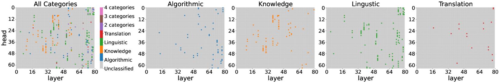
## Scatter Plots: Layer vs. Head for Different Categories
### Overview
The image presents five scatter plots, each visualizing the relationship between "layer" and "head" for different categories of data. The first plot shows all categories combined, while the subsequent four plots isolate "Algorithmic", "Knowledge", "Linguistic", and "Translation" categories respectively. The plots appear to represent some form of model analysis, potentially related to neural network layers.
### Components/Axes
* **X-axis:** "layer", ranging from approximately 0 to 80.
* **Y-axis:** "head", ranging from approximately 0 to 60.
* **Legend (All Categories plot):**
* Algorithmic (Blue)
* Knowledge (Orange)
* Linguistic (Green)
* Translation (Red)
* Unclassified (Gray)
* **Titles:** Each plot is titled with the category it represents (e.g., "Algorithmic", "Knowledge"). The first plot is titled "All Categories".
* **Category Labels (All Categories plot):** "4 categories", "3 categories", "2 categories" are present, likely indicating the number of categories represented in that region of the plot.
### Detailed Analysis or Content Details
**1. All Categories Plot:**
* The plot shows a scattered distribution of points across the entire range of "layer" and "head".
* The "Unclassified" category (gray) is concentrated in the lower-right quadrant (high layer, low head).
* "Translation" (red) points are scattered, with a slight concentration around layer 64 and head 12-24.
* "Linguistic" (green) points are concentrated in the upper-right quadrant (high layer, high head).
* "Knowledge" (orange) points are scattered, with a concentration around layer 32 and head 24-36.
* "Algorithmic" (blue) points are concentrated in the lower-left quadrant (low layer, low head).
**2. Algorithmic Plot:**
* Points are predominantly blue.
* The distribution is relatively uniform across the "layer" axis, but concentrated at lower "head" values (below 24).
* There is a slight increase in point density around layer 64.
**3. Knowledge Plot:**
* Points are predominantly orange.
* The distribution is concentrated between layers 16 and 64, with a peak around layer 32.
* "head" values range from approximately 12 to 48, with a concentration around 24-36.
**4. Linguistic Plot:**
* Points are predominantly green.
* The distribution is concentrated in the upper-right quadrant, with a strong presence at higher "layer" values (above 48) and higher "head" values (above 24).
* There is a noticeable cluster around layer 64 and head 48.
**5. Translation Plot:**
* Points are predominantly red.
* The distribution is relatively sparse, with points scattered across the entire range of "layer" and "head".
* There is a slight concentration around layer 64 and head 12-24.
### Key Observations
* The "Linguistic" category exhibits a clear trend of increasing "head" values with increasing "layer" values.
* The "Algorithmic" category is primarily located at lower "layer" and "head" values.
* The "Unclassified" category in the "All Categories" plot suggests a potential area for further investigation or refinement of the categorization process.
* The "Translation" category shows the most dispersed distribution, indicating a potentially more complex relationship between "layer" and "head".
### Interpretation
These scatter plots likely represent the activation patterns or feature representations learned by a neural network model for different categories of data. The "layer" axis represents the depth of the network, while the "head" axis could represent a specific feature or output dimension.
* The concentration of "Linguistic" points at higher layers suggests that linguistic features are learned more deeply within the network.
* The concentration of "Algorithmic" points at lower layers suggests that algorithmic features are learned earlier in the network.
* The dispersed distribution of "Translation" points may indicate that translation requires a more complex interplay of features across different layers.
* The "Unclassified" points could represent data that does not fit neatly into any of the defined categories, or data that requires further processing or labeling.
The plots provide insights into how different categories of data are processed and represented within the model. This information could be used to optimize the model architecture, improve the categorization process, or gain a better understanding of the underlying relationships between the data and the model's internal representations. The plots suggest that the model learns different types of features at different depths, and that some categories require more complex representations than others.