## Bar Chart: Computation FLOPS Comparison
### Overview
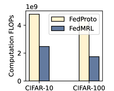
The image is a bar chart comparing the computation FLOPS (Floating Point Operations Per Second) of two methods, FedProto and FedMRL, on two datasets, CIFAR-10 and CIFAR-100. The y-axis represents computation FLOPS in units of 1e9, and the x-axis represents the datasets.
### Components/Axes
* **Title:** Implicitly, "Computation FLOPS Comparison"
* **X-axis:** Datasets: CIFAR-10, CIFAR-100
* **Y-axis:** Computation FLOPS (1e9). Scale: 0 to 4, with an additional tick at the top labeled "1e9", implying the scale is in billions of FLOPS.
* **Legend:** Located at the top-right of the chart.
* FedProto: Represented by light yellow bars with black outlines.
* FedMRL: Represented by dark blue-gray bars with black outlines.
### Detailed Analysis
* **CIFAR-10:**
* FedProto: Approximately 4.8e9 FLOPS.
* FedMRL: Approximately 2.4e9 FLOPS.
* **CIFAR-100:**
* FedProto: Approximately 3.5e9 FLOPS.
* FedMRL: Approximately 1.7e9 FLOPS.
### Key Observations
* For both datasets, FedProto requires significantly more computation FLOPS than FedMRL.
* Both FedProto and FedMRL require fewer FLOPS on CIFAR-100 than on CIFAR-10.
### Interpretation
The chart suggests that FedMRL is more computationally efficient than FedProto for both CIFAR-10 and CIFAR-100 datasets. The difference in FLOPS between the two methods is more pronounced for CIFAR-10. The lower FLOPS required for CIFAR-100 compared to CIFAR-10 for both methods could be due to differences in the complexity or structure of the datasets, or the way the algorithms handle them.