## Bar Chart: Activation Rate Comparison of AI Models
### Overview
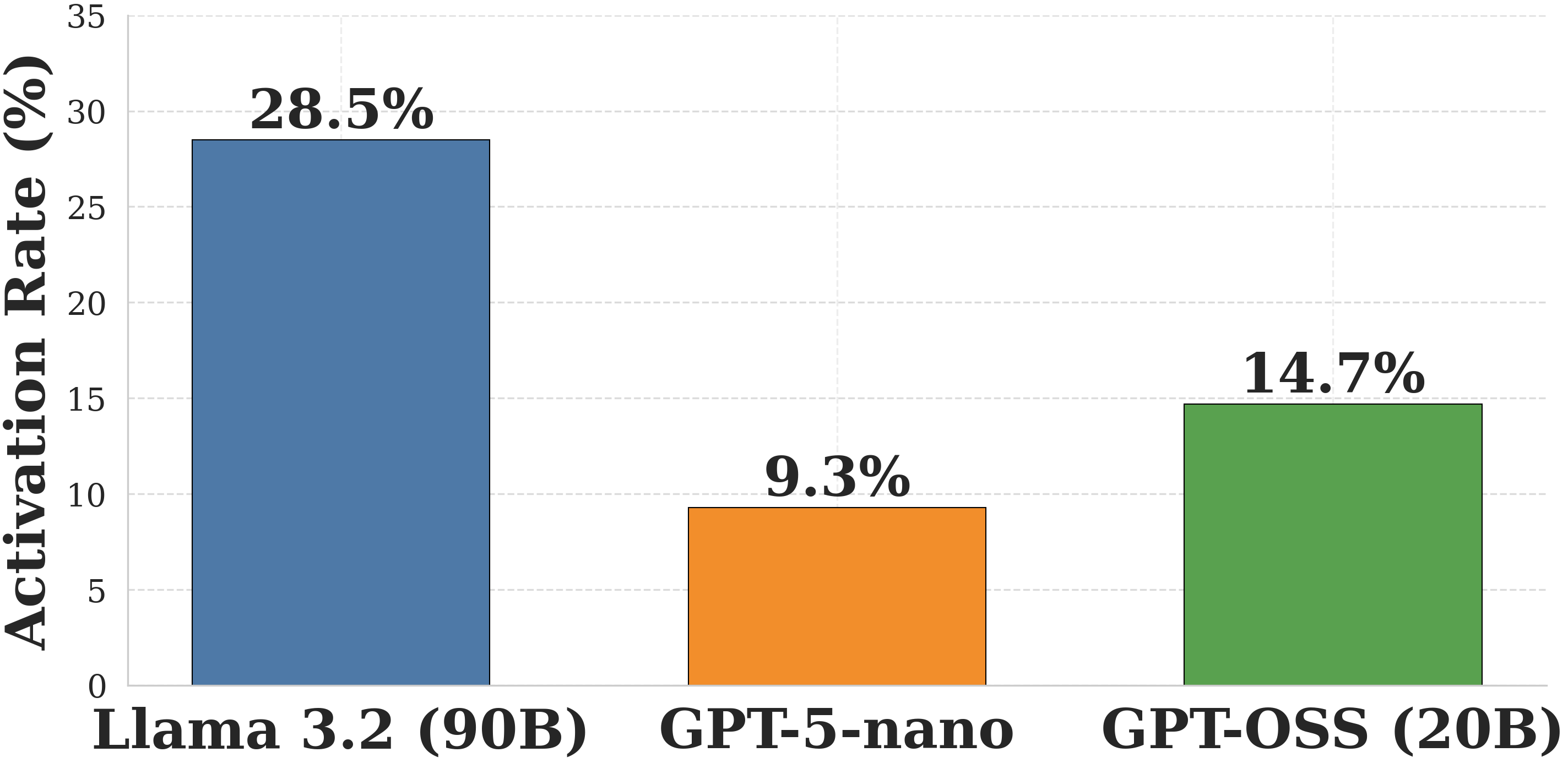
The image is a vertical bar chart comparing the "Activation Rate (%)" of three distinct artificial intelligence models. The chart presents a clear performance comparison, with one model significantly outperforming the others.
### Components/Axes
* **Y-Axis (Vertical):** Labeled "Activation Rate (%)". The scale runs from 0 to 35, with major gridlines at intervals of 5 (0, 5, 10, 15, 20, 25, 30, 35).
* **X-Axis (Horizontal):** Lists three AI model names as categorical labels.
* **Data Series:** Three bars, each a different color, representing the activation rate for each model. The exact percentage value is displayed directly above each bar.
* **Legend:** Not present as a separate element. The model names are placed directly below their corresponding bars on the x-axis, serving as direct labels.
### Detailed Analysis
The chart displays the following data points, from left to right:
1. **Llama 3.2 (90B)**
* **Bar Color:** Steel blue.
* **Position:** Leftmost bar.
* **Value:** 28.5% (displayed above the bar).
* **Visual Trend:** This is the tallest bar, indicating the highest activation rate among the three models.
2. **GPT-5-nano**
* **Bar Color:** Orange.
* **Position:** Center bar.
* **Value:** 9.3% (displayed above the bar).
* **Visual Trend:** This is the shortest bar, indicating the lowest activation rate.
3. **GPT-OSS (20B)**
* **Bar Color:** Green.
* **Position:** Rightmost bar.
* **Value:** 14.7% (displayed above the bar).
* **Visual Trend:** This bar is of medium height, placing its activation rate between the other two models.
### Key Observations
* There is a substantial disparity in activation rates. The leading model, Llama 3.2 (90B), has an activation rate more than three times that of the lowest-performing model, GPT-5-nano.
* The model with the largest indicated parameter count (90B) has the highest activation rate, while the "nano" model has the lowest. The relationship is not perfectly linear, as the 20B model falls in the middle.
* The chart uses a clean, minimalist design with direct value labeling, making the exact comparisons unambiguous.
### Interpretation
This chart likely illustrates a performance metric from a specific technical benchmark or evaluation task for large language models. The "Activation Rate" could refer to several technical concepts, such as:
* The percentage of neurons or parameters activated during a forward pass (relevant for sparse models or Mixture-of-Experts architectures).
* A success rate on a specific task or prompt type.
* A measure of model responsiveness or engagement with a given input.
The data suggests that for the particular task or condition being measured, the **Llama 3.2 (90B)** model is significantly more "active" or successful than the **GPT-OSS (20B)** and **GPT-5-nano** models. The notably low rate for "GPT-5-nano" might indicate it is a much smaller, less capable, or differently optimized model for this specific metric. The chart effectively communicates a clear hierarchy of performance among these three models on this specific, though undefined, measure.