## Scatter Plot Comparison: Model Performance
### Overview
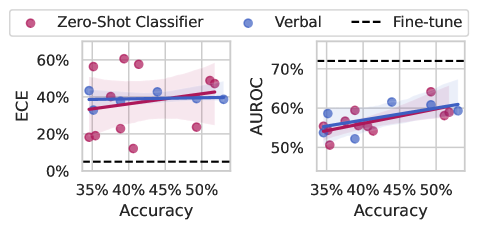
The image presents two scatter plots comparing the performance of three models: a Zero-Shot Classifier (red), a Verbal model (blue), and a Fine-tuned model (black dashed line). The left plot shows the relationship between Accuracy (x-axis) and ECE (Expected Calibration Error, y-axis), while the right plot shows the relationship between Accuracy (x-axis) and AUROC (Area Under the Receiver Operating Characteristic curve, y-axis). Each plot includes a regression line with a shaded confidence interval for the Zero-Shot Classifier and Verbal models.
### Components/Axes
* **Legend:** Located at the top of the image.
* Zero-Shot Classifier: Represented by red circles and a red regression line with a pink shaded confidence interval.
* Verbal: Represented by blue circles and a blue regression line with a light blue shaded confidence interval.
* Fine-tune: Represented by a black dashed horizontal line.
* **Left Plot (ECE vs. Accuracy):**
* Y-axis (ECE): Labeled "ECE" with a range from 0% to 60%, with tick marks at 0%, 20%, 40%, and 60%.
* X-axis (Accuracy): Labeled "Accuracy" with a range from 35% to 50%, with tick marks at 35%, 40%, 45%, and 50%.
* **Right Plot (AUROC vs. Accuracy):**
* Y-axis (AUROC): Labeled "AUROC" with a range from 50% to 70%, with tick marks at 50%, 60%, and 70%.
* X-axis (Accuracy): Labeled "Accuracy" with a range from 35% to 50%, with tick marks at 35%, 40%, 45%, and 50%.
* Fine-tune: Represented by a black dashed horizontal line at approximately 72% AUROC.
### Detailed Analysis
**Left Plot (ECE vs. Accuracy):**
* **Zero-Shot Classifier (Red):**
* Trend: Slightly positive, but relatively flat.
* Data Points: Scattered across the plot. Approximate data points: (35%, 20%), (35%, 60%), (37%, 20%), (40%, 25%), (40%, 60%), (45%, 40%), (50%, 25%), (50%, 50%), (52%, 50%).
* **Verbal (Blue):**
* Trend: Slightly positive.
* Data Points: Clustered around 40% ECE. Approximate data points: (35%, 45%), (37%, 40%), (42%, 40%), (45%, 42%), (52%, 40%).
* **Fine-tune (Black Dashed Line):**
* Constant ECE at approximately 5%.
**Right Plot (AUROC vs. Accuracy):**
* **Zero-Shot Classifier (Red):**
* Trend: Positive.
* Data Points: Approximate data points: (35%, 52%), (37%, 55%), (40%, 55%), (42%, 54%), (45%, 58%), (50%, 60%), (52%, 62%).
* **Verbal (Blue):**
* Trend: Positive.
* Data Points: Approximate data points: (35%, 55%), (37%, 53%), (42%, 58%), (45%, 60%), (50%, 62%).
* **Fine-tune (Black Dashed Line):**
* Constant AUROC at approximately 72%.
### Key Observations
* In the ECE vs. Accuracy plot, the Fine-tuned model has a significantly lower ECE than both the Zero-Shot Classifier and Verbal models, indicating better calibration.
* In the AUROC vs. Accuracy plot, the Fine-tuned model has a higher AUROC than both the Zero-Shot Classifier and Verbal models, indicating better discrimination.
* The Verbal model generally has a lower ECE and a higher AUROC than the Zero-Shot Classifier, suggesting better overall performance.
* The accuracy range is relatively narrow, between 35% and 50%.
### Interpretation
The plots suggest that fine-tuning leads to a model with superior calibration (lower ECE) and discrimination (higher AUROC) compared to the Zero-Shot Classifier and Verbal models. The Verbal model appears to offer a performance improvement over the Zero-Shot Classifier, but neither approaches the performance of the Fine-tuned model. The relatively flat trends for the Zero-Shot Classifier and Verbal models in the ECE plot suggest that increasing accuracy does not necessarily improve calibration for these models. The positive trends in the AUROC plot indicate that increasing accuracy does improve discrimination for all models. The Fine-tune model's horizontal line indicates that its performance is independent of the "Accuracy" metric shown on the x-axis.