## Line Chart: Length Reduction vs. Threshold
### Overview
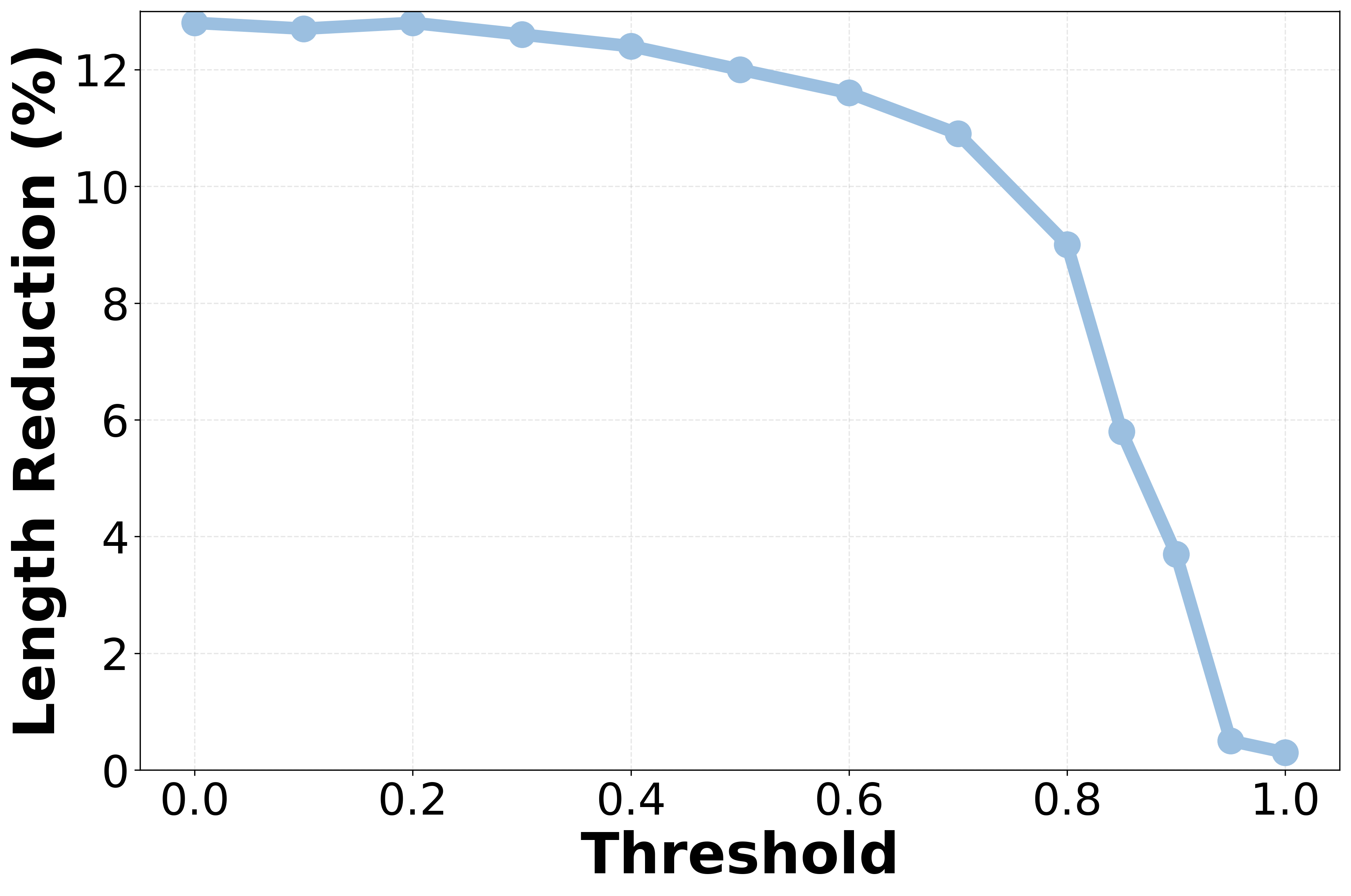
The image displays a single-series line chart plotting "Length Reduction (%)" against a "Threshold" parameter. The chart shows how the percentage of length reduction changes as the threshold value increases from 0.0 to 1.0. The data is represented by a light blue line with circular markers at each data point.
### Components/Axes
* **Y-Axis (Vertical):** Labeled **"Length Reduction (%)"**. The scale runs from 0 to 12, with major tick marks at intervals of 2 (0, 2, 4, 6, 8, 10, 12).
* **X-Axis (Horizontal):** Labeled **"Threshold"**. The scale runs from 0.0 to 1.0, with major tick marks at intervals of 0.2 (0.0, 0.2, 0.4, 0.6, 0.8, 1.0).
* **Data Series:** A single line, colored light blue (#a2c2f0 approximate), connecting circular markers of the same color. There is no legend, as only one series is present.
* **Grid:** A faint, dashed grid is present in the background, aligned with the major tick marks on both axes.
### Detailed Analysis
The line chart plots 13 distinct data points. The trend is characterized by an initial plateau followed by an accelerating decline.
**Data Points (Approximate Values):**
The line begins at the far left (Threshold = 0.0) and proceeds to the right. The following table lists the approximate coordinates for each marker, read from the chart.
| Threshold (X) | Length Reduction (%) (Y) | Visual Trend Description |
| :--- | :--- | :--- |
| 0.0 | ~13.0 | Starting point, highest value. |
| 0.1 | ~12.9 | Nearly flat, very slight decrease. |
| 0.2 | ~13.0 | Returns to near the starting peak. |
| 0.3 | ~12.8 | Begins a very gradual decline. |
| 0.4 | ~12.5 | Continues gradual decline. |
| 0.5 | ~12.0 | Decline becomes slightly more noticeable. |
| 0.6 | ~11.6 | Steady, moderate decline. |
| 0.7 | ~10.9 | Decline rate increases. |
| 0.8 | ~9.0 | **Sharp increase in the rate of decline.** |
| 0.85 | ~5.8 | Very steep drop. |
| 0.9 | ~3.7 | Continues very steep drop. |
| 0.95 | ~0.5 | Approaches zero. |
| 1.0 | ~0.3 | Final point, near-zero reduction. |
**Trend Verification:**
The visual trend is clear: the line is essentially flat or gently sloping downward from Threshold 0.0 to approximately 0.6. After 0.6, the downward slope steepens. The slope becomes dramatically steeper (near-vertical) between Threshold 0.7 and 0.95, indicating a rapid collapse in the length reduction percentage.
### Key Observations
1. **Plateau Region:** For Threshold values between 0.0 and ~0.4, the Length Reduction percentage is stable, hovering between approximately 12.5% and 13.0%.
2. **Inflection Point:** The rate of decline begins to increase noticeably around a Threshold of 0.5-0.6.
3. **Critical Drop Zone:** The most significant feature is the precipitous drop that occurs between Threshold values of 0.7 and 0.95. In this narrow range of 0.25, the Length Reduction falls from ~10.9% to ~0.5%.
4. **Asymptotic Behavior:** As the Threshold approaches 1.0, the Length Reduction asymptotically approaches 0%, with the final two points (0.95 and 1.0) showing minimal change.
### Interpretation
This chart demonstrates a strong, non-linear inverse relationship between the "Threshold" parameter and the resulting "Length Reduction (%)". The data suggests the existence of a critical threshold range.
* **System Behavior:** The system or process being measured maintains a high and stable level of length reduction (around 13%) for low threshold settings (0.0 to 0.4). This implies that below a certain point, adjusting the threshold has little effect on the outcome.
* **Performance Cliff:** The sharp decline after Threshold 0.7 indicates a "performance cliff" or phase transition. Once the threshold exceeds this critical region, the effectiveness of the length reduction mechanism collapses rapidly. This is a crucial design consideration; operating the system with a threshold above 0.7 yields diminishing and eventually negligible returns.
* **Trade-off Implication:** If "Length Reduction" is a desirable outcome (e.g., data compression, model pruning, noise filtering), then lower threshold values are vastly superior. The chart quantifies the severe penalty for using a high threshold. The optimal operating point for maximum reduction appears to be at or below a threshold of 0.4.
* **Underlying Mechanism:** The shape of the curve—a stable plateau followed by an accelerating drop—is characteristic of systems with a capacity limit or a saturation point. The threshold may represent a tolerance for error or a minimum significance score; as it increases, fewer elements qualify for reduction, until a tipping point is reached where almost nothing is reduced.