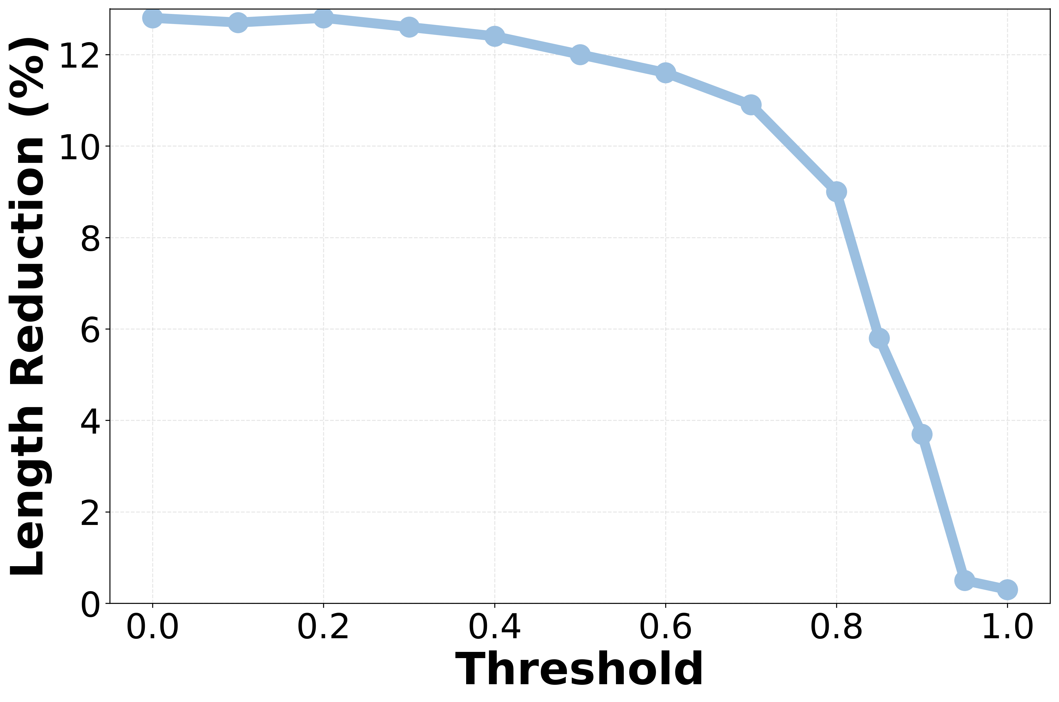
## Line Graph: Length Reduction vs. Threshold
### Overview
The image depicts a line graph illustrating the relationship between a "Threshold" (x-axis) and "Length Reduction (%)" (y-axis). The blue line shows a gradual decline followed by a sharp drop as the threshold increases from 0.0 to 1.0.
### Components/Axes
- **X-axis (Threshold)**: Labeled "Threshold," scaled from 0.0 to 1.0 in increments of 0.2.
- **Y-axis (Length Reduction %)**: Labeled "Length Reduction (%)", scaled from 0 to 12 in increments of 2.
- **Legend**: No explicit legend is visible in the image.
- **Line**: A single blue line represents the data series, with circular markers at each data point.
### Detailed Analysis
- **Initial Trend (Threshold 0.0–0.8)**: The line remains relatively flat, hovering between **12.5% and 12.8%** length reduction.
- **Sharp Decline (Threshold 0.8–1.0)**: At a threshold of **0.8**, the line drops abruptly to **~5.5%**, then plunges to **~0.5%** at **1.0**.
### Key Observations
1. **Plateau Effect**: The length reduction remains stable until the threshold exceeds **0.8**.
2. **Threshold Sensitivity**: A critical threshold of **0.8–1.0** triggers a near-complete loss of length reduction.
3. **Data Point Precision**: Values are approximate due to the absence of gridlines or exact numerical labels on the line.
### Interpretation
The graph suggests a **threshold-dependent mechanism** where increasing the threshold beyond **0.8** causes a dramatic reduction in effectiveness. This could indicate a tipping point in a system (e.g., material stress, biological response, or algorithmic performance) where small changes in input (threshold) lead to disproportionate outcomes. The flat region implies robustness or insensitivity to threshold variations below **0.8**, while the steep decline highlights vulnerability or failure at higher thresholds. The absence of a legend or additional context limits interpretation of the threshold's real-world meaning (e.g., temperature, concentration, etc.).