## Line Chart: Importance Score Across Reasoning Steps
### Overview
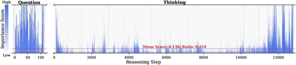
The image is a line chart divided into two sections: "Question" (left) and "Thinking" (right). It visualizes the distribution of "Importance Scores" across "Reasoning Steps" (x-axis) with a vertical scale from "Low" to "High" (y-axis). A red dashed line labeled "Mean Score: 0.138; Ratio: 0.224" spans the "Thinking" section. The chart uses blue lines for data points and a legend in the top-left corner.
---
### Components/Axes
- **Y-Axis (Left)**:
- Label: "Importance Score"
- Scale: Gradient from light blue (Low) to dark blue (High).
- Position: Left edge of the chart.
- **X-Axis (Bottom)**:
- Label: "Reasoning Step"
- Scale: Linear from 0 to 12,000.
- Position: Bottom edge of the chart.
- **Legend**:
- Located in the top-left corner.
- Blue color corresponds to "Importance Score."
- **Title**:
- "Question" (left section) and "Thinking" (right section) are labeled at the top.
- **Red Dashed Line**:
- Label: "Mean Score: 0.138; Ratio: 0.224"
- Position: Horizontal across the "Thinking" section.
---
### Detailed Analysis
#### "Question" Section (Left)
- **Data**:
- A single vertical blue line dominates the leftmost part of the chart.
- The line peaks sharply at the start (x ≈ 0) and tapers off toward x ≈ 100.
- No other data points are visible in this section.
#### "Thinking" Section (Right)
- **Data**:
- Multiple blue spikes appear across the x-axis (0–12,000).
- Spikes are irregular, with varying heights and frequencies.
- Most spikes are below the red dashed line (mean score), but some exceed it.
- Notable clusters of spikes occur near x ≈ 4,000, 8,000, and 12,000.
- **Red Dashed Line**:
- Horizontal line at y ≈ 0.138 (mean score).
- Ratio of 0.224 is annotated in red text near the line.
---
### Key Observations
1. **High Importance in "Question" Phase**:
- The "Question" section shows a single, extreme spike, indicating a critical importance score at the start.
2. **Variable Importance in "Thinking" Phase**:
- The "Thinking" section has scattered spikes, suggesting inconsistent importance scores.
- The red dashed line (mean score: 0.138) acts as a reference, with most spikes below it.
3. **Ratio Interpretation**:
- The ratio of 0.224 may represent the proportion of "Thinking" steps with scores above the mean.
4. **Outliers**:
- Spikes near x ≈ 12,000 in the "Thinking" section are the highest in that phase.
---
### Interpretation
The chart suggests that the initial "Question" phase is highly impactful, with a single critical step dominating the importance score. In contrast, the "Thinking" phase exhibits lower average importance (mean score: 0.138) but includes sporadic high-value steps (e.g., near x ≈ 12,000). The ratio of 0.224 implies that only a small fraction of "Thinking" steps exceed the mean score, highlighting inefficiencies or variability in reasoning. The red dashed line serves as a benchmark, emphasizing that most "Thinking" steps are less impactful than the initial question. This could indicate a need to optimize reasoning processes to elevate the significance of later steps.