## Line Chart: Accuracy vs. Sample Size for Multiple Methods
### Overview
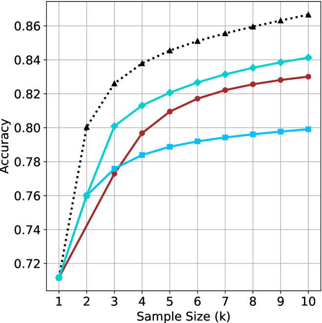
The image is a line chart comparing the performance (Accuracy) of four different methods as a function of increasing Sample Size (k). The chart demonstrates how accuracy improves for each method as more samples are used, with one method consistently outperforming the others.
### Components/Axes
* **Chart Type:** Line chart with markers.
* **X-Axis:** Labeled "Sample Size (k)". It has discrete integer markers from 1 to 10.
* **Y-Axis:** Labeled "Accuracy". It has numerical markers from 0.72 to 0.86, in increments of 0.02.
* **Legend:** Located in the top-left corner of the plot area. It contains four entries:
1. **Proposed Method:** Black, dotted line with upward-pointing triangle markers.
2. **Baseline A:** Cyan (light blue), solid line with diamond markers.
3. **Baseline B:** Red, solid line with circle markers.
4. **Baseline C:** Blue, solid line with square markers.
* **Grid:** A light gray grid is present, aligned with the major ticks on both axes.
### Detailed Analysis
The following data points are approximate visual estimates from the chart.
**Trend Verification & Data Points:**
1. **Proposed Method (Black, Dotted, Triangles):**
* **Trend:** Shows a strong, steady logarithmic-like increase. It starts lowest at k=1 but quickly becomes the highest-performing method and maintains the largest lead.
* **Approximate Values:**
* k=1: ~0.72
* k=2: ~0.80
* k=3: ~0.825
* k=4: ~0.838
* k=5: ~0.845
* k=6: ~0.850
* k=7: ~0.855
* k=8: ~0.858
* k=9: ~0.862
* k=10: ~0.865
2. **Baseline A (Cyan, Solid, Diamonds):**
* **Trend:** Shows a rapid initial increase that begins to plateau after k=4. It is the second-best performing method for all k > 1.
* **Approximate Values:**
* k=1: ~0.71
* k=2: ~0.76
* k=3: ~0.80
* k=4: ~0.812
* k=5: ~0.820
* k=6: ~0.826
* k=7: ~0.830
* k=8: ~0.835
* k=9: ~0.838
* k=10: ~0.840
3. **Baseline B (Red, Solid, Circles):**
* **Trend:** Shows a steady, near-linear increase. It starts tied for last place but surpasses Baseline C after k=2.
* **Approximate Values:**
* k=1: ~0.71
* k=2: ~0.74
* k=3: ~0.775
* k=4: ~0.795
* k=5: ~0.808
* k=6: ~0.816
* k=7: ~0.822
* k=8: ~0.825
* k=9: ~0.828
* k=10: ~0.830
4. **Baseline C (Blue, Solid, Squares):**
* **Trend:** Shows an initial increase that plateaus most significantly after k=3. It is the lowest-performing method for k > 2.
* **Approximate Values:**
* k=1: ~0.71
* k=2: ~0.76
* k=3: ~0.775
* k=4: ~0.784
* k=5: ~0.788
* k=6: ~0.792
* k=7: ~0.794
* k=8: ~0.796
* k=9: ~0.798
* k=10: ~0.800
### Key Observations
* **Performance Hierarchy:** A clear and consistent performance hierarchy is established by k=3 and maintained thereafter: Proposed Method > Baseline A > Baseline B > Baseline C.
* **Convergence at Start:** All four methods begin at nearly the same accuracy point (~0.71-0.72) when Sample Size (k) is 1.
* **Diminishing Returns:** All methods show diminishing returns (the slope of the line decreases) as k increases, but the degree varies. Baseline C shows the most severe plateauing.
* **Widening Gap:** The performance gap between the Proposed Method and the best baseline (Baseline A) widens as k increases, from ~0.04 at k=3 to ~0.025 at k=10.
### Interpretation
This chart presents a classic comparative analysis in machine learning or statistical modeling, evaluating how different algorithms or techniques scale with increased data (sample size).
* **What the data suggests:** The "Proposed Method" is demonstrably superior, not only in final accuracy but also in its learning efficiency. It extracts more performance gain per additional sample, especially in the early stages (k=1 to k=3). The baselines, particularly Baseline C, appear to hit a performance ceiling much earlier.
* **Relationship between elements:** The x-axis (Sample Size) is the independent variable, representing resource investment (data collection). The y-axis (Accuracy) is the dependent variable, representing the return on that investment. The lines model the "learning curve" for each method.
* **Notable Anomalies/Patterns:** The most striking pattern is the immediate and sustained divergence of the Proposed Method from the pack after just one additional sample (k=2). This suggests a fundamental architectural or algorithmic advantage. The near-identical starting point for all methods is also notable, indicating they share a common baseline performance with minimal data, but their capacity to leverage additional data differs radically.
* **Practical Implication:** For applications where data is scarce (low k), the choice of method may be less critical. However, as more data becomes available, selecting the Proposed Method becomes increasingly important to maximize performance. The chart argues strongly for the adoption of the Proposed Method in data-rich environments.