\n
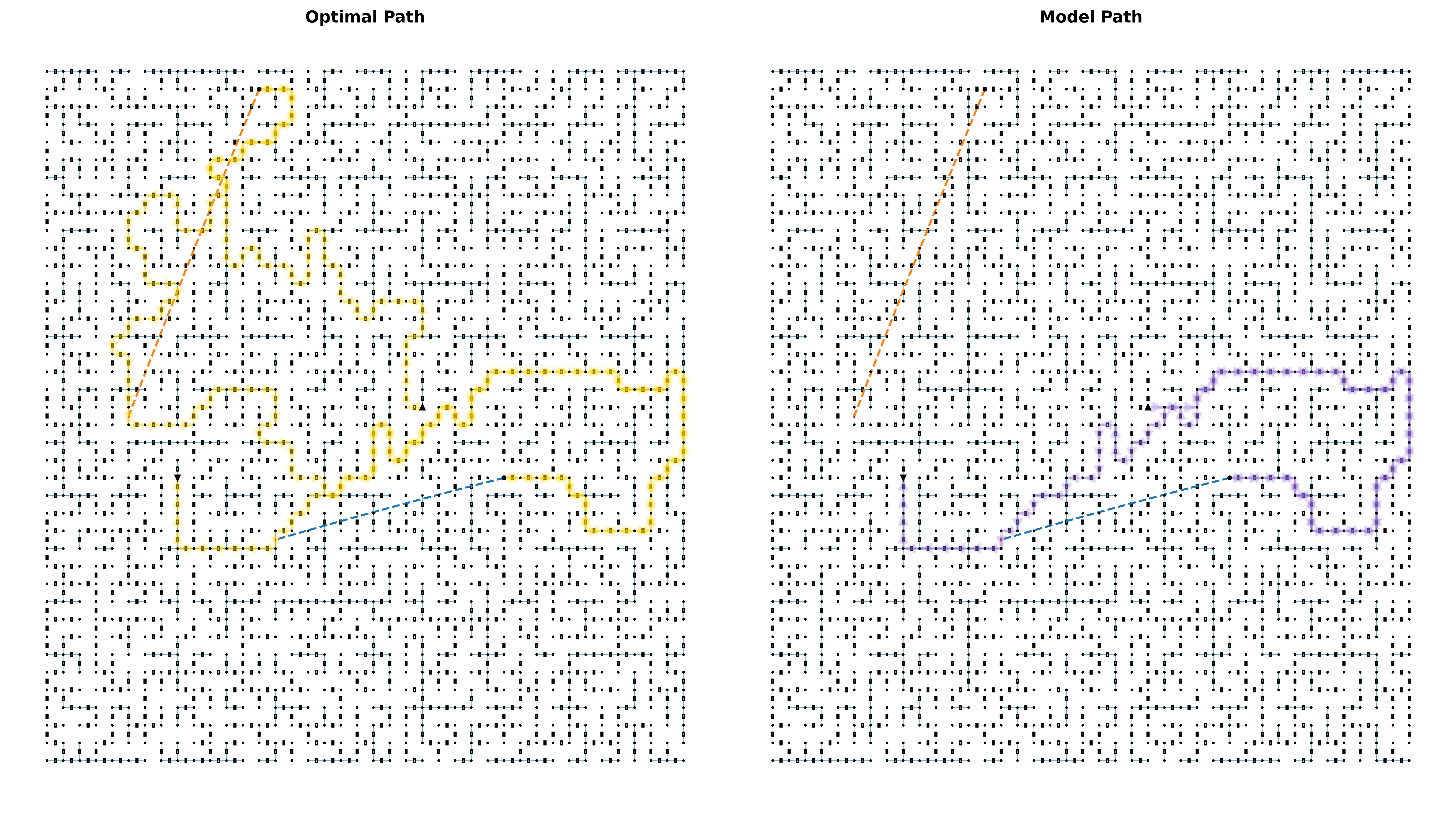
## Diagram: Path Comparison - Optimal vs. Model
### Overview
The image presents a comparison of two paths plotted on a field of randomly distributed points. The left panel displays the "Optimal Path", while the right panel shows the "Model Path". Both paths appear to navigate from the top-left to the bottom-right of the respective panels. The background consists of a dense scattering of small, grey dots.
### Components/Axes
There are no explicit axes or scales. The diagram relies on visual comparison of the paths within the coordinate space defined by the point field. The diagram is split into two panels, labeled "Optimal Path" (left) and "Model Path" (right) at the top center of each panel. The paths are represented by connected line segments of different colors.
### Detailed Analysis or Content Details
**Optimal Path (Left Panel):**
The path is composed of segments colored orange and yellow.
- The initial segment is orange, extending diagonally downwards from the top-left.
- This transitions to a yellow segment that meanders with several sharp turns, generally moving towards the bottom-right.
- A final orange segment completes the path, angling towards the bottom-right corner.
- A short blue segment is present near the bottom-left corner.
**Model Path (Right Panel):**
The path is composed of segments colored orange and purple.
- The initial segment is orange, extending diagonally downwards from the top-left, similar to the optimal path.
- This transitions to a purple segment that exhibits a more erratic, zig-zag pattern.
- The purple path has several sharp angles and appears less direct than the optimal path.
- A short blue segment is present near the bottom-left corner.
**Point Field:**
Both panels share a similar background of randomly distributed grey dots. The density of these dots appears relatively uniform across both panels.
### Key Observations
- The "Optimal Path" appears more direct and less convoluted than the "Model Path".
- The "Model Path" exhibits a more erratic and less efficient trajectory.
- Both paths share an initial orange segment.
- Both paths have a short blue segment near the bottom-left corner.
- The point field does not appear to influence the path selection, serving as a visual backdrop.
### Interpretation
This diagram likely illustrates the comparison between an ideal or calculated path ("Optimal Path") and a path generated by a model ("Model Path"). The difference in path complexity suggests that the model may not be accurately predicting or replicating the optimal route. The presence of the point field could represent obstacles or a cost map, but the paths do not seem to actively avoid or respond to the point distribution. The short blue segment in both paths could represent a fixed starting or ending point, or a constraint imposed on both the optimal and model solutions. The diagram highlights the discrepancy between the theoretical optimal solution and the model's output, indicating a potential area for model improvement. The model path's zig-zag pattern suggests it may be struggling with local optima or lacks a global view of the environment.