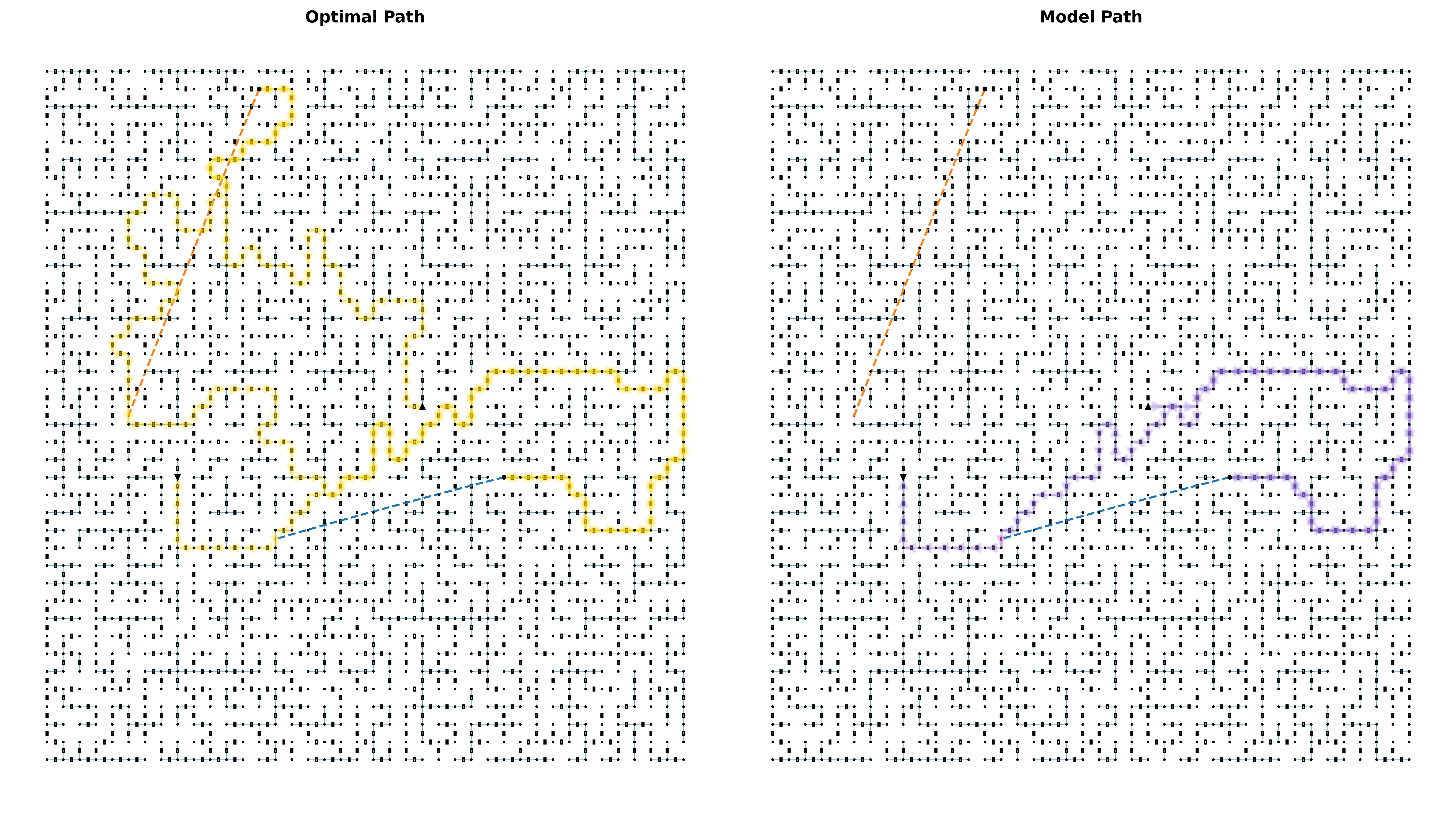
## Diagram: Comparison of Optimal and Model Paths in a Grid Maze
### Overview
The image presents two side-by-side grid mazes labeled **"Optimal Path"** (left) and **"Model Path"** (right). Each grid contains a maze-like structure with a highlighted path (yellow for optimal, purple for model) and a dashed blue line representing a straight-line approximation between the start and end points. Arrows indicate the start (top-left) and end (bottom-right) positions.
### Components/Axes
- **Grid Structure**: Both grids share an identical maze layout, composed of black and white cells forming interconnected pathways.
- **Path Highlighting**:
- **Optimal Path**: Yellow line tracing a non-linear, zigzag route through the maze.
- **Model Path**: Purple line following a similar zigzag pattern but with slight deviations.
- **Dashed Blue Line**: A straight-line approximation connecting the start and end points in both grids.
- **Arrows**: Black arrows at the top-left (start) and bottom-right (end) of each grid.
- **Labels**:
- Top-left: **"Optimal Path"** (black text).
- Top-right: **"Model Path"** (black text).
### Detailed Analysis
- **Optimal Path (Left Grid)**:
- The yellow path starts at the top-left arrow, navigates through the maze with multiple turns, and ends at the bottom-right arrow.
- The dashed blue line (straight-line approximation) is shorter than the actual path, indicating the optimal path is longer than the direct route.
- **Model Path (Right Grid)**:
- The purple path mirrors the optimal path’s general trajectory but includes minor deviations (e.g., extra turns or longer detours).
- The dashed blue line is identical in both grids, suggesting the model’s path is also longer than the straight-line approximation.
- **Color Consistency**:
- Yellow (optimal) and purple (model) paths are distinct, with no overlap in color coding.
- Dashed blue lines are consistent across both grids, serving as a reference for efficiency.
### Key Observations
1. **Path Efficiency**: The optimal path (yellow) is more direct than the model path (purple), as evidenced by fewer turns and shorter detours.
2. **Dashed Line Discrepancy**: Both paths exceed the length of the dashed blue line, highlighting the inefficiency of the model’s route.
3. **Grid Symmetry**: The mazes are identical, emphasizing that the difference lies solely in the pathfinding algorithm’s performance.
### Interpretation
The diagram illustrates a comparison between an optimal pathfinding solution and a model’s output. The optimal path (yellow) demonstrates a more efficient route, while the model path (purple) introduces unnecessary complexity, likely due to suboptimal decision-making in the algorithm. The dashed blue lines act as a benchmark, showing that both paths are longer than the ideal straight-line distance. This suggests the model may require refinement to better approximate the optimal solution. The identical maze structures reinforce that the disparity in path efficiency is attributable to the algorithm’s design rather than environmental factors.