\n
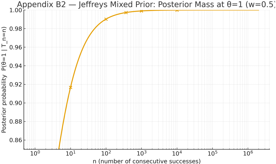
## Chart: Posterior Probability vs. Number of Consecutive Successes
### Overview
The image presents a chart illustrating the posterior probability P(θ=1 | T_n=n) as a function of the number of consecutive successes, 'n'. The chart is titled "Appendix B2 – Jeffreys Mixed Prior: Posterior Mass at θ=1 (w=0.5)". The chart displays a single, smooth curve representing the posterior probability, along with a few data points marked with yellow triangles.
### Components/Axes
* **Title:** Appendix B2 – Jeffreys Mixed Prior: Posterior Mass at θ=1 (w=0.5) - positioned at the top-center of the image.
* **X-axis:** Labeled "n (number of consecutive successes)". The scale is logarithmic, ranging from 10⁰ (1) to 10⁶ (1,000,000). Axis markers are present at 10⁰, 10¹, 10², 10³, 10⁴, 10⁵, and 10⁶.
* **Y-axis:** Labeled "Posterior probability P(θ=1 | T_n=n)". The scale ranges from 0.86 to 1.00, with markers at 0.86, 0.88, 0.90, 0.92, 0.94, 0.96, 0.98, and 1.00.
* **Data Series:** A single orange line representing the posterior probability.
* **Data Points:** Yellow triangles marking specific data points on the curve.
### Detailed Analysis
The orange line representing the posterior probability starts at approximately 0.87 when n = 10⁰ (n=1). The line then increases rapidly, approaching 0.95 when n = 10¹ (n=10). The curve continues to rise, becoming less steep, and reaches approximately 0.99 when n = 10² (n=100). The curve plateaus around 0.998 at n = 10³ (n=1000), and continues to approach 1.00 as n increases.
The yellow data points are located at:
* n = 10⁰ (n=1): Posterior probability ≈ 0.87
* n = 10¹ (n=10): Posterior probability ≈ 0.95
* n = 10² (n=100): Posterior probability ≈ 0.99
* n = 10³ (n=1000): Posterior probability ≈ 0.998
* n = 10⁶ (n=1,000,000): Posterior probability ≈ 1.00
The trend of the orange line is a steep, positive slope initially, which gradually flattens out as 'n' increases. This indicates that as the number of consecutive successes increases, the posterior probability of θ=1 rapidly approaches 1.
### Key Observations
* The posterior probability increases rapidly with the number of consecutive successes.
* The rate of increase diminishes as the number of consecutive successes grows larger.
* The posterior probability approaches 1.0 as 'n' becomes large, suggesting strong evidence for θ=1 with a sufficient number of consecutive successes.
* The data points closely follow the orange line, indicating a good fit between the data and the modeled curve.
### Interpretation
This chart demonstrates the effect of observing consecutive successes on the posterior belief in a parameter θ being equal to 1. The Jeffreys mixed prior, with w=0.5, is used to update the probability based on the observed data (consecutive successes). The rapid increase in posterior probability suggests that even a relatively small number of consecutive successes provides strong evidence in favor of θ=1. The logarithmic scale on the x-axis highlights the importance of even a few initial successes in shifting the belief towards θ=1. The flattening of the curve at higher values of 'n' indicates diminishing returns – additional consecutive successes contribute less and less to increasing the posterior probability once it is already close to 1. This is a typical Bayesian learning curve, where initial observations have a larger impact on the posterior than subsequent observations. The chart effectively illustrates how Bayesian inference updates beliefs based on evidence.