## Chart: Error and PI vs. ln(n)
### Overview
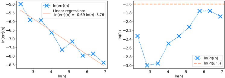
The image presents two separate line charts side-by-side. The left chart plots ln(err)(n) against ln(n), along with a linear regression line. The right chart plots ln(PI)(n) against ln(n), along with a horizontal line representing ln(PI(u*)).
### Components/Axes
**Left Chart:**
* **X-axis:** ln(n), with tick marks at 3, 4, 5, 6, and 7.
* **Y-axis:** ln(err)(n), with tick marks at -8.5, -8.0, -7.5, -7.0, -6.5, -6.0, -5.5, and -5.0.
* **Data Series 1:** ln(err)(n), plotted with blue 'x' markers connected by a dashed blue line.
* **Data Series 2:** Linear regression of ln(err)(n), plotted as a solid light orange line. The equation for the regression line is given as ln(err)(n) = -0.69 ln(n) - 3.76.
* **Legend:** Located at the top-right of the chart.
**Right Chart:**
* **X-axis:** ln(n), with tick marks at 3, 4, 5, 6, and 7.
* **Y-axis:** ln(PI), with tick marks at -3.0, -2.8, -2.6, -2.4, -2.2, -2.0, -1.8, and -1.6.
* **Data Series 1:** ln(PI)(n), plotted with blue 'x' markers connected by a dashed blue line.
* **Data Series 2:** ln(PI(u*)), plotted as a dashed light orange horizontal line.
* **Legend:** Located at the bottom-right of the chart.
### Detailed Analysis
**Left Chart (ln(err)(n) vs. ln(n)):**
* **ln(err)(n) Trend:** The blue line with 'x' markers generally slopes downward from ln(n) = 2 to ln(n) = 5, then increases slightly.
* ln(n) = 2, ln(err)(n) ≈ -5.0
* ln(n) = 3, ln(err)(n) ≈ -5.9
* ln(n) = 4, ln(err)(n) ≈ -6.6
* ln(n) = 5, ln(err)(n) ≈ -7.7
* ln(n) = 6, ln(err)(n) ≈ -7.1
* ln(n) = 7, ln(err)(n) ≈ -7.3
* **Linear Regression:** The light orange line represents the linear regression.
* The equation is ln(err)(n) = -0.69 ln(n) - 3.76.
**Right Chart (ln(PI)(n) vs. ln(n)):**
* **ln(PI)(n) Trend:** The blue line with 'x' markers decreases from ln(n) = 2 to ln(n) = 3, then increases significantly.
* ln(n) = 2, ln(PI)(n) ≈ -2.3
* ln(n) = 3, ln(PI)(n) ≈ -3.0
* ln(n) = 4, ln(PI)(n) ≈ -2.9
* ln(n) = 5, ln(PI)(n) ≈ -2.4
* ln(n) = 6, ln(PI)(n) ≈ -1.7
* ln(n) = 7, ln(PI)(n) ≈ -1.9
* **ln(PI(u*)) Trend:** The light orange dashed line is horizontal, indicating a constant value.
* ln(PI(u*)) ≈ -1.6
### Key Observations
* The left chart shows a generally decreasing trend of ln(err)(n) with increasing ln(n), which is approximated by a linear regression.
* The right chart shows a non-monotonic trend of ln(PI)(n) with increasing ln(n), initially decreasing and then increasing significantly.
* ln(PI(u*)) remains constant across all values of ln(n).
### Interpretation
The charts likely represent the relationship between error (err) and performance index (PI) with respect to a parameter 'n' (possibly the number of iterations or data points) in a computational model. The logarithmic scale suggests that the relationships might be exponential or power-law in nature.
The left chart indicates that the error generally decreases as 'n' increases, which is expected in many iterative algorithms. The linear regression provides a simplified model for this relationship.
The right chart shows a more complex behavior of the performance index. The initial decrease might indicate a burn-in phase, while the subsequent increase suggests that the performance improves significantly as 'n' increases beyond a certain point. The constant ln(PI(u*)) likely represents an upper bound or target performance level.
The relationship between error and performance index is not immediately clear from these charts alone, but they provide insights into how these metrics change with respect to 'n'. Further analysis would be needed to understand the underlying mechanisms and optimize the model.