## Line Charts: Logarithmic Error and Probability Trends
### Overview
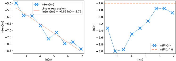
The image contains two side-by-side line charts comparing logarithmic transformations of error (`Ln(err)(n)`) and probability (`Ln(Pl)(n)`) against the natural logarithm of sample size (`ln(n)`). Both charts use blue crosses (`×`) for data points and orange lines for regression trends. The left chart shows a downward trend, while the right chart exhibits a V-shaped pattern.
---
### Components/Axes
#### Left Chart (`Ln(err)(n)`)
- **X-axis**: `ln(n)` (natural logarithm of sample size), labeled with integer values 3 to 7.
- **Y-axis**: `Ln(err)(n)` (logarithm of error), ranging from -8.5 to -5.0.
- **Legend**:
- Blue crosses (`×`): Data points for `Ln(err)(n)`.
- Orange solid line: Linear regression equation `Ln(err)(n) = -0.69 ln(n) - 3.76`.
#### Right Chart (`Ln(Pl)(n)`)
- **X-axis**: `ln(n)` (same scale as left chart, 3 to 7).
- **Y-axis**: `Ln(Pl)(n)` (logarithm of probability), ranging from -3.0 to -1.6.
- **Legend**:
- Blue crosses (`×`): Data points for `Ln(Pl)(n)`.
- Orange dashed line: Regression trend `Ln(Pl)(u*))` (constant value ~-1.6).
---
### Detailed Analysis
#### Left Chart (`Ln(err)(n)`)
- **Data Points**:
- `ln(n) = 3`: `Ln(err)(n) ≈ -5.0`.
- `ln(n) = 4`: `Ln(err)(n) ≈ -6.0`.
- `ln(n) = 5`: `Ln(err)(n) ≈ -7.0`.
- `ln(n) = 6`: `Ln(err)(n) ≈ -7.5`.
- `ln(n) = 7`: `Ln(err)(n) ≈ -8.5`.
- **Trend**:
- The orange regression line slopes downward, confirming a negative correlation between `ln(n)` and `Ln(err)(n)`. The slope coefficient (-0.69) indicates a moderate logarithmic decrease in error with increasing sample size.
#### Right Chart (`Ln(Pl)(n)`)
- **Data Points**:
- `ln(n) = 3`: `Ln(Pl)(n) ≈ -2.4`.
- `ln(n) = 4`: `Ln(Pl)(n) ≈ -2.8` (minimum point).
- `ln(n) = 5`: `Ln(Pl)(n) ≈ -2.2`.
- `ln(n) = 6`: `Ln(Pl)(n) ≈ -1.8`.
- `ln(n) = 7`: `Ln(Pl)(n) ≈ -2.0`.
- **Trend**:
- The blue crosses form a V-shape, with the lowest value at `ln(n) = 4`. The orange dashed line (`Ln(Pl)(u*))` is horizontal at ~-1.6, suggesting a theoretical upper bound or equilibrium value for `Ln(Pl)(n)`.
---
### Key Observations
1. **Left Chart**:
- Error decreases logarithmically as sample size increases, consistent with the regression equation.
- The slope (-0.69) implies a ~69% reduction in error per unit increase in `ln(n)`.
2. **Right Chart**:
- Probability (`Pl(n)`) initially decreases sharply until `ln(n) = 4`, then increases slightly.
- The dashed orange line (`Ln(Pl)(u*))` at ~-1.6 acts as a ceiling, indicating a theoretical limit for `Pl(n)`.
3. **Anomalies**:
- At `ln(n) = 5`, `Ln(err)(n)` dips below the regression line, suggesting an outlier or measurement noise.
- The V-shape in `Ln(Pl)(n)` contradicts the linear regression assumption, hinting at a non-linear relationship.
---
### Interpretation
- **Error Reduction**: The left chart demonstrates that larger sample sizes (`n`) reduce error (`err(n)`) in a logarithmic fashion, aligning with statistical principles where increased data improves model accuracy.
- **Probability Behavior**: The right chart reveals a U-shaped relationship between `ln(n)` and `Pl(n)`, suggesting an optimal sample size (`ln(n) ≈ 4`) for minimizing `Pl(n)`. The horizontal regression line (`Ln(Pl)(u*))` implies a theoretical equilibrium where probability stabilizes despite further increases in `n`.
- **Practical Implications**: The outlier at `ln(n) = 5` in the left chart warrants investigation, as it deviates from the expected trend. The V-shape in `Ln(Pl)(n)` challenges the assumption of linearity, indicating potential model limitations or external factors influencing `Pl(n)`.
This analysis highlights the interplay between sample size, error, and probability, emphasizing the need for robust regression models to capture non-linear relationships.