## Flowchart Diagram: Hierarchical Process Structure
### Overview
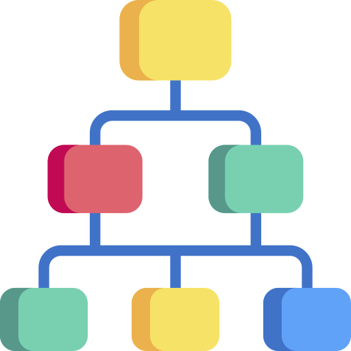
The image depicts a multi-tiered flowchart with a hierarchical structure. It consists of colored square nodes connected by blue lines, arranged in three distinct levels. The diagram uses color-coded nodes to represent different elements or stages, though no explicit labels or textual annotations are present.
### Components/Axes
- **Nodes**:
- Top tier: 1 yellow square
- Middle tier: 2 squares (left: red, right: green)
- Bottom tier: 3 squares (left: green, center: yellow, right: blue)
- **Connectors**:
- Blue lines link nodes vertically and horizontally
- No arrows or directional indicators present
- **Color Legend**:
- No explicit legend exists, but colors appear to categorize nodes:
- Yellow: Top/central authority
- Red: Left-side middle tier
- Green: Right-side middle tier and left-side bottom tier
- Blue: Right-side bottom tier
### Detailed Analysis
1. **Top Tier**:
- Single yellow square at apex
- Positioned centrally above middle tier
- Connected via single blue line to middle tier
2. **Middle Tier**:
- Left node: Red square with vertical shadow on left edge
- Right node: Green square with vertical shadow on right edge
- Both nodes connected to top tier via single blue line
- Connected to bottom tier via two separate blue lines
3. **Bottom Tier**:
- Left node: Green square with vertical shadow on left edge
- Center node: Yellow square with vertical shadow on right edge
- Right node: Blue square with vertical shadow on right edge
- Each node connected to middle tier via individual blue lines
### Key Observations
- No textual labels, axis titles, or legends present
- Color distribution suggests potential categorization:
- Yellow appears in top and center-bottom positions
- Green appears in both middle-right and bottom-left positions
- Red and blue are unique to their respective positions
- Shadow effects on all squares suggest 3D rendering style
- No numerical data, time indicators, or quantitative elements visible
### Interpretation
This flowchart appears to represent an organizational structure or decision-making process with three hierarchical levels. The color coding may indicate:
1. **Authority levels**: Yellow (top) > Red/Green (middle) > Green/Yellow/Blue (bottom)
2. **Functional divisions**:
- Red/Green middle tier could represent departments
- Bottom tier might show sub-teams or operational units
3. **Process flow**:
- Top-down decision making (yellow → red/green)
- Middle tier bifurcation (red → green bottom nodes)
- Bottom tier trinary split (green → yellow → blue)
The absence of labels makes definitive interpretation challenging. The color choices and shadow effects suggest this is a stylized diagram meant for visual clarity rather than data representation. The symmetrical layout implies balanced relationships between nodes, though the lack of directional arrows leaves process flow ambiguous.
## Recommendations for Technical Documentation
1. Add explicit labels to all nodes
2. Include a color legend explaining categorization
3. Add directional arrows to clarify process flow
4. Consider adding explanatory text blocks for each tier
5. Implement interactive elements if used in digital formats