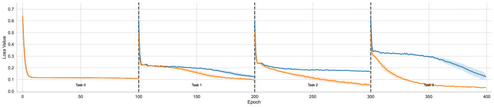
## Line Chart: Loss Value vs. Epoch Across Sequential Tasks
### Overview
The image displays a line chart tracking the "Loss Value" of two distinct models or training runs (represented by a blue line and an orange line) over 400 training epochs. The training process is segmented into four sequential tasks (Task 0, Task 1, Task 2, Task 3), each spanning 100 epochs. The chart illustrates how the loss for each model evolves as it learns each new task in sequence, a setup typical for evaluating continual or incremental learning systems.
### Components/Axes
* **Chart Type:** Multi-series line chart with a shaded confidence interval or variance band.
* **X-Axis:** Labeled "Epoch". Linear scale from 0 to 400, with major tick marks every 50 epochs (0, 50, 100, 150, 200, 250, 300, 350, 400).
* **Y-Axis:** Labeled "Loss Value". Linear scale from 0.0 to 0.7, with major tick marks every 0.1 units.
* **Data Series:**
1. **Blue Line:** Represents one model's loss trajectory. It is accompanied by a light blue shaded area, indicating variance or standard deviation across multiple runs.
2. **Orange Line:** Represents a second model's loss trajectory. No shaded variance area is visible for this series.
* **Task Segmentation:** Vertical dashed black lines at Epoch 100, 200, and 300 demarcate the boundaries between tasks. Text labels ("Task 0", "Task 1", "Task 2", "Task 3") are placed centrally within each 100-epoch segment, just above the x-axis.
* **Legend:** No explicit legend box is present. The two series are distinguished solely by color (blue and orange).
### Detailed Analysis
**Task 0 (Epochs 0-100):**
* **Trend:** Both lines show a classic, rapid learning curve.
* **Data Points:** Both models start at a high loss of approximately **0.65** at Epoch 0. They experience a steep, near-identical decline, converging to a low, stable loss of approximately **0.1** by Epoch ~20. They remain flat at this level for the remainder of the task.
**Task 1 (Epochs 100-200):**
* **Trend:** A sharp spike in loss occurs for both models at the task transition (Epoch 100), followed by a new learning phase where the models' performances begin to diverge.
* **Data Points:** At Epoch 100, loss spikes to approximately **0.6** for both. Following the spike:
* The **blue line** decreases gradually, ending the task at a loss of approximately **0.15**.
* The **orange line** decreases more rapidly, ending the task at a lower loss of approximately **0.1**.
**Task 2 (Epochs 200-300):**
* **Trend:** Another sharp loss spike at the transition, followed by a more pronounced divergence between the models.
* **Data Points:** At Epoch 200, loss spikes to approximately **0.55-0.6**.
* The **blue line** shows a shallow decline, plateauing around a loss of **0.18-0.2** for most of the task.
* The **orange line** continues a steady, strong decline, finishing the task at a loss of approximately **0.05**.
**Task 3 (Epochs 300-400):**
* **Trend:** A final spike at transition, with the performance gap between the models becoming very large.
* **Data Points:** At Epoch 300, loss spikes to approximately **0.6**.
* The **blue line** exhibits a very slow, linear decline from ~0.35 to ~0.15 over the 100 epochs. The shaded variance area is most prominent here.
* The **orange line** drops precipitously, reaching a near-zero loss (approximately **0.02-0.03**) by Epoch ~350 and remaining there.
### Key Observations
1. **Task Transition Spike:** A consistent, sharp increase in loss occurs at the beginning of each new task (Epochs 100, 200, 300) for both models, indicating the challenge of adapting to new data.
2. **Diverging Performance:** While both models perform identically on the initial task (Task 0), the orange model consistently achieves lower final loss values on all subsequent tasks (1, 2, and 3).
3. **Learning Efficiency:** The orange model demonstrates faster and more effective learning on new tasks, as seen in its steeper post-spike decline. The blue model's learning rate appears to slow significantly in Tasks 2 and 3.
4. **Variance:** The blue model shows increasing variance (wider shaded area) in its loss during Task 3, suggesting less stable training outcomes compared to the orange model.
### Interpretation
This chart likely compares a standard neural network (blue line) against a model designed for continual learning (orange line), such as one employing replay buffers, regularization, or modular architectures.
* **What the data suggests:** The orange model is successfully mitigating "catastrophic forgetting." It not only learns each new task effectively but also appears to retain knowledge from previous tasks, allowing for better starting points and faster convergence. The blue model, in contrast, struggles more with each successive task, showing signs of interference or capacity saturation.
* **How elements relate:** The vertical dashed lines are critical, marking the points where the training data distribution changes. The immediate spike shows the models' initial confusion. The subsequent slope of each line indicates the model's plasticity—its ability to adapt. The orange line's consistently steeper slope post-spike indicates superior plasticity.
* **Notable anomalies:** The blue line's plateau during Task 2 is notable; it suggests the model reached a performance limit or a local minimum it could not escape, unlike the orange model. The pronounced variance in the blue line during Task 3 further indicates training instability in later stages of sequential learning.
**Conclusion:** The visualization provides strong evidence that the model represented by the orange line is more robust and effective for sequential, multi-task learning scenarios than the model represented by the blue line.