\n
## Diagram: Strain-Time Curves for Different Quench Rates
### Overview
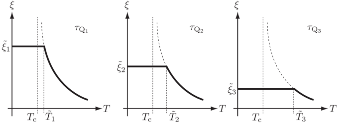
The image presents three separate graphs illustrating the relationship between strain (ξ) and time (T) during quenching processes. Each graph represents a different quench rate, labeled TQ1, TQ2, and TQ3. The graphs depict the strain evolution as a function of time, with key points marked to indicate critical temperatures and strain levels.
### Components/Axes
* **Y-axis:** Strain (ξ). The scale is not explicitly labeled with numerical values, but it is clear that the strain increases upwards.
* **X-axis:** Time (T). The scale is not explicitly labeled with numerical values.
* **Graphs:** Three separate curves, each representing a different quench rate.
* **Labels:**
* TQ1, TQ2, TQ3: Labels indicating the quench rate for each graph.
* Tc: Critical temperature, marked as a vertical dashed line in each graph.
* T1, T2, T3: Time points after the critical temperature, marked as vertical dashed lines.
* ξ1, ξ2, ξ3: Strain levels at the beginning of the curves.
### Detailed Analysis
**Graph 1 (TQ1):**
* The curve starts at a constant strain level ξ1.
* At time Tc, the strain remains constant for a short duration.
* After time Tc, the strain decreases rapidly and non-linearly until time T1.
* The trend is a steep downward slope.
* Approximate values: ξ1 ≈ 1.0 (relative to the scale), Tc ≈ 0.3 (relative to the scale), T1 ≈ 0.7 (relative to the scale).
**Graph 2 (TQ2):**
* The curve starts at a constant strain level ξ2.
* At time Tc, the strain remains constant for a longer duration than in Graph 1.
* After time Tc, the strain decreases gradually and non-linearly until time T2.
* The trend is a gentler downward slope compared to Graph 1.
* Approximate values: ξ2 ≈ 0.7 (relative to the scale), Tc ≈ 0.4 (relative to the scale), T2 ≈ 0.8 (relative to the scale).
**Graph 3 (TQ3):**
* The curve starts at a constant strain level ξ3.
* At time Tc, the strain remains constant for an even longer duration than in Graph 2.
* After time Tc, the strain decreases slowly and non-linearly until time T3.
* The trend is the gentlest downward slope among the three graphs.
* Approximate values: ξ3 ≈ 0.5 (relative to the scale), Tc ≈ 0.5 (relative to the scale), T3 ≈ 0.9 (relative to the scale).
### Key Observations
* The initial strain levels (ξ1, ξ2, ξ3) decrease as the quench rate increases (TQ1 to TQ3).
* The duration of constant strain at Tc increases as the quench rate increases.
* The rate of strain decrease after Tc decreases as the quench rate increases.
* The graphs demonstrate a clear correlation between quench rate and the resulting strain-time behavior.
### Interpretation
The diagrams illustrate the effect of different quench rates on the strain evolution during a quenching process. A faster quench rate (TQ1) results in a higher initial strain, a shorter period of constant strain at the critical temperature, and a rapid decrease in strain. Conversely, a slower quench rate (TQ3) leads to a lower initial strain, a longer period of constant strain, and a gradual decrease in strain.
The critical temperature (Tc) represents a point where the material's phase transformation begins. The time points (T1, T2, T3) indicate the completion of the transformation process for each quench rate. The differences in strain behavior suggest that the quench rate influences the microstructure and mechanical properties of the material. Faster quenching tends to produce harder, more brittle materials, while slower quenching results in softer, more ductile materials.
The diagrams are a visual representation of the time-temperature-transformation (TTT) curves, commonly used in materials science to understand phase transformations during heat treatment. The curves demonstrate how the cooling rate affects the resulting microstructure and properties of the material.