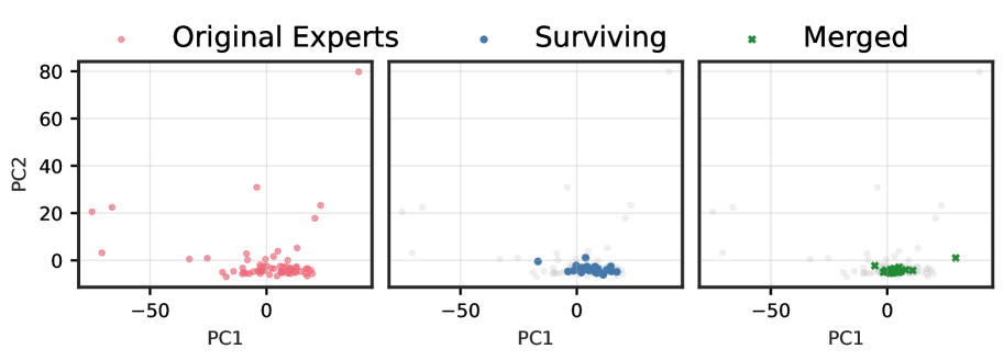
This image presents a series of three scatter plots, arranged horizontally, that visualize data points in a 2D principal component space (PC1 vs. PC2). The plots illustrate the distribution of "Original Experts," "Surviving" data, and "Merged" data, with the "Original Experts" data serving as a faded background context in the latter two plots.
**1. Overall Chart Structure and Legend:**
The image is composed of a header containing a legend and three distinct subplots.
The legend is positioned at the top center of the image and defines three categories of data points:
* A light pink circular marker (•) represents "Original Experts".
* A blue circular marker (•) represents "Surviving".
* A green 'x' marker (x) represents "Merged".
**2. Axis Labels and Tick Markers (Common to all subplots):**
* **Y-axis Label**: PC2
* **Y-axis Tick Values**: 0, 20, 40, 60, 80
* **X-axis Label**: PC1 (displayed once below the middle subplot, but applies to all three)
* **X-axis Tick Values**: -50, 0, 50
**3. Subplot Analysis:**
**3.1. Left Subplot: "Original Experts"**
This subplot primarily displays the "Original Experts" data points.
* **Data Series Displayed**: "Original Experts" (pink circular markers).
* **Visual Trend/Distribution**: The "Original Experts" data points show a broad distribution. A dense cluster of points is concentrated near the origin, approximately within the range of PC1 from -10 to 20 and PC2 from -5 to 5. Beyond this cluster, several sparse outlier points are visible, extending to higher PC2 values and across a wider PC1 range.
* **Approximate Data Ranges for "Original Experts" (pink points)**:
* PC1: Approximately -70 to 30.
* PC2: Approximately -5 to 80.
* **Notable Outliers (approximate coordinates)**:
* (-70, 20)
* (-20, 20)
* (-10, 25)
* (10, 30)
* (20, 80)
* (30, 0)
* (30, 20)
**3.2. Middle Subplot: "Surviving"**
This subplot displays the "Surviving" data points, with the "Original Experts" data shown as a faded background.
* **Data Series Displayed**: "Surviving" (blue circular markers) and "Original Experts" (faint grey circular markers).
* **Visual Trend/Distribution of "Surviving" (blue points)**: The "Surviving" data points form a tight, dense cluster exclusively near the origin. This cluster is significantly more concentrated than the "Original Experts" cluster in the first plot, suggesting a selection process that retained points with low PC1 and PC2 values. No significant outliers are observed for the "Surviving" points.
* **Approximate Data Ranges for "Surviving" (blue points)**:
* PC1: Approximately -10 to 10.
* PC2: Approximately -5 to 5.
* **Visual Trend/Distribution of "Original Experts" (faint grey points)**: These points represent the full distribution of "Original Experts" as seen in the left subplot, but rendered with low opacity to provide contextual background.
**3.3. Right Subplot: "Merged"**
This subplot displays the "Merged" data points, with the "Original Experts" data shown as a faded background.
* **Data Series Displayed**: "Merged" (green 'x' markers) and "Original Experts" (faint grey circular markers).
* **Visual Trend/Distribution of "Merged" (green 'x' markers)**: The "Merged" data points also form a dense cluster near the origin, similar in concentration to the "Surviving" points. However, this cluster appears slightly shifted and includes two distinct outliers.
* **Approximate Data Ranges for "Merged" (green points)**:
* PC1: Approximately -5 to 35.
* PC2: Approximately -5 to 5.
* **Notable Outliers (approximate coordinates)**:
* (25, 0)
* (35, 0)
* **Visual Trend/Distribution of "Original Experts" (faint grey points)**: These points represent the full distribution of "Original Experts" as seen in the left subplot, but rendered with low opacity to provide contextual background.
**4. Comparative Analysis and Key Trends:**
* The "Original Experts" data shows a wide spread with a central cluster and several high-variance outliers.
* Both "Surviving" and "Merged" datasets represent subsets or transformations of the "Original Experts" data, primarily focusing on points near the origin (low PC1 and PC2 values).
* "Surviving" data forms a very compact cluster, indicating a strong filtering process that removed all outliers and points with higher PC2 values from the "Original Experts" set.
* "Merged" data also forms a compact cluster near the origin, but it includes two distinct outliers along the positive PC1 axis, suggesting a different selection or aggregation mechanism compared to "Surviving". The "Merged" cluster itself appears slightly wider along the PC1 axis than the "Surviving" cluster.