Here is a detailed description of the information contained in the image.
### Overview
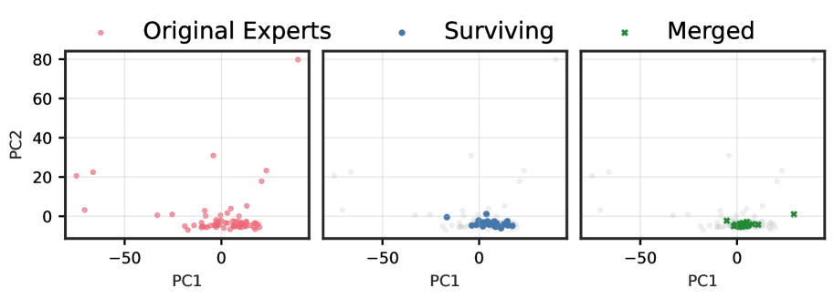
The image presents three side-by-side scatter plots, sharing a common legend and axes. The plots illustrate the distribution of data points, labeled as different types of "Experts," in a two-dimensional space defined by principal components.
### Legend
The legend is located at the top of the image and defines the markers used in the plots:
* **Red Circle:** "Original Experts"
* **Blue Circle:** "Surviving"
* **Green 'x':** "Merged"
### Axes
All three plots share the same axes and scales:
* **Vertical Axis (Y-axis):** Labeled "PC2". The axis has markers at 0, 20, 40, 60, and 80.
* **Horizontal Axis (X-axis):** Labeled "PC1". The axis has markers at -50 and 0.
### Plot Descriptions
#### 1. Left Plot: "Original Experts"
* **Data Displayed:** This plot shows the distribution of "Original Experts" using red circle markers.
* **Key Trends & Data Points:**
* The majority of the points are clustered tightly around the origin (PC1 ≈ 0, PC2 ≈ 0), roughly within the range of PC1 from -20 to +20 and PC2 from -10 to +10.
* There are several notable outliers:
* One point is located at approximately PC1 = 40, PC2 = 80.
* Another point is at approximately PC1 = -10, PC2 = 30.
* A point is situated around PC1 = 20, PC2 = 20.
* A small group of points is located around PC1 = -70, PC2 = 20.
#### 2. Middle Plot: "Surviving"
* **Data Displayed:** This plot shows the "Surviving" experts using blue circle markers. The "Original Experts" from the left plot are shown in the background as faint grey circles for context.
* **Key Trends & Data Points:**
* The "Surviving" points are a subset of the "Original Experts."
* They form a tight cluster around the origin, similar to the main cluster in the first plot, but with a slightly smaller spread (roughly PC1 from -10 to +20 and PC2 from -5 to +5).
* Crucially, the outliers observed in the "Original Experts" plot (e.g., at PC2=80, PC2=30, etc.) are not present in the "Surviving" set.
#### 3. Right Plot: "Merged"
* **Data Displayed:** This plot shows the "Merged" experts using green 'x' markers. Similar to the middle plot, the "Original Experts" are shown in the background as faint grey circles.
* **Key Trends & Data Points:**
* The "Merged" points are also a subset of the "Original Experts."
* They form a tight cluster around the origin, very similar in location and spread to the "Surviving" points (roughly PC1 from -5 to +15 and PC2 from -5 to +5).
* Unlike the "Surviving" set, the "Merged" set includes one distinct outlier point located at approximately PC1 = 30, PC2 = 0.