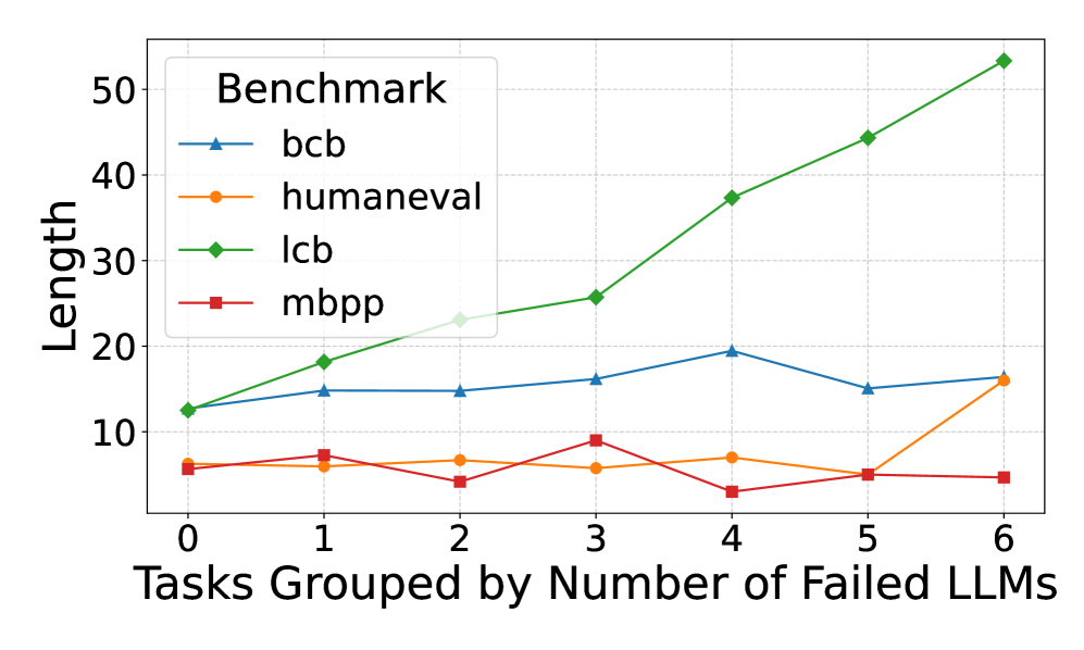
## Line Chart: Length vs. Failed LLMs
### Overview
This line chart displays the relationship between the number of failed Large Language Models (LLMs) and the length of tasks across four different benchmarks: bcb, humaneval, lcb, and mbpp. The x-axis represents the number of failed LLMs (grouped tasks), ranging from 0 to 6. The y-axis represents the length of the tasks.
### Components/Axes
* **Title:** Benchmark
* **X-axis Label:** Tasks Grouped by Number of Failed LLMs
* **Y-axis Label:** Length
* **Legend:** Located in the top-left corner, listing the four benchmarks with corresponding line colors:
* bcb (Blue)
* humaneval (Orange)
* lcb (Green)
* mbpp (Red)
* **X-axis Markers:** 0, 1, 2, 3, 4, 5, 6
* **Y-axis Markers:** 0, 10, 20, 30, 40, 50
### Detailed Analysis
Here's a breakdown of each benchmark's trend and data points:
* **bcb (Blue Line):** The line generally fluctuates around a value of approximately 20.
* At 0 failed LLMs: ~14
* At 1 failed LLM: ~17
* At 2 failed LLMs: ~22
* At 3 failed LLMs: ~22
* At 4 failed LLMs: ~20
* At 5 failed LLMs: ~15
* At 6 failed LLMs: ~17
* **humaneval (Orange Line):** The line shows a slight decrease initially, then a small increase, and ends relatively flat.
* At 0 failed LLMs: ~5
* At 1 failed LLM: ~7
* At 2 failed LLMs: ~6
* At 3 failed LLMs: ~8
* At 4 failed LLMs: ~6
* At 5 failed LLMs: ~4
* At 6 failed LLMs: ~7
* **lcb (Green Line):** This line exhibits a strong upward trend, increasing almost linearly.
* At 0 failed LLMs: ~15
* At 1 failed LLM: ~22
* At 2 failed LLMs: ~28
* At 3 failed LLMs: ~34
* At 4 failed LLMs: ~39
* At 5 failed LLMs: ~44
* At 6 failed LLMs: ~52
* **mbpp (Red Line):** The line remains relatively flat and low throughout, with minor fluctuations.
* At 0 failed LLMs: ~8
* At 1 failed LLM: ~8
* At 2 failed LLMs: ~6
* At 3 failed LLMs: ~7
* At 4 failed LLMs: ~6
* At 5 failed LLMs: ~4
* At 6 failed LLMs: ~5
### Key Observations
* The `lcb` benchmark shows a clear positive correlation between the number of failed LLMs and task length. As more LLMs fail, the task length increases significantly.
* The `mbpp` benchmark remains consistently low in length, regardless of the number of failed LLMs.
* `bcb` shows some fluctuation, but remains relatively stable around 20.
* `humaneval` shows minimal change, with a slight increase and decrease.
### Interpretation
The chart suggests that the difficulty or complexity of tasks, as measured by length, increases as more LLMs are unable to solve them, particularly for the `lcb` benchmark. This could indicate that the `lcb` benchmark contains tasks that become progressively more challenging or require more sophisticated reasoning as the number of failed attempts increases. The consistent low length of `mbpp` tasks suggests that these tasks are inherently simpler or less demanding, regardless of LLM performance. The relatively stable `bcb` benchmark suggests a consistent level of difficulty. The slight fluctuations in `humaneval` may indicate some sensitivity to the number of failed LLMs, but the effect is minimal.
The data implies that the benchmarks are not equally sensitive to LLM failures. `lcb` is highly sensitive, while `mbpp` is not. This could be due to the nature of the tasks within each benchmark, the evaluation metrics used, or the specific LLMs being tested. Further investigation would be needed to determine the underlying reasons for these differences.