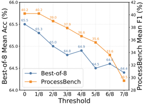
## Chart: Best-of-8 Mean Acc vs ProcessBench Mean F1
### Overview
The image is a line graph comparing the "Best-of-8 Mean Acc (%)" and "ProcessBench Mean F1 (%)" across different threshold values. The x-axis represents the threshold, ranging from 0 to 7/8. The left y-axis represents the "Best-of-8 Mean Acc (%)", and the right y-axis represents the "ProcessBench Mean F1 (%)".
### Components/Axes
* **X-axis:** Threshold, with values 0, 1/8, 2/8, 3/8, 4/8, 5/8, 6/8, 7/8
* **Left Y-axis:** Best-of-8 Mean Acc (%), ranging from 64.0 to 66.0
* **Right Y-axis:** ProcessBench Mean F1 (%), ranging from 28 to 42
* **Legend:** Located in the center of the chart.
* Blue line: Best-of-8
* Orange line: ProcessBench
### Detailed Analysis
* **Best-of-8 (Blue Line):**
* Trend: Generally decreasing, with a slight increase in the middle.
* Data Points:
* 0: 65.5%
* 1/8: 65.3%
* 2/8: 65.0%
* 3/8: 64.8%
* 4/8: 64.9%
* 5/8: 64.5%
* 6/8: 64.6%
* 7/8: 64.4%
* **ProcessBench (Orange Line):**
* Trend: Decreasing.
* Data Points:
* 0: 40.2%
* 1/8: 40.2%
* 2/8: 39.0%
* 3/8: 37.9%
* 4/8: 36.6%
* 5/8: 35.6%
* 6/8: 33.6%
* 7/8: 30.5%
### Key Observations
* The "Best-of-8 Mean Acc (%)" starts higher than the "ProcessBench Mean F1 (%)" but decreases less drastically.
* The "ProcessBench Mean F1 (%)" shows a consistent downward trend.
* Both metrics decrease as the threshold increases.
### Interpretation
The graph illustrates the performance of two different methods, "Best-of-8" and "ProcessBench," across varying threshold values. The "Best-of-8" method maintains a relatively stable accuracy, while the "ProcessBench" method experiences a more significant decline in F1 score as the threshold increases. This suggests that the "Best-of-8" method is more robust to changes in the threshold compared to the "ProcessBench" method. The data suggests that increasing the threshold negatively impacts both methods, but the impact is more pronounced on "ProcessBench."