\n
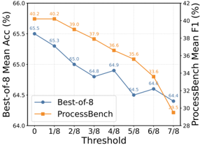
## Line Chart: Performance Comparison with Threshold Variation
### Overview
This line chart compares the performance of two models, "Best-of-8" and "ProcessBench", across varying threshold values. The x-axis represents the threshold, ranging from 0 to 7/8. The left y-axis displays the "Best-of-8 Mean Acc (%)", while the right y-axis shows the "ProcessBench Mean F1 (%)". The chart illustrates how accuracy and F1 score change as the threshold is adjusted.
### Components/Axes
* **X-axis:** Threshold, with markers at 0, 1/8, 2/8, 3/8, 4/8, 5/8, 6/8, and 7/8.
* **Left Y-axis:** Best-of-8 Mean Acc (%), ranging from 64.0 to 66.0.
* **Right Y-axis:** ProcessBench Mean F1 (%), ranging from 28 to 42.
* **Legend:** Located in the bottom-left corner.
* "Best-of-8" - Represented by a blue line with circular markers.
* "ProcessBench" - Represented by an orange line with circular markers.
* **Gridlines:** Horizontal and vertical gridlines are present to aid in reading values.
### Detailed Analysis
**Best-of-8 (Blue Line):**
The blue line representing "Best-of-8" shows a generally decreasing trend in accuracy as the threshold increases.
* At Threshold 0: Approximately 65.5%.
* At Threshold 1/8: Approximately 65.3%.
* At Threshold 2/8: Approximately 65.0%.
* At Threshold 3/8: Approximately 64.8%.
* At Threshold 4/8: Approximately 64.9%.
* At Threshold 5/8: Approximately 64.5%.
* At Threshold 6/8: Approximately 64.8%.
* At Threshold 7/8: Approximately 64.4%.
**ProcessBench (Orange Line):**
The orange line representing "ProcessBench" also exhibits a decreasing trend in F1 score as the threshold increases, but the decline is more pronounced.
* At Threshold 0: Approximately 40.2%.
* At Threshold 1/8: Approximately 40.2%.
* At Threshold 2/8: Approximately 39.0%.
* At Threshold 3/8: Approximately 37.9%.
* At Threshold 4/8: Approximately 36.6%.
* At Threshold 5/8: Approximately 35.6%.
* At Threshold 6/8: Approximately 33.6%.
* At Threshold 7/8: Approximately 31.3%.
### Key Observations
* Both models show a decrease in performance as the threshold increases.
* The "ProcessBench" model experiences a more significant drop in F1 score compared to the "Best-of-8" model's decrease in accuracy.
* At a threshold of 0, both models have relatively high performance, with "ProcessBench" having a slightly lower F1 score than "Best-of-8" has accuracy.
* The performance gap between the two models widens as the threshold increases.
### Interpretation
The chart suggests that increasing the threshold negatively impacts the performance of both models. However, "ProcessBench" is more sensitive to threshold changes than "Best-of-8". This could indicate that "ProcessBench" relies more heavily on a specific threshold range for optimal performance, while "Best-of-8" is more robust to variations. The decreasing trend for both models could be due to the threshold filtering out valuable information or introducing bias. The initial plateau at threshold 0 suggests that the models perform well with minimal filtering. The widening gap between the two models as the threshold increases suggests that the models are affected differently by the filtering process. The data suggests that a lower threshold is preferable for maintaining performance, especially for the "ProcessBench" model.