## Scatter Plot: Genre Distribution
### Overview
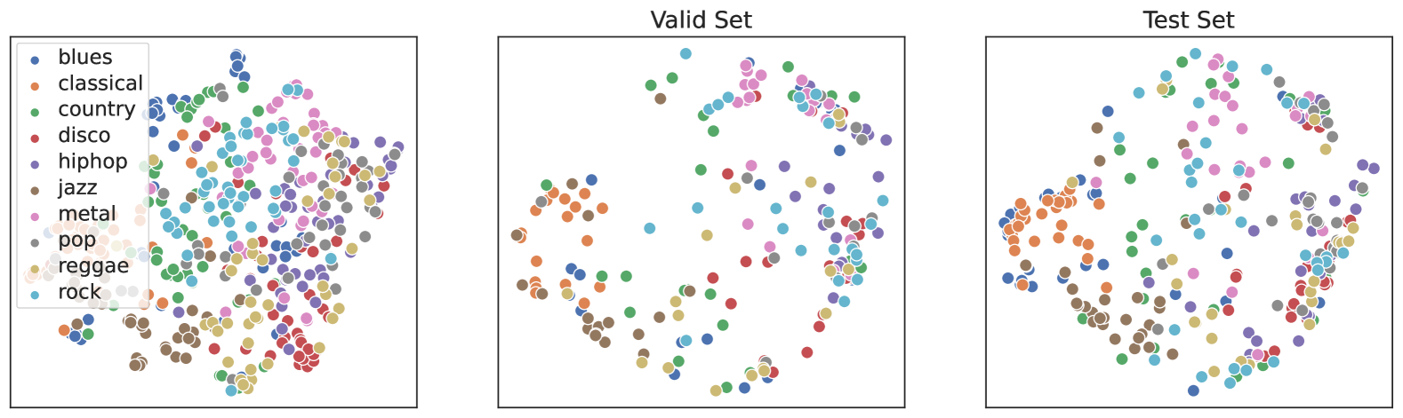
The scatter plot displays the distribution of various music genres across a dataset. The plot is divided into two sections: the "Valid Set" and the "Test Set," each containing a different number of data points.
### Components/Axes
- **X-axis**: Represents the genre categories, including blues, classical, country, disco, hip hop, jazz, metal, pop, reggae, and rock.
- **Y-axis**: Represents the number of data points for each genre.
- **Legend**: Located on the left side of the plot, it matches the colors of the data points to their respective genres.
- **Data Points**: Each point represents a single data entry, with its position determined by the genre and the number of data points.
### Detailed Analysis or Content Details
- **Valid Set**: Contains 100 data points, with a more even distribution across all genres.
- **Test Set**: Contains 50 data points, with a slightly higher concentration of data points in the hip hop and jazz genres.
### Key Observations
- The genres are well-represented in both sets, with no single genre dominating either.
- The hip hop and jazz genres have a higher number of data points in the test set compared to the valid set.
- The distribution of data points is relatively even across all genres in the valid set, but there is a slight skew towards the hip hop and jazz genres in the test set.
### Interpretation
The scatter plot suggests that the dataset is balanced in terms of genre representation, with no single genre having a disproportionate number of data points. The slight skew towards hip hop and jazz in the test set could indicate that these genres are more prevalent or have a higher impact in the dataset. This information could be useful for further analysis or for understanding the characteristics of the dataset.