\n
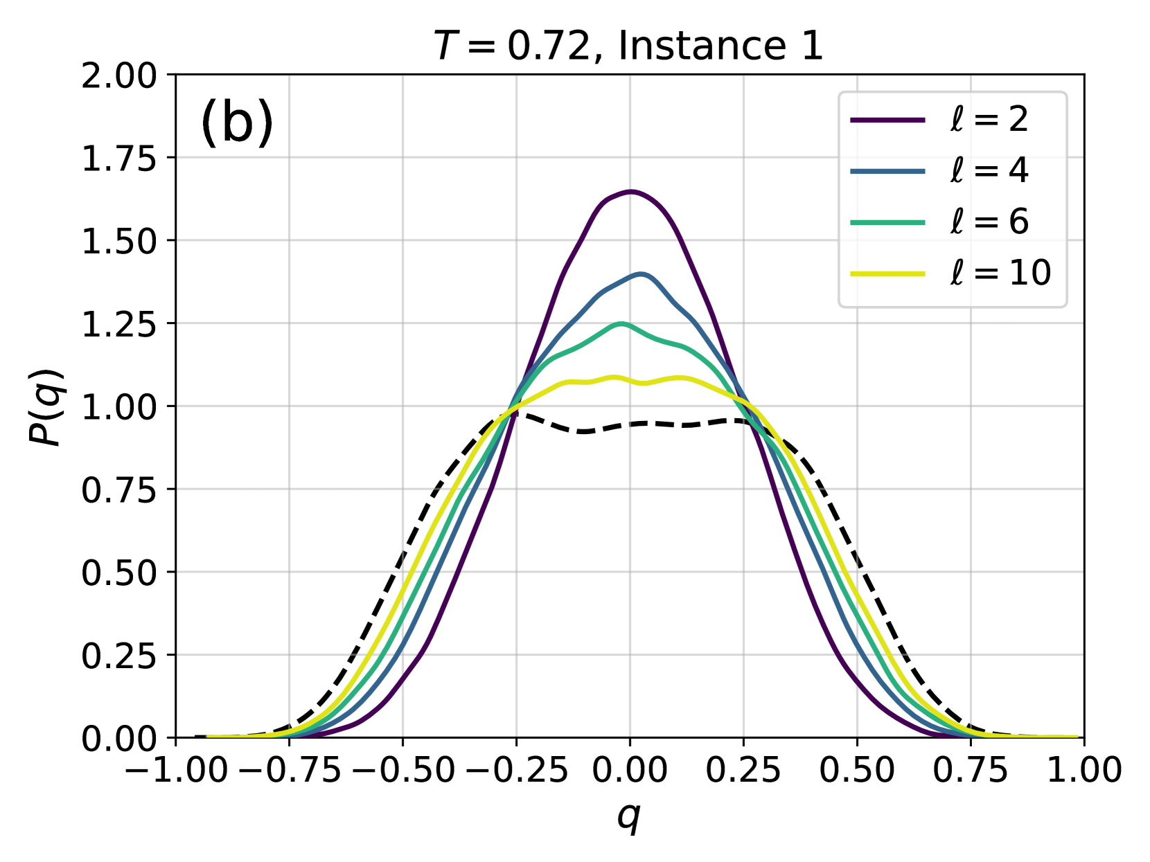
## Probability Distribution Plot: P(q) for Different ℓ Values
### Overview
This image is a scientific line plot, labeled as panel (b), showing the probability distribution function \( P(q) \) for a variable \( q \). The plot compares distributions for four different values of a parameter \( \ell \) (2, 4, 6, 10) and includes an additional reference distribution shown as a dashed black line. The title indicates the data corresponds to a temperature \( T = 0.72 \) and is from "Instance 1".
### Components/Axes
* **Title:** "T = 0.72, Instance 1" (centered at the top).
* **Panel Label:** "(b)" (located in the top-left corner of the plot area).
* **X-Axis:**
* **Label:** "q"
* **Scale:** Linear, ranging from -1.00 to 1.00.
* **Major Ticks:** -1.00, -0.75, -0.50, -0.25, 0.00, 0.25, 0.50, 0.75, 1.00.
* **Y-Axis:**
* **Label:** "P(q)"
* **Scale:** Linear, ranging from 0.00 to 2.00.
* **Major Ticks:** 0.00, 0.25, 0.50, 0.75, 1.00, 1.25, 1.50, 1.75, 2.00.
* **Legend:** Positioned in the top-right corner of the plot area. It contains four entries:
1. A solid purple line labeled "ℓ = 2".
2. A solid blue line labeled "ℓ = 4".
3. A solid green line labeled "ℓ = 6".
4. A solid yellow line labeled "ℓ = 10".
* **Data Series:** Five distinct curves are plotted:
1. **Purple solid line (ℓ = 2):** The tallest and narrowest distribution.
2. **Blue solid line (ℓ = 4):** Shorter and wider than the purple line.
3. **Green solid line (ℓ = 6):** Shorter and wider than the blue line.
4. **Yellow solid line (ℓ = 10):** The shortest and widest of the colored lines.
5. **Black dashed line:** A broader, flatter distribution with a slight dip at its center. It is not explicitly labeled in the legend.
### Detailed Analysis
All distributions are symmetric and centered at \( q = 0 \). They exhibit a bell-like shape, with probability density \( P(q) \) approaching zero as \( |q| \) approaches 1.
* **Trend with increasing ℓ:** As the parameter \( \ell \) increases from 2 to 10, the peak of the distribution \( P(q) \) at \( q=0 \) decreases, and the distribution becomes broader (has a larger variance).
* **Approximate Peak Values (at q ≈ 0):**
* ℓ = 2 (Purple): Peak \( P(q) \approx 1.65 \).
* ℓ = 4 (Blue): Peak \( P(q) \approx 1.40 \).
* ℓ = 6 (Green): Peak \( P(q) \approx 1.25 \).
* ℓ = 10 (Yellow): Peak \( P(q) \approx 1.10 \).
* Black Dashed Line: Peak \( P(q) \approx 1.00 \), with a shallow minimum at the center.
* **Width Comparison:** The yellow curve (ℓ=10) is the widest, with significant probability density extending to about \( q = \pm 0.75 \). The purple curve (ℓ=2) is the narrowest, with density falling to near zero by \( q = \pm 0.50 \). The black dashed line is the broadest of all.
### Key Observations
1. **Inverse Relationship:** There is a clear inverse relationship between the parameter \( \ell \) and the peak height of \( P(q) \). Higher \( \ell \) values correspond to lower, flatter distributions.
2. **Reference Distribution:** The unlabeled black dashed line represents a distribution that is distinct from the \( \ell \)-series. It is broader and has a unique "double-hump" or plateau-like shape near its peak, unlike the single smooth peaks of the colored lines.
3. **Symmetry and Bounds:** All distributions are perfectly symmetric around \( q=0 \) and are confined within the bounds \( q \in [-1, 1] \), suggesting \( q \) may be a normalized or bounded variable.
### Interpretation
This plot likely illustrates the effect of a system parameter \( \ell \) (which could represent length scale, interaction range, or a similar physical quantity) on the probability distribution of an order parameter or observable \( q \) at a fixed temperature \( T = 0.72 \).
* **Physical Meaning:** The trend suggests that increasing \( \ell \) makes the system more disordered or fluctuating. A smaller \( \ell \) (e.g., 2) leads to a sharply peaked distribution, indicating the system is strongly localized around the state \( q=0 \). A larger \( \ell \) (e.g., 10) allows for greater fluctuations, spreading the probability over a wider range of \( q \) values.
* **The Dashed Line:** The distinct black dashed line could represent a theoretical prediction (e.g., a Gaussian distribution), a baseline case (e.g., \( \ell \to \infty \) or \( \ell = 0 \)), or the distribution for a different phase or condition. Its flatter top suggests a regime where multiple states near \( q=0 \) are almost equally probable.
* **Contextual Clue:** The label "Instance 1" implies this is one realization from a set of simulations or experiments, and the behavior might be averaged or compared across other instances. The panel label "(b)" confirms this is part of a multi-panel figure, where panel (a) likely shows related data, perhaps for a different temperature or instance.
In summary, the graph provides quantitative evidence that the parameter \( \ell \) controls the "sharpness" of the probability distribution for \( q \), with higher \( \ell \) values promoting broader fluctuations in the system at the given temperature.