## Line Chart: P(q) vs. q for Different 'l' Values
### Overview
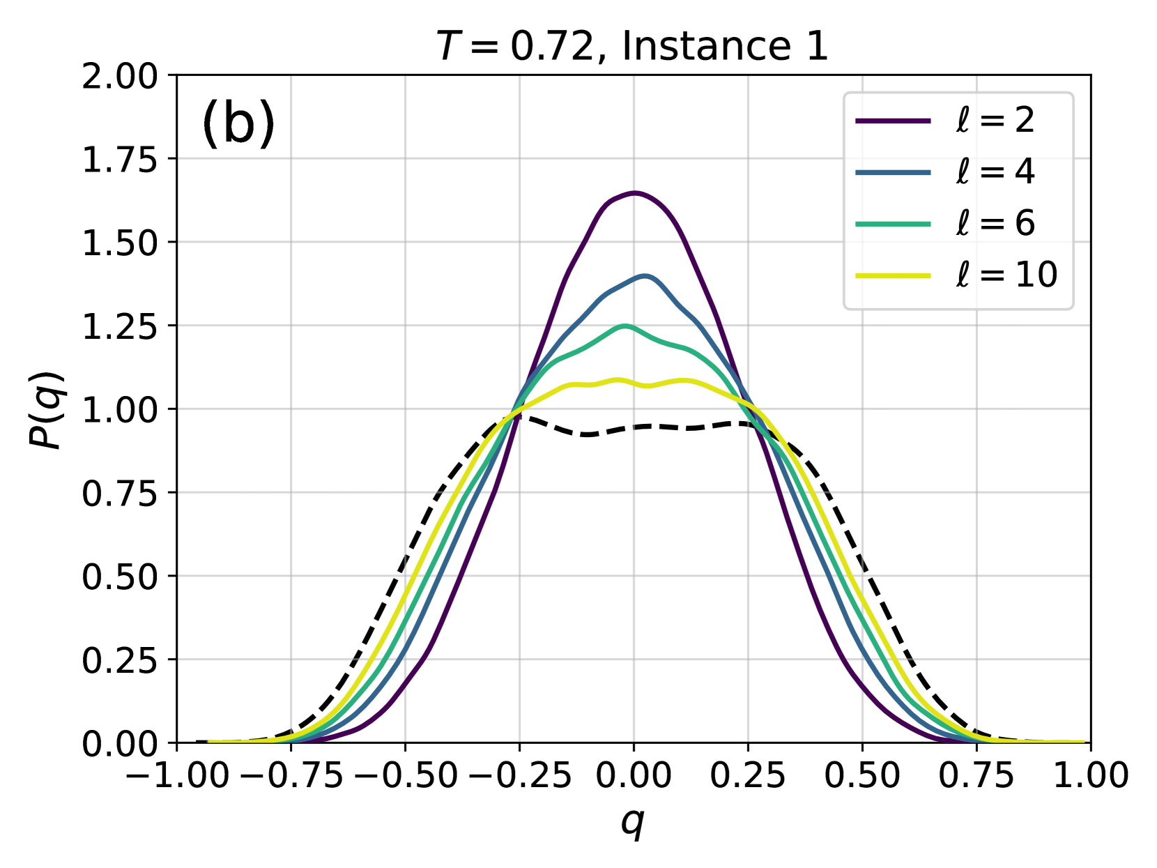
The image is a line chart displaying the relationship between P(q) and q for different values of 'l' (2, 4, 6, and 10) at a constant temperature T = 0.72 for Instance 1. The chart includes a dashed black line, which is not explicitly defined in the legend. The x-axis represents 'q', and the y-axis represents 'P(q)'.
### Components/Axes
* **Title:** T = 0.72, Instance 1
* **X-axis:**
* Label: q
* Scale: -1.00 to 1.00, with increments of 0.25
* **Y-axis:**
* Label: P(q)
* Scale: 0.00 to 2.00, with increments of 0.25
* **Legend (Top-Right):**
* l = 2 (Purple)
* l = 4 (Dark Blue)
* l = 6 (Green)
* l = 10 (Yellow)
* **Unlabeled Line:** Dashed Black Line
### Detailed Analysis
* **l = 2 (Purple):** The line starts at approximately P(q) = 0 at q = -1.00, rises to a peak of approximately P(q) = 1.65 at q = 0, and then decreases back to approximately P(q) = 0 at q = 1.00.
* **l = 4 (Dark Blue):** The line starts at approximately P(q) = 0 at q = -1.00, rises to a peak of approximately P(q) = 1.40 at q = 0, and then decreases back to approximately P(q) = 0 at q = 1.00.
* **l = 6 (Green):** The line starts at approximately P(q) = 0 at q = -1.00, rises to a peak of approximately P(q) = 1.25 at q = 0, and then decreases back to approximately P(q) = 0 at q = 1.00.
* **l = 10 (Yellow):** The line starts at approximately P(q) = 0 at q = -1.00, rises to a peak of approximately P(q) = 1.05 at q = 0, and then decreases back to approximately P(q) = 0 at q = 1.00.
* **Dashed Black Line:** The line starts at approximately P(q) = 0 at q = -1.00, rises to a local peak of approximately P(q) = 0.95 at q = -0.25, dips to approximately P(q) = 0.90 at q = 0, rises to a local peak of approximately P(q) = 0.95 at q = 0.25, and then decreases back to approximately P(q) = 0 at q = 1.00.
### Key Observations
* As the value of 'l' increases, the peak value of P(q) at q = 0 decreases.
* All lines are symmetric around q = 0.
* The dashed black line has a flatter peak compared to the other lines.
### Interpretation
The chart illustrates how the distribution P(q) changes with different values of 'l' at a fixed temperature. The decrease in the peak value of P(q) as 'l' increases suggests that the distribution becomes broader and less concentrated around q = 0. The dashed black line likely represents a baseline or a different condition, as it exhibits a flatter peak and a different shape compared to the other lines. The symmetry around q = 0 indicates that the system is symmetric with respect to the variable 'q'.