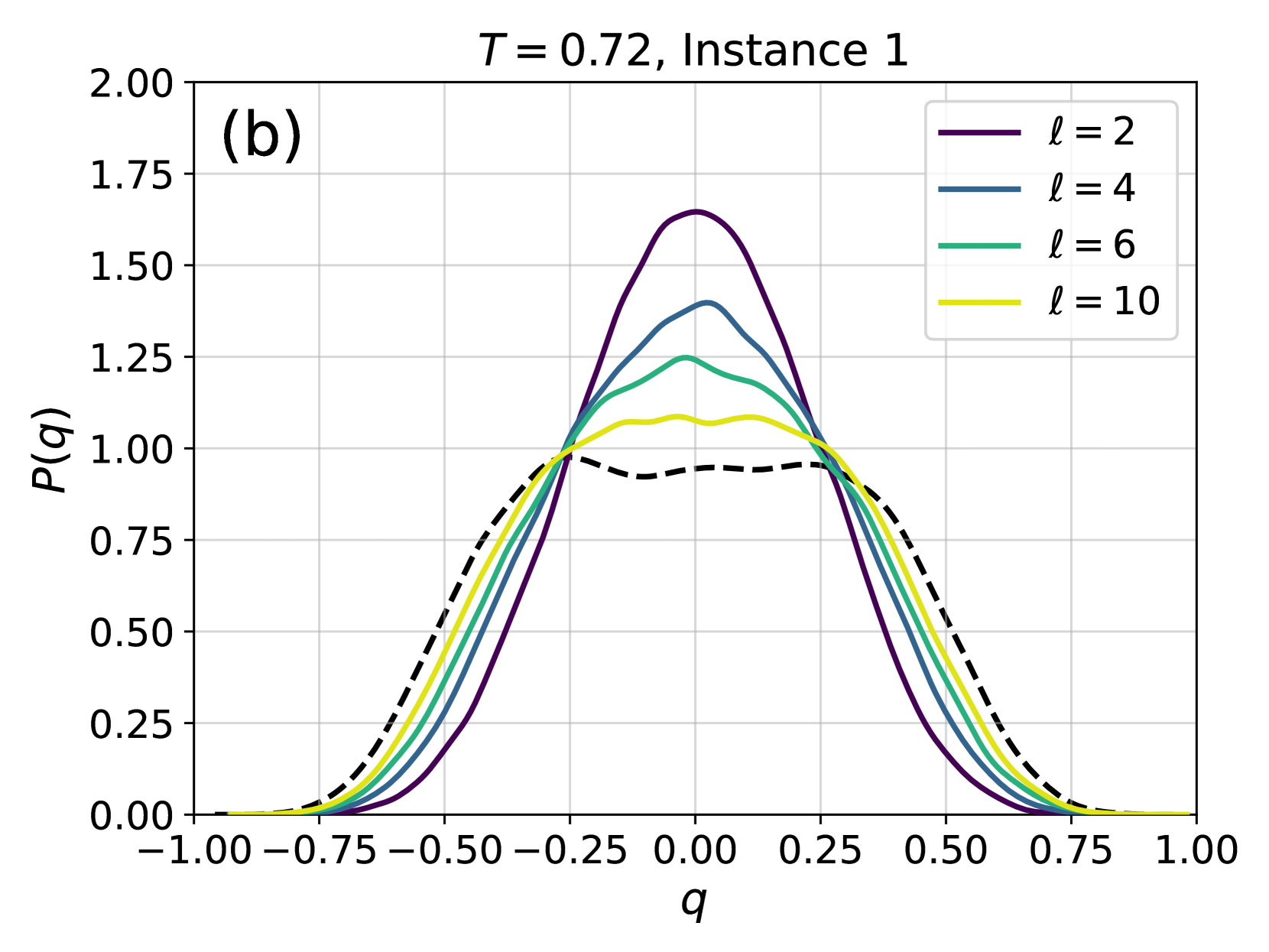
## Line Chart: Probability Distribution P(q) at T = 0.72, Instance 1
### Overview
The chart displays probability distributions P(q) as a function of q for four distinct values of ℓ (2, 4, 6, 10) at a fixed temperature T = 0.72. A dashed reference curve is included for comparison. All distributions are symmetric around q = 0 but exhibit shifts and variations in peak height and width.
### Components/Axes
- **X-axis (q)**: Ranges from -1.00 to 1.00 in increments of 0.25. Labeled "q".
- **Y-axis (P(q))**: Ranges from 0.00 to 2.00 in increments of 0.25. Labeled "P(q)".
- **Legend**: Located in the top-right corner, mapping colors to ℓ values:
- Purple: ℓ = 2
- Blue: ℓ = 4
- Green: ℓ = 6
- Yellow: ℓ = 10
- Dashed black: Reference curve (ℓ unspecified).
- **Title**: "T = 0.72, Instance 1" at the top-center.
- **Graph Label**: "(b)" in the top-left corner.
### Detailed Analysis
1. **ℓ = 2 (Purple Line)**:
- Peaks sharply at q ≈ 0.25 with P(q) ≈ 1.75.
- Symmetric but skewed slightly toward positive q.
- Steep decline on both sides of the peak.
2. **ℓ = 4 (Blue Line)**:
- Peaks at q ≈ 0.2 with P(q) ≈ 1.5.
- Broader than ℓ = 2, indicating a wider distribution.
- Smoother curve with less pronounced shoulders.
3. **ℓ = 6 (Green Line)**:
- Peaks at q ≈ 0.15 with P(q) ≈ 1.3.
- Further broadened and flattened compared to ℓ = 4.
- Shoulders extend closer to q = 0.
4. **ℓ = 10 (Yellow Line)**:
- Peaks at q ≈ 0.1 with P(q) ≈ 1.1.
- Nearly symmetric around q = 0.
- Minimal shoulders; distribution is more uniform.
5. **Dashed Black Reference Curve**:
- Peaks at q = 0 with P(q) ≈ 1.0.
- Symmetric and smooth, serving as a baseline for comparison.
### Key Observations
- **Peak Shift**: As ℓ increases, the peak of P(q) shifts leftward (toward negative q) and lowers in height.
- **Width Increase**: Higher ℓ values correspond to broader distributions, suggesting increased variability in q.
- **Reference Curve**: The dashed line (ℓ = ∞?) provides a theoretical limit, showing a uniform distribution at q = 0.
- **Symmetry**: All curves are symmetric about q = 0, but higher ℓ values exhibit reduced asymmetry.
### Interpretation
The data suggests a phase transition or critical behavior in the system as ℓ increases. At lower ℓ (e.g., ℓ = 2), the system exhibits a sharp, localized peak, indicative of a narrow, high-probability state. As ℓ increases, the distribution broadens and flattens, implying a transition toward a more disordered or critical state. The dashed reference curve may represent an idealized or asymptotic behavior (e.g., ℓ → ∞), where the system becomes uniformly distributed. The temperature T = 0.72 likely plays a role in stabilizing these distributions, with higher ℓ values approaching criticality. The shift in peak positions could reflect competing interactions or external perturbations in the system.